"Go2Health" - Elegant Logo Medallion For Holistic Health Brand / Podcast
Want to win a job like this?
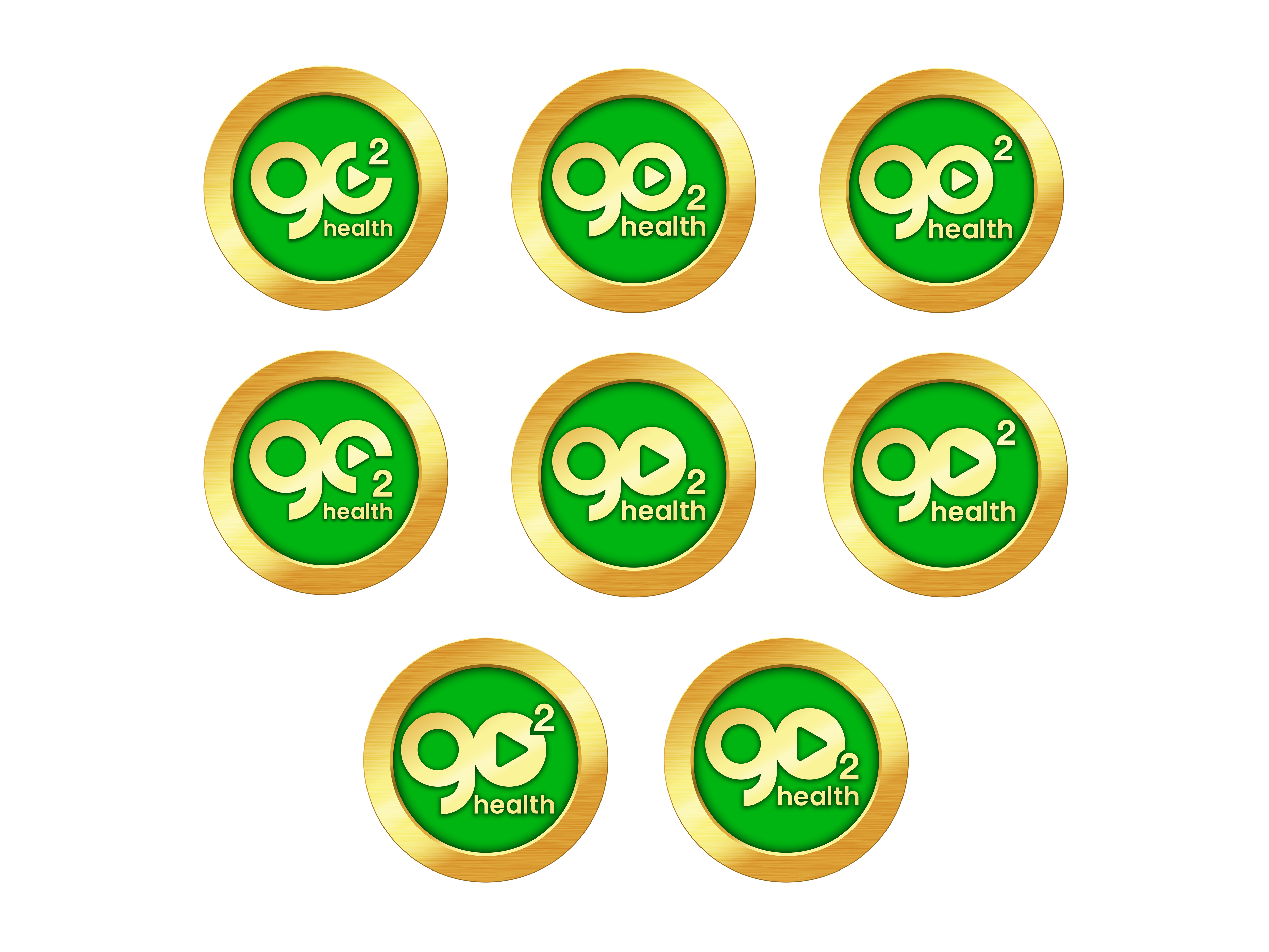
This customer received 202 logo designs from 47 designers. They chose this logo design from ArtTank as the winning design.
Join for free Find Design Jobs-
 US$150
-
 202 designs
-
 47 designers
Logo Design Brief
We’re launching a podcast and media project called Go2Health—a fresh, edgy-yet-trusted show focused on holistic health, nutrition, vitality, and transformation.
The name plays off the phrase “Go to hell!”—but reclaims it as a powerful, positive redirection:
“Go to Health.”
It also nods to an earlier TV show of the same name hosted by the central figure in this project, a well-known holistic health expert.
We’re looking for a striking, elegant, and meaningful logo that can anchor the visual identity of this brand—something that feels memorable, a little unexpected, but ultimately warm, intelligent, and trustworthy.
________________________________________
What We Want:
We’re primarily looking for a medallion-style emblem logo—a circular or badge-style mark that feels solid, meaningful, and versatile.
• The main emblem should stand on its own, but we’re also open to seeing versions paired with the full “Go2Health” text.
• The emblem may creatively incorporate elements of the name itself (i.e., "Go", "2", "Health").
PLEASE SEE THE ATTACHED REFERENCE FILE WITH FULL DETAILS.
Thank you!
Target Market(s)
Audiences interested in holistic health, supplements, biohacking, etc.
Industry/Entity Type
Holistic Health (Info, Podcasting, Supplements)
Logo Text
Go2Health
Logo styles of interest
Emblem Logo
Logo enclosed in a shape
Pictorial/Combination Logo
A real-world object (optional text)
Look and feel
Each slider illustrates characteristics of the customer's brand and the style your logo design should communicate.
Elegant
Bold
Playful
Serious
Traditional
Modern
Personable
Professional
Feminine
Masculine
Colorful
Conservative
Economical
Upmarket
Requirements
Must have
- Fundamentally based on the medallion concept described in the brief - gold with green interior... make it look "realistic" with some depth and texture.
Should not have
- Not too many concepts blended into a collage that makes things look messy rather than clean.