Design signage & window art that screams: “This is the place for wall decor!”
Want to win a job like this?
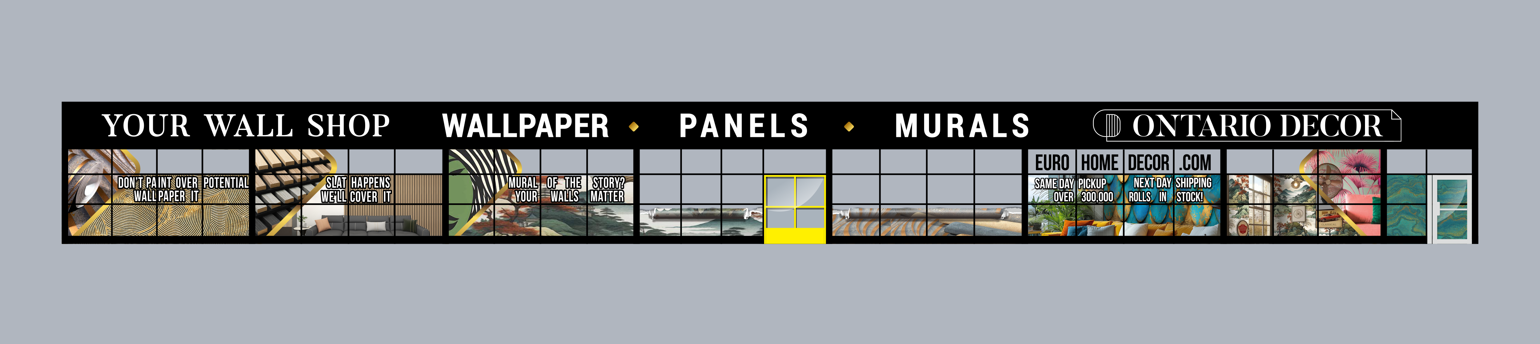
This customer received 76 graphic designs from 18 designers. They chose this graphic design from yusmoker as the winning design.
Join for free Find Design Jobs- Guaranteed
-
 C$290
C$290
-
 76 designs
-
 18 designers
Graphic Design Brief
Contest Goal:
Design a single, cohesive storefront signage system for Ontario Decor. That includes the top fascia and bottom window graphics, presented as one polished connected visual package. Designers will provide a composite mock-up showing how the overall design looks in context.
***All Designs need to creatively incorporate the torn paper effect where the showroom is located .Example found attached(Window-Graphics_Inspo.jpg)
Category taglines
Each product section (at the bottom of each window group) should include bold, eye-catching taglines. Use the examples below — final wording may be refined later.
Window image focus clarified
Left side: Product closeups and detail shots
Right side: Lifestyle/in-room imagery
2. Layout Specifications/Dimensions
Fascia: 148 ft wide × 4 ft high
Regular windows: approx. 49” × 36”
Door glass: approx. 75” × 30”
Yellow zone (NewStorefrnt.png): Showroom windows + doors — must preserve visibility
Blue zones: All windows eligible for full-coverage graphics
Assets:
NewStorefrnt.png (layout reference)
Window-Graphics_Inspo.jpg (for torn-paper effect reference)
Ontario Decor Logo File(remove bottom text please)
Wallpaper,Mural and Panels Images in their own Zip files
3. Fascia Signage (Top Strip)
Background: Solid black or deep charcoal
Font: Bold, modern, highly legible Silver/white is preferred.
Left-aligned text layout (in this order):
Wallpaper
Murals
Panels
EuroHomeDecor.com
Ontario Decor (just the logo,it must be the same size as other top font)
Note: Do not include any taglines with the Ontario Decor logo — the product categories are already clearly spelled out.
4. Window Graphics (Lower Section)
Design a seamless visual layout across the storefront windows that reflects each product category. Each window section must line up directly below its corresponding fascia label.
Section Breakdown:
Wallpaper
Visuals: Close-up patterns, roll textures, product shots
Tagline: Don’t Paint Over Potential. Wallpaper It.
Murals
Visuals: Large-scale mural applications, dramatic visuals
Tagline: Mural of the Story? Your Walls Matter.
Panels
Visuals: Slat walls, acoustic panels, product installations
Tagline: Slat Happens. We got you covered!
5. Showroom Zone (Yellow Area in Layout)
Apply the torn-paper effect from Window-Graphics_Inspo.jpg within the yellow showroom area
This should simulate a dramatic peel-back revealing the showroom interior while maintaining clear visibility and fitting seamlessly with the surrounding design.
6. Visual Structure Guide
Left windows: Product closeups and material textures
Right windows: Styled room scenes and optional torn-paper aesthetic (some torn effect could be used on the left side too, if it works compositionally)
Taglines: Must be visually emphasized in each section
Overall layout should be clean, balanced, and contemporary
7. Final Goals
Maintain alignment between fascia text and window content
Keep the entrance clean and unobstructed
Communicate Ontario Decor’s brand clearly: modern, bold, and functional
Updates
Low designer entries
Hi Designers,
We haven’t received as many submissions as we’d hoped, so we’re updating the contest to help encourage more participation. We’re now ready to guarantee the project once we see a few creative designs that align with our brief and demonstrate some originality.
To make this easier and less risky for you, please feel free to submit a rough outline or draft concept before investing too much time into final designs. This approach allows us to quickly provide feedback and helps you save valuable design time.
Important Reminder:
Please remember that the images in the provided WallpaperMuralAndPanelImages folder are only references to demonstrate our general product range. They should not be directly included in your final designs, as most are outdated and may unintentionally limit your creativity. Instead, use them only as a starting point or for inspiration, and feel free to choose modern, fresh imagery that reflects a contemporary look and feel.
We look forward to your creative ideas!
Thank you,
Ontario Decor Team
Added Thursday, 03 July 2025
👋 Hi Designers!
Thanks so much for all the creativity and hard work you’ve been putting into the Ontario Decor storefront project — the concepts so far have been full of potential, and we’re really excited to take things to the finish line and get our dream storefront!
A few important updates:
⸻
✅ The Project Is Now Guaranteed!
We’ve officially GUARANTEED the project on DesignCrowd — which means a winner will be selected, and the full prize will be awarded. Your time and talent are truly appreciated.
🎉 Bonus: Depending on the quality and diversity of submissions, we also plan to award 2nd and 3rd place designers with bonus payouts as a thank-you for standout contributions. So even if you’re not selected as the main winner, there’s still a strong opportunity to be recognized and rewarded.
⸻
🔄 Final Brief Changes & Clarifications
1. Fascia Layout Shifted Left
The top strip (fascia) should now feature left-aligned product categories:
• Wallpaper, Murals, Panels, EuroHomeDecor.com, and the Ontario Decor logo.
• This ensures clean alignment with the window sections below.
• That said, if centering them creates a stronger overall design with your window layout, we’re open to seeing that too!
2. Taglines Required Under Each Product Section
These should be visually bold and engaging:
• Wallpaper: Don’t Paint Over Potential. Wallpaper It.
• Murals: Mural of the Story? Your Walls Matter.
• Panels: Slat Happens. We’ll Cover It.
3. Window Imagery Layout Refined
• Left Side Windows: Close-ups and texture shots
• Right Side Windows: Lifestyle/in-room visuals
• Torn-paper effect is welcome on both sides if it fits compositionally — but is especially impactful on the right.
4. Torn-Paper Effect is Required in the Showroom Area
• Must be used in the yellow zone (see NewStorefrnt.png)
• Refer to Window-Graphics_Inspo.jpg — this should simulate a peel-back revealing the showroom, while maintaining visibility inside.
⸻
📐 Design Guidelines to Follow
• Fascia background: Solid black or deep charcoal
• Font: Bold, modern, highly legible (white or silver preferred)
• Ontario Decor logo: Use version without tagline; match size of other fascia text
• Do not add any taglines beside the logo — the product labels cover that
• Overall style: Modern, clean, bold, and balanced
• Entrance and doors must remain clearly visible and unobstructed
• Window visuals must directly line up below their corresponding fascia labels
• Taglines must stand out but stay clean — don’t crowd the composition
⸻
📁 Provided Assets
• NewStorefrnt.png – for layout, yellow/blue zone references
• Window-Graphics_Inspo.jpg – torn paper visual reference
• Ontario Decor Logo (no tagline)
• Wallpaper / Mural / Panel image ZIPs for use in each section
⸻
💬 Feel free to experiment within the brief — creative risks are welcome as long as the structure and brand goals are respected. Looking forward to seeing the next round of your ideas!
Thanks again for being part of this. We’ll be watching closely — and rewarding creativity, attention to detail, and brand fit.
All the best,
Ben
Ontario Decor
Added Tuesday, 08 July 2025
Sick
The submitted designs need more time to adapt them to fit the goals
Target Market(s)
Homeowners, interior designers, contractors, and DIY renovators looking for premium wall decor solutions such as wallpaper, decorative panels, and murals. Most customers are style-conscious, value design, and want to enhance living or commercial spaces with bold, modern decor elements.
Industry/Entity Type
Interior Design / Home Improvement / Retail
Look and feel
Each slider illustrates characteristics of the customer's brand and the style your logo design should communicate.
Elegant
Bold
Playful
Serious
Traditional
Modern
Personable
Professional
Feminine
Masculine
Colorful
Conservative
Economical
Upmarket
Requirements
Must have
- • A single cohesive design that integrates both the top signage and window graphics • The text: “Eurohomedecor.com | Panels | Wallpaper | Murals” plus the Ontario Decor logo • High legibility from a distance (ideal for street traffic) • A clear, well-lit showroom entrance (yellow-marked section must stay mostly transparent) •The torn paper effect(Window-Graphics_Inspo.jpg) • Visual alignment between fascia and windows (should feel like one system)
Nice to have
- Use of subtle framing, transparency, or frosted effects to blend the entrance into the full design • Modern typography and layout styles • Elements inspired by included reference files (especially “BottomIdeaInspo” and “Window-Graphics”) • Visual references to wallpaper, panels, or mural-style art in the window graphics • A few creative layout options or variations of the final concept (if time allows)
Should not have
- Should not haves • Cluttered or overly busy designs • Serif or ornate fonts that are hard to read at a distance • Fully opaque designs on the showroom entrance • Literal or outdated imagery(provided in WallpaperMuralAndPanelImages.zip they are supposed to help guide your design,Please dont only use those as the images) — the overall tone should be bold and modern, not traditional