Trinity PUD - Green Energy Icon
Want to win a job like this?
This customer received 255 logo designs from 115 designers. They chose this logo design from omahsegoro as the winning design.
Join for free Find Design Jobs- Guaranteed
-
 US$150
-
 255 designs
-
 115 designers
Logo Design Brief
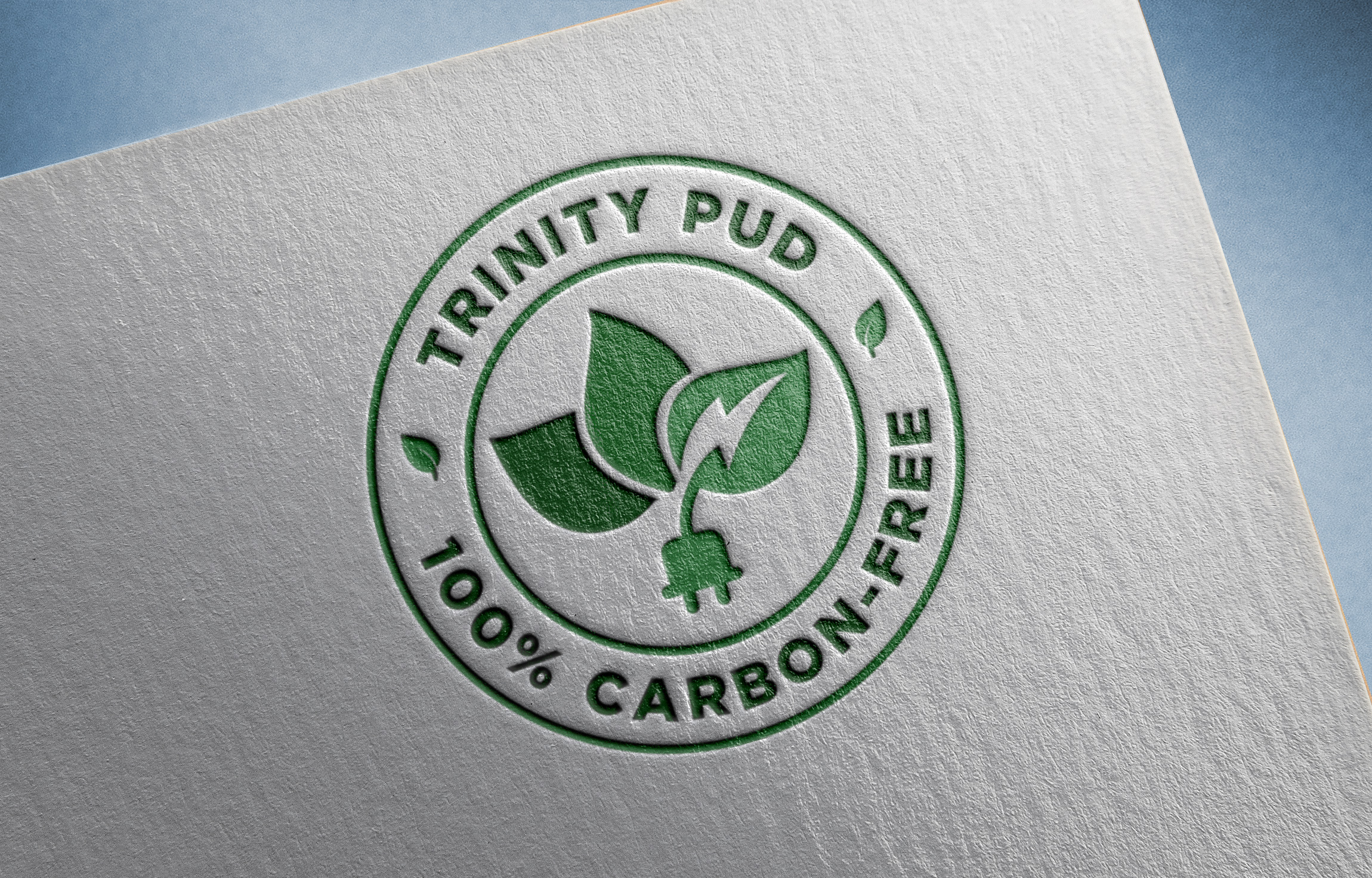
Trinity Public Utilities District is a customer owned electric utility in Northern California that distributes 100% carbon-free energy to its customers. One of our local Chambers of Commerce has requested that we develop a 'green energy icon' that can be utilized by our customers to identify their products as being produced with 100% carbon-free energy. Our energy is 100% hydropower generated at Trinity Dam. I have included 2 samples that AI generated that we initially liked, but we need help with the design/formatting and are open to additional ideas. I've also included our current logo, that we are not changing (it is dated, but very recognizable to our customers and I thought the colors would be helpful).
Updates
Slow in providing feedback
Target Market(s)
Consumers interested in green energy products
Industry/Entity Type
Electric Utility
Logo Text
Trinity PUD - 100% carbon-free
Look and feel
Each slider illustrates characteristics of the customer's brand and the style your logo design should communicate.