Nordic Spring is a recruitment agency seeking a timeless, sophisticated logo
Want to win a job like this?
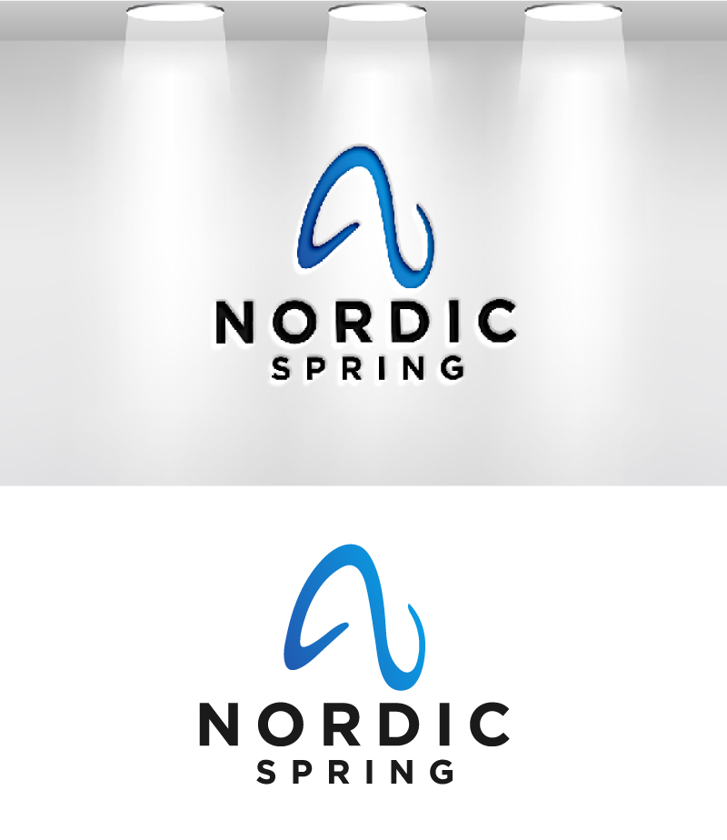
This customer received 386 logo designs from 132 designers. They chose this logo design from VisionCraft™ as the winning design.
Join for free Find Design Jobs- Guaranteed
-
 €190
€190
-
 386 designs
-
 132 designers
Logo Design Brief
Nordic Spring – Logo Design Brief
A Brand Identity Rooted in Precision, Trust, and Growth
Welcome to the Challenge
This is more than just a logo. It’s the visual foundation of a brand that will shape the future of recruitment in banking, finance, and real estate. Nordic Spring isn’t just another agency—it’s a trusted partner in industries where credibility, expertise, and precision define success.
We need a logo that speaks volumes without shouting—something timeless, sophisticated, and meaningful. We’re looking for a design that inspires confidence, reflects our Nordic roots, and subtly conveys the idea of growth, renewal, and transformation.
This is where you come in.
Who We Are & What We Stand For
At Nordic Spring, we connect top-tier professionals with leading companies in Stockholm’s financial and real estate markets. We don’t deal in mass recruitment—we specialize in strategic, high-value placements where trust and expertise are everything.
Our name, Nordic Spring, represents both our regional identity and our mission:
🌿 Spring – A season of renewal and fresh opportunities, just as we help businesses and careers grow.
❄️ Nordic – Precision, integrity, and stability, mirroring the industries we serve.
We are not trendy. We are not fleeting. We are a solid, serious player in a world where reputation matters. Our visual identity must reflect that.
What We Need from This Logo
We’re not here for something generic. This logo should be built to last—a mark that is instantly recognizable, speaks directly to our audience, and gives the impression of trust, growth, and Nordic precision.
✅ Simplicity & Clarity
Think Apple, Nike, or Goldman Sachs—clean, refined, and effortless.
A minimalist but powerful design that doesn’t rely on unnecessary details.
✅ Memorability
The logo should stick in people’s minds—a mark that feels distinct, confident, and unique.
Subtle, thoughtful details that create a deeper connection without being obvious.
✅ Timelessness
No trends. No gimmicks. This logo should be just as strong in 10, 20, or 50 years.
Scandinavian-inspired simplicity ensures longevity.
✅ Versatility & Scalability
Must work everywhere—on a website, business card, high-end print materials, and even a skyscraper.
Needs to be effective in full color, grayscale, and black & white.
✅ Relevance to Industry & Brand
Should feel at home in the finance, banking, and real estate worlds.
Evoke trust, professionalism, and high-value service without being stiff or outdated.
✅ Smart Use of Color & Typography
Colors:
Deep blue (stability, trust, expertise).
Muted green (growth, opportunity, renewal).
Accents of gold or silver (premium quality, exclusivity).
Avoid anything overly bright or playful—this is serious business.
Typography:
Strong, clean sans-serif for modern professionalism or an elegant, refined serif for timeless prestige.
No script fonts, no playful rounded edges.
✅ Hidden Meaning or Clever Design (Optional, but Powerful)
A subtle, intelligent design feature that makes people look twice.
Example: The FedEx hidden arrow, the Amazon A–Z smile—smart, not gimmicky.
Something that nods to growth, connection, or Nordic simplicity without being cliché.
Design Directions & Inspirations
We’re open to different approaches, as long as they align with our brand’s identity:
💠 Wordmark (Strong Typography-Driven Logo)
Think Goldman Sachs, UBS, or PwC—a bold, timeless font treatment with a slight custom tweak to make it unique.
💠 Symbol + Wordmark Combination
A clean, abstract symbol paired with our name.
The symbol should reflect growth, renewal, precision, or stability without being obvious or overused.
💠 Lettermark (Monogram-Based Logo – NS or Nordic Spring)
A structured, well-balanced monogram that works as an independent mark.
Could be used in luxury branding and works well in corporate environments.
What to Avoid
🚫 No generic recruitment icons (shaking hands, people figures, or arrows).
🚫 No overly complex or trendy designs that won’t stand the test of time.
🚫 No playful or casual aesthetics—this needs to feel premium and established.
Final Deliverables
We expect a logo system that includes:
✅ Primary logo (full color)
✅ Black & white version
✅ Scalable vector files (SVG, EPS, AI)
✅ Favicon & social media adaptations
✅ Typography & color guidelines
Target Market(s)
Nordic Spring targets banking, finance, and real estate firms in Stockholm, connecting them with top-tier professionals. Our clients demand trust, expertise, and precision, making us a premium, specialized recruitment partner.
Industry/Entity Type
recruitment, consultancy
Logo Text
Nordic Spring
Logo styles of interest
Abstract Logo
Conceptual / symbolic (optional text)
Lettermark Logo
Acronym or letter based logo (text only)
Font styles to use
Other font styles liked:
- GT ultra
Colors
Colors selected by the customer to be used in the logo design:
Look and feel
Each slider illustrates characteristics of the customer's brand and the style your logo design should communicate.
Elegant
Bold
Playful
Serious
Traditional
Modern
Personable
Professional
Feminine
Masculine
Colorful
Conservative
Economical
Upmarket
Requirements
Must have
- Relevance, spimplcity, remberable
Nice to have
- clearity and easy to reconize
Should not have
- The logo shoul work for linkedin and such (smaller formats)