Logo Design Opportunity: Create a Modern, Minimalist Identity for 'Cana' – A Young Adults Ministry
Want to win a job like this?
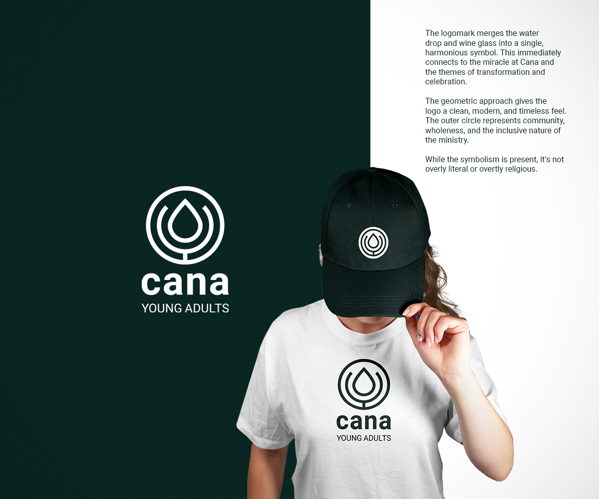
This customer received 294 logo designs from 101 designers. They chose this logo design from Sunilc as the winning design.
Join for free Find Design Jobs- Guaranteed
-
 US$300
-
 294 designs
-
 101 designers
Logo Design Brief
Background:
Cana is the new young adults ministry at Boulder Valley Christian Church, located in a predominantly non-Christian area. The ministry is designed to meet the unique challenges of young adulthood, offering community, connection, and spiritual growth. The name "Cana" comes from the story of Jesus’ first miracle in John 2, where He transformed water into wine at a wedding—a story symbolizing transformation, joy, and community.
Cana seeks to be a pivotal space for young adults—a place where they can grow, connect, and discover their God-given purpose.
Target Audience:
The primary audience is Gen Z young adults, who are navigating college, starting careers, building relationships, and seeking community. Given this group’s modern aesthetic preferences, the logo should feel sleek, relevant, and inviting while avoiding anything overly religious or cheesy.
Vision for the Logo:
The logo should reflect the essence of Cana: transformation, joy, and community. It should be:
Incorporate transformation, joy, community, or the story of Cana somehow
Sleek, modern, and clean
Minimalist (less is more)
Appealing to Gen Z
Non-cheesy and professional
Potentially without overtly Christian symbols (a cross is optional but not necessary)
Brand Feel:
The logo should align with Boulder Valley Christian Church’s existing branding (guidelines attached) but also stand out as unique to Cana. Consider these qualities:
Hopeful and welcoming
Vibrant and fresh
Timeless yet trendy
Inspiration from the Ministry Vision
Cana emphasizes:
Transformation: Inspired by Jesus turning water into wine
Community: A place of belonging and connection
Joy: A sense of celebration and purpose in life
These themes could be subtly integrated into the design.
Deliverables:
Primary logo in vector format
Variations for light and dark backgrounds
A secondary mark or icon (optional)
Optional Elements:
Incorporate subtle nods to the story of Cana (e.g., water, wine, vessels, or abstract forms)
Play with modern typography and minimalistic shapes
Additional Context:
Below is a quick summary of what Cana offers:
🌿 Life Groups: Intimate gatherings in homes for meals and meaningful conversations.
🎶 Worship Nights: Monthly church-based events focused on encountering God.
🎉 Social Events: Casual meetups like hikes, game nights, and axe throwing.
🌍 Mission Opportunities: Global and local service projects to make a tangible impact.
We’re excited to see a design that captures the heart of Cana—a space where young adults can grow, connect, and embrace their faith journey.
Updates
Designs look the same
Target Market(s)
Gen Z
Industry/Entity Type
Church
Logo Text
'cana' - possibly 'cana - young adults'
Logo styles of interest
Wordmark Logo
Word or name based logo (text only)
Lettermark Logo
Acronym or letter based logo (text only)
Font styles to use
Other font styles liked:
- Museo Sans, or Helvetica Neue
Colors
Designer to choose only greyscale colors for use in the design.
Look and feel
Each slider illustrates characteristics of the customer's brand and the style your logo design should communicate.
Elegant
Bold
Playful
Serious
Traditional
Modern
Personable
Professional
Feminine
Masculine
Colorful
Conservative
Economical
Upmarket
Requirements
Must have
- Logo that can easily be added to websites, stickers, etc.
Nice to have
- Originality in the design.
Should not have
- Do not include a cross unless it is subtle