Rack Card Redesign - Food Tours - 4 Cities - Culinary Tourism
Want to win a job like this?
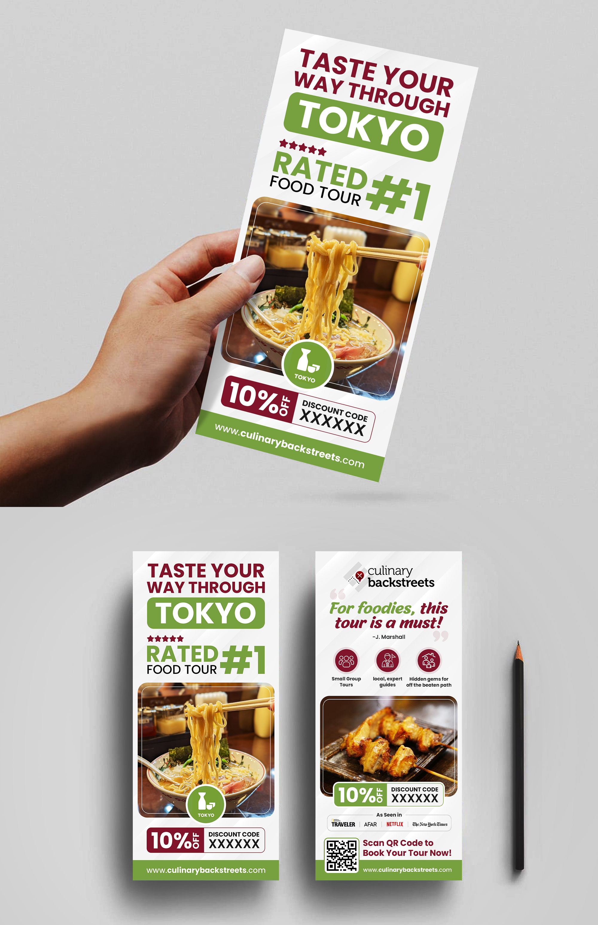
This customer received 59 flyer designs from 10 designers. They chose this flyer design from Sam.Art as the winning design.
Join for free Find Design Jobs-
 US$230
-
 59 designs
-
 10 designers
Flyer Design Brief
Project Brief: We are a culinary tourism company looking to elevate our current Food Tour rack cards. The full project scope is attached in pdf.
To start with, please create rack cards for these city food tours: Naples, Lisbon, Tokyo, and Mexico City.
Reference for Style and Tone: see our newest food tour page to understand the brand’s aesthetic and tone: https://culinarybackstreets.com/tours-food-tours/tours-osaka/2025/umami-town/
Current Rack Card: see attached images
They are basically OK but the design is not so great. Maybe something bolder with more stylized icons etc.
General Redesign Notes:
Simplification: The current designs are too busy. Use clean lines, bold typography, and enough white space to make the information digestible.
Color Palette: Stick with Culinary Backstreets’ branding— note each city tour has their own city color and icon.
Icons: Create bold, modern, and visually consistent icons to represent features.
Photos: See the pdf document for link to photos.
Typography: Choose fonts that are clean, legible, and bold to draw attention to key points.
Target Market(s)
Travelers in cities interested in culture and food tours
Font styles to use
Other font styles liked:
- Avenir Regular, Avenir Bold, Avenir Black 95
Look and feel
Each slider illustrates characteristics of the customer's brand and the style your logo design should communicate.