Logo Designs for TRU "The Retail University
Want to win a job like this?
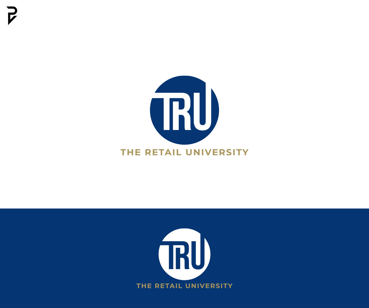
This customer received 204 logo designs from 100 designers. They chose this logo design from poisonvectors as the winning design.
Join for free Find Design Jobs- Guaranteed
-
 US$150
-
 204 designs
-
 100 designers
Logo Design Brief
We need a modern, professional logo designed for TRU (The Retail University), a premier business advisory service specializing in launching and growing beauty stores. The logo should capture our mission of empowering beauty store owners to achieve success through expert advice and proven strategies.
Project Overview:
Company Name: The Retail University (TRU)
Industry: Business advisory, specializing in beauty store startups and growth
Tagline: (Optional: Include if relevant in the design process)
Key Characteristics:
keep the focus on TRU as the centerpiece of the brand to ensure flexibility for future sub-brands like TRU Marketing and TRU Operations.
Modern & Timeless: The logo should feel contemporary yet stand the test of time.
Professional & Trustworthy: Reflect our position as the best in the industry.
Empowering & Inspirational: Symbolize success and growth for beauty store owners.
Design Requirements:
Color Palette:
Main: Shades of royal blue or gold (to convey trust and excellence).
Accent: White or neutral tones for balance and clarity.
Open to suggestions for a complementary palette that emphasizes professionalism and success.
Typography:
Clean, bold, and modern fonts.
Must be easy to read at any size.
Icon/Imagery:
Can incorporate symbols of growth (e.g., upward arrow, graph), retail (e.g., shopping bag outline, storefront), or academia (e.g., graduation cap or book) if it enhances the design.
The icon should be versatile for use across various media (websites, merchandise, presentations, etc.).
Style:
Minimalist but impactful. Avoid overly complex designs.
Corporate yet approachable to appeal to beauty store owners.
Deliverables:
Primary logo: Full version with icon and text.
Secondary logo: Simplified version (e.g., icon-only or text-only) for smaller applications.
File Formats: High-resolution vector files (.AI, .EPS) and web-friendly files (.PNG, .JPG).
Color Variations: Full color, black-and-white, and transparent background versions.
Additional Information:
The logo will be used for our website, marketing materials, merchandise, and signage.
It should reflect our commitment to excellence, innovation, and customer success in the beauty industry.
IMPROTANT: keep the focus on TRU as the centerpiece of the brand to ensure flexibility for future sub-brands like TRU Marketing and TRU Operations.
Target Market(s)
ChatGPT The target market for TRU (The Retail University) is primarily beauty store owners and entrepreneurs within the beauty industry who are looking to launch, grow, or optimize their beauty supply businesses.
Industry/Entity Type
This is the business advisory and education industry, with a niche focus on the beauty retail sector. It combines elements of: Business Consulting – Helping beauty store owners launch, grow, and optimize their businesses. Education/Training – Providing mentorship, courses, and tools tailored to beauty entrepreneurs. Retail Support – Specializing in strategies for success in the beauty supply and retail market. In essence, TRU (The Retail University) operates at the intersection of education, entrepreneurship, and the beauty industry.
Logo Text
TRU "The Retail University"
Colors
Designer to choose colors to be used in the design.
Look and feel
Each slider illustrates characteristics of the customer's brand and the style your logo design should communicate.
Elegant
Bold
Playful
Serious
Traditional
Modern
Personable
Professional
Feminine
Masculine
Colorful
Conservative
Economical
Upmarket
Requirements
Must have
- Logo Must-Haves: 1. Professional Look: * The logo should exude credibility and authority, as TRU is an educational and advisory platform. * Use clean lines and well-balanced typography. 2. Industry Connection: * Incorporate subtle nods to the beauty retail industry (e.g., storefront icon, product shelf outline) or education/mentorship (e.g., graduation cap, book, arrow). * Avoid overly generic icons to ensure the logo feels specific to beauty entrepreneurship. 3. Color Palette: * Primary Colors: Shades of Orange for sophistication, success, and excellence. * Accent Colors: Neutral tones (white, gray, black) for balance. * Use colors that align with empowerment and premium service. 4. Typography: * Use modern, bold fonts to convey strength and confidence. * Consider a secondary serif font for a touch of elegance or academia. 5. Simplicity & Versatility: * The logo should be minimalist enough to work across multiple mediums: websites, social media, merchandise, and printed materials. * Avoid clutter or overly complex details. 6. Scalability: * Design should maintain clarity and impact when resized for small items (e.g., website favicon, business cards) or large formats (e.g., banners, signage). 7. Tagline Integration (Optional): * Leave space for a tagline like “Launching Beauty Businesses to Success” if desired, but ensure it’s removable for simpler use. 8. Memorability: * Include unique design elements that make the logo instantly recognizable and easy to recall, even at a glance. Branding Must-Haves: 1. Educational Feel: * Incorporate elements that reflect learning, growth, and mentorship to reinforce TRU’s core purpose as a university for beauty entrepreneurs. 2. Empowerment Messaging: * Visuals and branding should communicate success, ambition, and confidence to align with the aspirations of beauty store owners. 3. Premium Aesthetic: * Use a high-quality design style that matches TRU’s status as a leading authority in the beauty business space. 4. Adaptability for Sub-Brands: * Ensure the design is flexible enough to expand into potential sub-brands (e.g., TRU Academy, TRU Mastermind) without losing identity. 5. Inclusive Design: * The branding should feel welcoming and relatable to beauty entrepreneurs from diverse backgrounds.
Nice to have
- Nice-to-Haves for TRU's Logo 1. Sleek Symbolism * Elements that hint at growth, success, or retail (e.g., upward arrows, shopping bags). 2. Pop of Color * A secondary accent color to make the logo stand out. 3. Modern Font Pairing * A mix of bold and elegant fonts for a professional yet fresh look. 4. Versatile Layouts * Versions for horizontal and vertical use to fit different spaces. 5. Premium Look * A clean and polished design that looks expensive and professional.
Should not have
- Things the Logo Should NOT Have Overly Complex Designs – Keep it simple and clean. Trendy Elements – Avoid styles that will look outdated quickly. Too Many Colors – Stick to 2-3 max for professionalism. Generic Icons – No clip art or overused symbols. Hard-to-Read Fonts – Avoid cursive or overly decorative fonts. Cluttered Look – No unnecessary details or crowded elements. Unrelated Imagery – Stay focused on beauty, retail, and education themes. Low-Quality Design – Ensure it looks polished and premium.