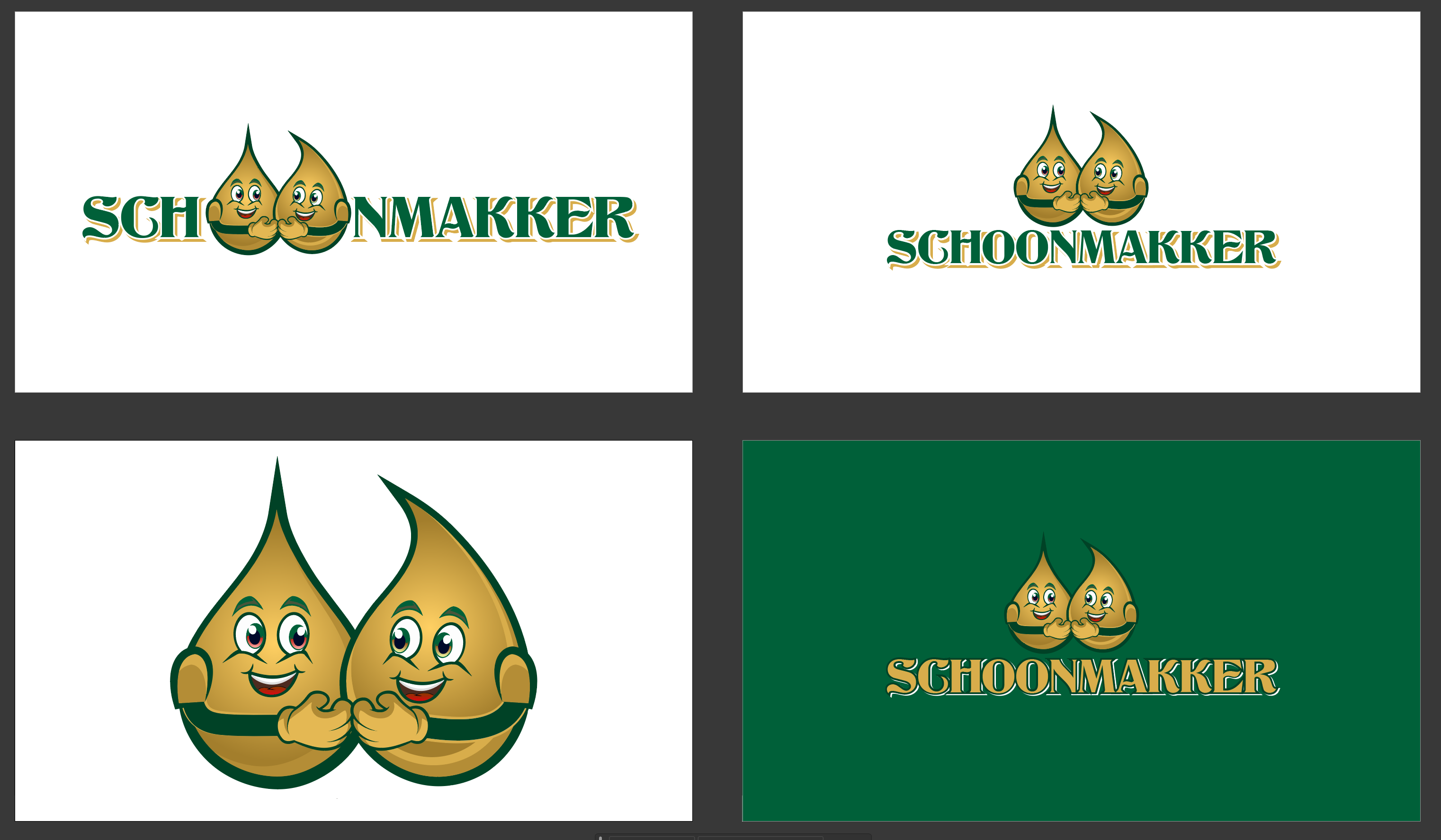
A logo for SCHOONMAKKER
Want to win a job like this?
This customer received 32 logo designs from 4 designers. They chose this logo design from Rickyy as the winning design.
Join for free Find Design Jobs-
 €80
€80
-
 32 designs
-
 4 designers
Logo Design Brief
Project Overview
Name: SCHOONMAKKER
Purpose: This logo is for a new cleaning product webshop, created by Patrick and Marc, the owners of Bioaktief. Though technically stepbrothers, they consider themselves brothers and want to reflect this family bond in their branding. "SCHOONMAKKER" should convey trust, transparency, and efficiency while also embodying an element of unity and strength.
Design Requirements
Core Icon Elements
Shine/Glow: Emphasize cleanliness and freshness. Consider using symbols of shine or sparkles.
Liquid Elements: A transparent drop or bubble, representing both purity and the product’s liquid nature.
Hands Together (Unity): Symbolize "strength together," showing the partnership between Patrick and Marc.
Cleaning Icons: Incorporate recognizable cleaning symbols such as a spray bottle, sponge, or bubble.
Word Associations
The logo should evoke feelings of freshness, cleanliness, and ease—as if using "Schoonmakkers" products results in a well-organized, clear, and fast-cleaned space.
Keywords to inspire the design: clear, tidy, sparkle, organized, refreshed, and pure.
Target Audience
Women aged 20–50 who manage household cleaning.
Men aged 30–50 who seek solutions for outdoor cleaning (like garden maintenance).
Busy young adults aged 25–40 who appreciate quick and effective cleaning solutions.
Enthusiastic, independent cleaners and people who appreciate transparency and reliability in a product.
Synonyms for "Clean" and "Transparent"
Words to consider for aesthetic direction: pure, fresh, clean, neat, clear, organized, shine, and standout (or "blinken" in Dutch).
Emotions to Evoke
Optimism and Relief: Using Schoonmakkers products should feel refreshing and effortless.
Surprise and Trust: Products should be effective beyond expectations, building trust through high performance.
Brand Colors
Deep Dark Blue (#003366): Conveys trust, strength, and professionalism, aligning with the transparent and reliable positioning of "Schoonmakkers."
Yellow Orange (#FFC107): Represents enthusiasm, positivity, and energy. This vibrant tone will evoke joy, optimism, and dynamism without overwhelming the viewer.
The balance of dark blue for reliability and yellow-orange for energy should embody both strength and approachable vibrance.
Brand Name and Typography
The brand name “Schoonmakkers” must be prominently displayed within the logo.
Typography should be clean, modern, and straightforward, reflecting transparency and simplicity.
The font style could incorporate rounded edges to feel friendly and approachable or sleek lines to give a more professional look, suitable for home, garden, and industrial products.
Design Style
The logo should be modern, simple, and instantly recognizable.
It should incorporate a transparent or reflective element, such as a droplet or bubble, symbolizing cleanliness and purity.
Incorporate an element symbolizing togetherness or unity, reflecting Patrick and Marc’s strong bond.
Avoid overly complex details; instead, keep it minimalist and versatile for online platforms and packaging.
Formats and Usages
Deliverables should include vector formats (SVG, EPS) for scalability and PNG/JPEG for digital use.
Provide variations for dark and light backgrounds to ensure visibility and versatility.
Summary
"Schoonmakkers" aims to present itself as a trustworthy, efficient, and dynamic brand. The logo should blend symbols of cleanliness (such as a water droplet or sparkle) with a touch of energy and unity, using the distinct deep dark blue and yellow-orange color scheme. It must appeal to a broad audience, particularly those seeking effective, quick, and transparent cleaning solutions.
With this logo, we want to visually communicate the brand’s commitment to ease, transparency, and family values—Patrick and Marc's “samen sterk” ethos as they work together to make cleaning effortless for their customers.
Logo Text
SCHOONMAKKER
Look and feel
Each slider illustrates characteristics of the customer's brand and the style your logo design should communicate.