San Francisco Remodel - construction company
Want to win a job like this?
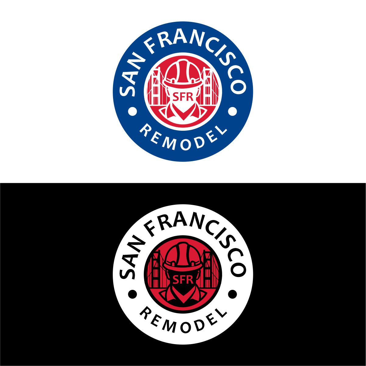
This customer received 303 logo designs from 106 designers. They chose this logo design from creative.bugs as the winning design.
Join for free Find Design Jobs- Guaranteed
-
 US$390
-
 303 designs
-
 106 designers
Logo Design Brief
San Francisco Remodel (SFR) Logo Design Brief
We are looking for a bold, recognizable logo that positions San Francisco Remodel (SFR) as an industry leader in construction and remodeling. The design should convey strength, trust, and craftsmanship, aligning us with the visual impact of major brands like the NBA, U.S. Navy, and Patagonia, while maintaining a unique identity that resonates with San Francisco.
Design Directions (Four Concepts)
1. NBA-Inspired Construction League Logo
• A silhouette of a construction worker replacing the basketball player in the NBA logo.
• The figure could be holding a hammer, blueprint, or another tool symbolic of craftsmanship.
• Red, white, and blue color scheme for a strong, authoritative look.
• The tagline: “In a League of Our Own” could be incorporated for exclusivity.
2. U.S. Navy-Inspired Emblem
• A military-style badge featuring SFR with bold typography.
• Elements like stars, stripes, or an eagle could enhance strength and credibility.
• Metallic or navy color tones with gold accents for a prestigious feel.
3. San Francisco-Inspired Bridge Concept
• A logo incorporating the Golden Gate Bridge into the typography or as an icon.
• A modern and sleek design that subtly integrates SFR into the bridge structure.
• Could use negative space to form the bridge or the initials SFR within the design.
(I want to see more) 4. Patagonia-Inspired Outdoor Aesthetic but with a play on construction
• A rugged, nature-inspired design with a silhouette of the Golden Gate Bridge, similar to Patagonia’s outdoor adventure theme.
• A bold yet minimalist style that captures durability, resilience, and craftsmanship.
• Earthy or cool-toned colors with clean, strong typography that stands out.
• Could incorporate a mountain or skyline feel, reflecting San Francisco’s natural and urban landscape. Be original but I would like it to feel like Patagonia but in a construction way
Brand Identity Goals
The logo should reflect:
✅ Professionalism & Strength – SFR is a powerhouse in remodeling.
✅ San Francisco Pride – A nod to the Golden Gate Bridge and the city’s architecture.
✅ Iconic Recognition – Something that stands out like major sports, military, and outdoor brands.
✅ Versatile & Scalable – It should work on trucks, hard hats, uniforms, and branding materials.
✅ Enduring & Timeless Design – A logo that won’t go out of style and represents quality craftsmanship.
Updates
Low design quality
Sick
I would like to see more Patagonia type ideas
Added Friday, 31 January 2025
Target Market(s)
Homeowners
Industry/Entity Type
Construction Remodeling
Logo Text
SFR
Logo styles of interest
Emblem Logo
Logo enclosed in a shape
Pictorial/Combination Logo
A real-world object (optional text)
Lettermark Logo
Acronym or letter based logo (text only)
Look and feel
Each slider illustrates characteristics of the customer's brand and the style your logo design should communicate.
Elegant
Bold
Playful
Serious
Traditional
Modern
Personable
Professional
Feminine
Masculine
Colorful
Conservative
Economical
Upmarket
Requirements
Must have
- Must-Haves for the San Francisco Remodel (SFR) Logo 1. Bold & Professional Look – The logo should convey strength, trust, and craftsmanship, positioning SFR as an industry leader. 2. Scalability & Versatility – It must look sharp on trucks, uniforms, business cards, websites, and signage without losing clarity. 3. Modern & Sleek Design – Clean lines, contemporary typography, and a minimalist but impactful aesthetic. 4. San Francisco Identity – Should incorporate the Golden Gate Bridge or a subtle city reference to emphasize the local connection. 5. Strong Typography – A custom or bold sans-serif font that stands out and represents durability and precision. 6. Memorable & Recognizable – A unique design that stands out like major brands (NBA, U.S. Navy, or Nike) while maintaining originality. 7. Construction Theme Elements (Optional) – Can subtly integrate construction tools (hammer, blueprint, structure lines) but should not be overly generic. 8. Timeless Yet Innovative – Avoid overly trendy styles that will become outdated; instead, aim for longevity with a modern twist. 9. Color Palette – A strong and sophisticated scheme, possibly: • Red, White & Blue (NBA-inspired) for authority and credibility. • Dark Navy & Gold (U.S. Navy-inspired) for strength and prestige. • Black, Gray & Orange for a modern construction aesthetic. 10. Monogram or Icon Option – A standalone ‘SFR’ emblem or symbol that can work independently for branding (on hats, signage, or digital use).
Nice to have
- Nice-to-Haves for the San Francisco Remodel (SFR) Logo 1. Subtle Construction Elements – Small, refined details like a beam, blueprint lines, or rivets that reinforce the industry without making the design feel cluttered. 2. Gradient or Texture – A sleek metallic finish, brushed steel effect, or subtle gradients for added depth and a premium feel. 3. Negative Space Integration – Smart use of negative space to form a hidden symbol or message within the design (e.g., bridge silhouette in the letters). 4. Badge or Shield Option – A secondary logo variation in the form of a badge or emblem, great for uniforms and branding materials. 5. Abstract Icon or Geometric Shapes – A modern symbol alongside the text, possibly referencing construction forms like beams, angles, or frameworks. 6. Tagline Integration – The ability to include the tagline “In a League of Our Own” or something clever 7. Dynamic & Animated Version – A logo concept that can be animated for digital platforms, like an intro for videos or social media branding. 8. Custom Font or Lettering – Unique typography tailored specifically for SFR, making it exclusive and instantly recognizable. 9. Dual Color Variations – A design that looks equally great in both light and dark themes for flexibility in different branding applications. 10. Slight 3D Depth or Beveling – A touch of dimensionality for an impactful, premium look without making the design too complex.
Should not have
- Should Not Have for the San Francisco Remodel (SFR) Logo 1. Overly Complex Design – Avoid excessive details, clutter, or intricate graphics that don’t scale well for branding on uniforms, vehicles, or small print materials. 2. Generic Construction Icons – No basic house silhouettes, generic hammers, or clichéd hard hats—SFR should stand out as a premium brand, not blend in with standard contractor logos. 3. Trendy or Dated Fonts – Avoid overly stylized fonts like comic, script, or ultra-thin fonts that don’t convey strength and longevity. 4. Too Many Colors – Stick to a refined, bold palette rather than a mix of multiple colors that could weaken the brand’s visual impact. 5. Weak or Thin Typography – The font should be bold and clear, not thin, overly decorative, or hard to read. 6. Stock or Clipart Elements – No pre-made graphics or overused symbols; the logo should feel custom and unique to SFR. 7. Overly Literal Imagery – Avoid logos that directly depict a house, saw, or bricks—a more conceptual approach will give it a high-end, professional feel. 8. Complicated Gradients or Shadows – Subtle depth is okay, but excessive shading, beveling, or heavy gradients can make the logo look outdated or hard to reproduce in print. 9. Unbalanced Layouts – The design should feel stable and well-proportioned, not awkwardly stacked or unstructured. 10. Illegible Small-Scale Details – Avoid any fine lines or small elements that would disappear when scaled down (e.g., on business cards or hard hats).