Logo for Law Firm "Oak Law"
Want to win a job like this?
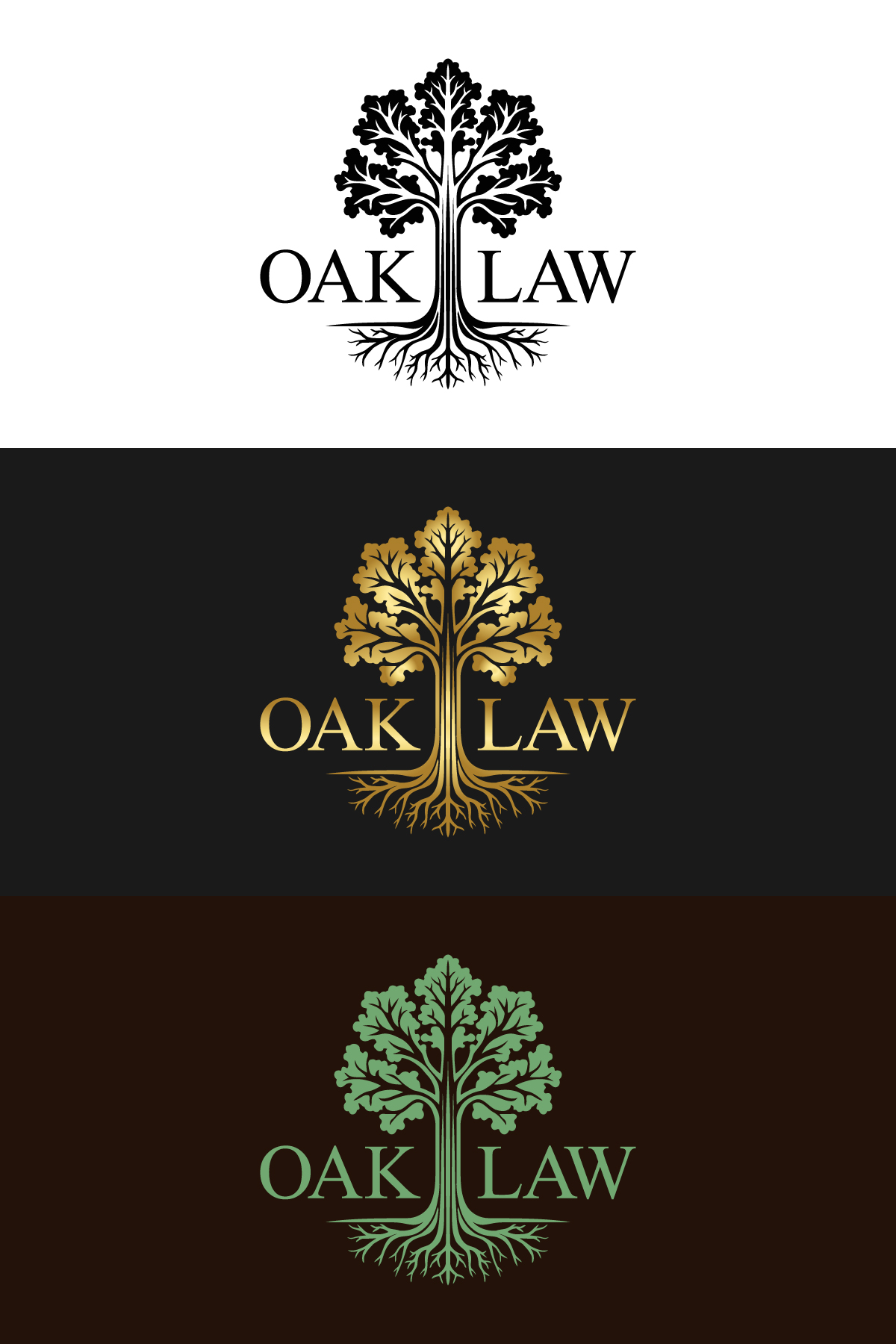
This customer received 170 logo designs from 77 designers. They chose this logo design from Betycat as the winning design.
Join for free Find Design Jobs-
 US$150
-
 170 designs
-
 77 designers
Logo Design Brief
Changing our Law firm name. We are a business and PI law Firm based in Royal Oak, MI.
Below are some notes of what we are looking for and have attached a draft picture of something similare to what we want to have
Notes: We want to keep it relatively simple
Leaves - Oak leaves, We liked the original with just the five large oak leaves but would be open to some more (Larger with fewer). Just would want longer branches and trunk so it looks more like a tree than a bush
Don't need a lot of detail in them but having the lines in it would be nice
Roots - want to make sure the roots are the same color as the tree, only one line across the top for the ground, roots don't necessarily touch the, outer circle
Trunk/Branches - Only 5 branches with 2 on each side and one going straight up, no knots, simple, and just a few lines for detail
Color - This was up for debate. We like the green and soft brown but were discussing other options including a dark flat gold color. Will want a black and white version as well
We will want "Oak Law" on it somewhere. would want to see one with the writing below as well as maybe one with "Oak" on one side and "Law" on the other, one where the logo is in a circle and used as the "O" followed by the remaining "ak Law", and one where the logo is to the left of the words.
Updates
Gathering more feedback
Logo Text
Oak Law
Look and feel
Each slider illustrates characteristics of the customer's brand and the style your logo design should communicate.