Interim Management New Level - for my new life - extremely important for me personally.
Want to win a job like this?
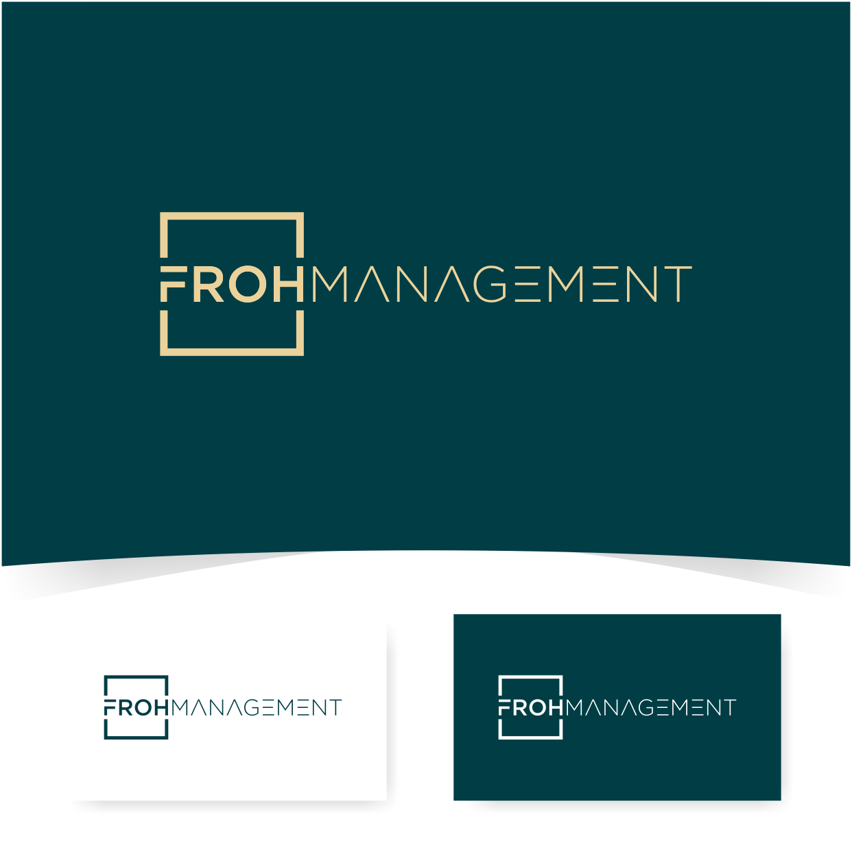
This customer received 262 logo designs from 96 designers. They chose this logo design from milio as the winning design.
Join for free Find Design Jobs- Guaranteed
-
 €190
€190
-
 262 designs
-
 96 designers
Logo Design Brief
Logo Design Brief
Domain/Name: frohmanagement.ch
Target Audience: Clients seeking serious and professional interim management services in the areas of Real Estate Management, Cost Efficiency, Digitalization, and Process Optimization.
Design Requirements:
Serious and Professional: The logo should convey trust and competence.
Simple and Clear: The design should be minimalist and easily recognizable.
Color Scheme: Use only one color, without gradients. The color should be serious and professional (e.g., blue or dark gray).
Font: Use a modern, easily readable font.
Elements: No complicated graphics or patterns. Simple symbols or lines that convey professionalism and clarity are welcome.
Versatility: The logo should work well in both digital form (website, email signatures) and print form (business cards, letterheads).
Additional Information:
Products: The logo should reflect the focus on Real Estate Management and Cost Efficiency as well as Digitalization and Process Optimization.
Brand Name: The name "frohmanagement" is derived from the first two letters of my first name, Frank, and the first two letters of my last name, Ohoven (FROH). "Management" emphasizes the focus on interim management services.
Explanation: The logo should clearly and prominently feature the name "frohmanagement" and highlight the areas of Real Estate Management and Digitalization/Process Optimization.
Further Notes:
The logo should be legible on various background colors (light and dark).
Optional: A subtle reference to management and efficiency can be included but should not dominate the design.
Updates
Thank you very much for the logos that have already arrived!
I would like to share the following thoughts with everyone:
It’s important for everyone to know that FROH are the letters of my first and last name, but in the German-speaking world, it also means happy and cheerful.
Therefore, differentiating the letters from "Management" would make sense to me.
While FM would be a nice combination, in the real estate market, it stands for Facility Management and is therefore not suitable for the logo. However, I find F i M or FIM quite interesting. This would also give meaning to the "i" for Interim Management. How this can be done, I leave to you, the designers.
Personally, I find logos that combine text and design more appealing, but I am still open to other ideas.
In terms of color, I have noticed that shades of gray, rich dark blues, and a mix with "brown" gold tones are very attractive to me.
These are my thoughts and learnings after the first few hours. I hope this helps to move things forward. Thank you all for your efforts. This is very important to me personally, as it is about building a new future for myself, not just a company, but truly about me as an individual.
Added Monday, 27 May 2024
Target Market(s)
Clients seeking serious and professional interim management services in the areas of Real Estate Management, Cost Efficiency, Digitalization, and Process Optimization.
Industry/Entity Type
Medium to large companies that need digitization and a breath of fresh air... possibly in the real estate sector but not necessarily
Logo Text
frohmanagement
Logo styles of interest
Pictorial/Combination Logo
A real-world object (optional text)
Wordmark Logo
Word or name based logo (text only)
Lettermark Logo
Acronym or letter based logo (text only)
Font styles to use
Look and feel
Each slider illustrates characteristics of the customer's brand and the style your logo design should communicate.
Elegant
Bold
Playful
Serious
Traditional
Modern
Personable
Professional
Feminine
Masculine
Colorful
Conservative
Economical
Upmarket
Requirements
Must have
- Use only one color, without gradients. The color should be serious and professional
Nice to have
- the connection between digitalization and real estate is only hinted at - it is not the focus of the logo - maybe you could take off the FROH a bit
Should not have
- should not look like a real estate company - Funny elements