OneApp - Improve Text below symbol
Winner
Want to win a job like this?
This customer received 281 logo designs from 101 designers. They chose this logo design from apik. as the winning design.
Join for free Find Design Jobs-
 US$150
-
 281 designs
-
 101 designers
Logo Design Brief
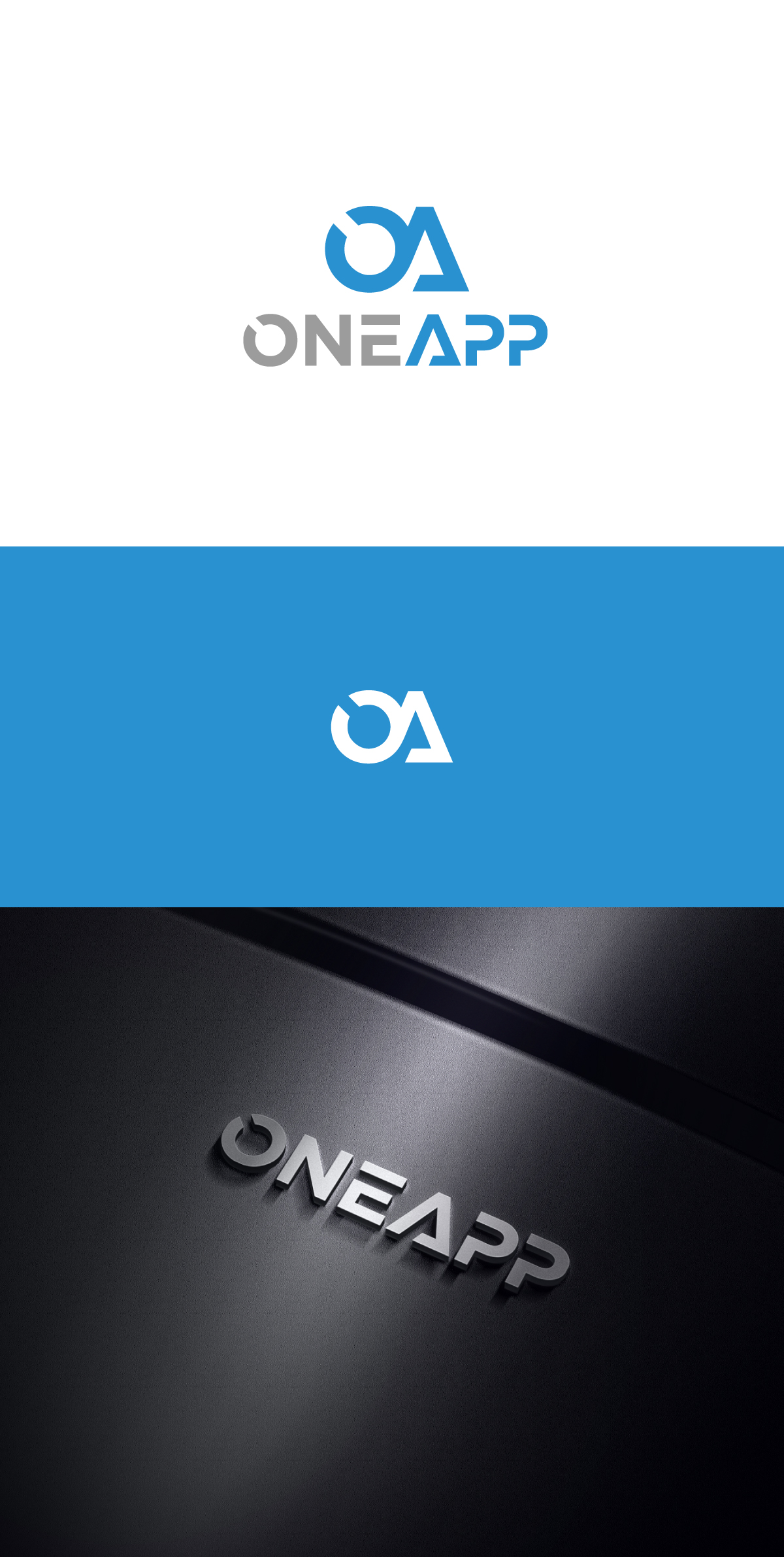
Want to improve current logo based on another logo I have seen (REAL3D). Our current logo has a OA where the two are connected and in blue, we love that. We want to improve the text ONEAPP Below that.
If possible lets make the O and A in ONEAPP the same as the OA symbol where they are connected.
Then make the other letters look futuristic like the REAL3D logo I uploaded, i drew a sketch to illustrate the idea. but the O is not as wide as the one in the OA, so here I am.
Also we like the rounded edges, NOT the hard edges like the ones in REAL3D.
Logo Text
ONEAPP
Look and feel
Each slider illustrates characteristics of the customer's brand and the style your logo design should communicate.
Elegant
Bold
Playful
Serious
Traditional
Modern
Personable
Professional
Feminine
Masculine
Colorful
Conservative
Economical
Upmarket
Files
Download all files - 2.3 MBPNG
cropped-OneApp-Site-Logo (1)
Friday, May 24, 2024
PNG
RealD+wBG
Friday, May 24, 2024
JPEG
Image_20240524_162635
Friday, May 24, 2024
Payments
1st place
US$150