Logo Design
Want to win a job like this?
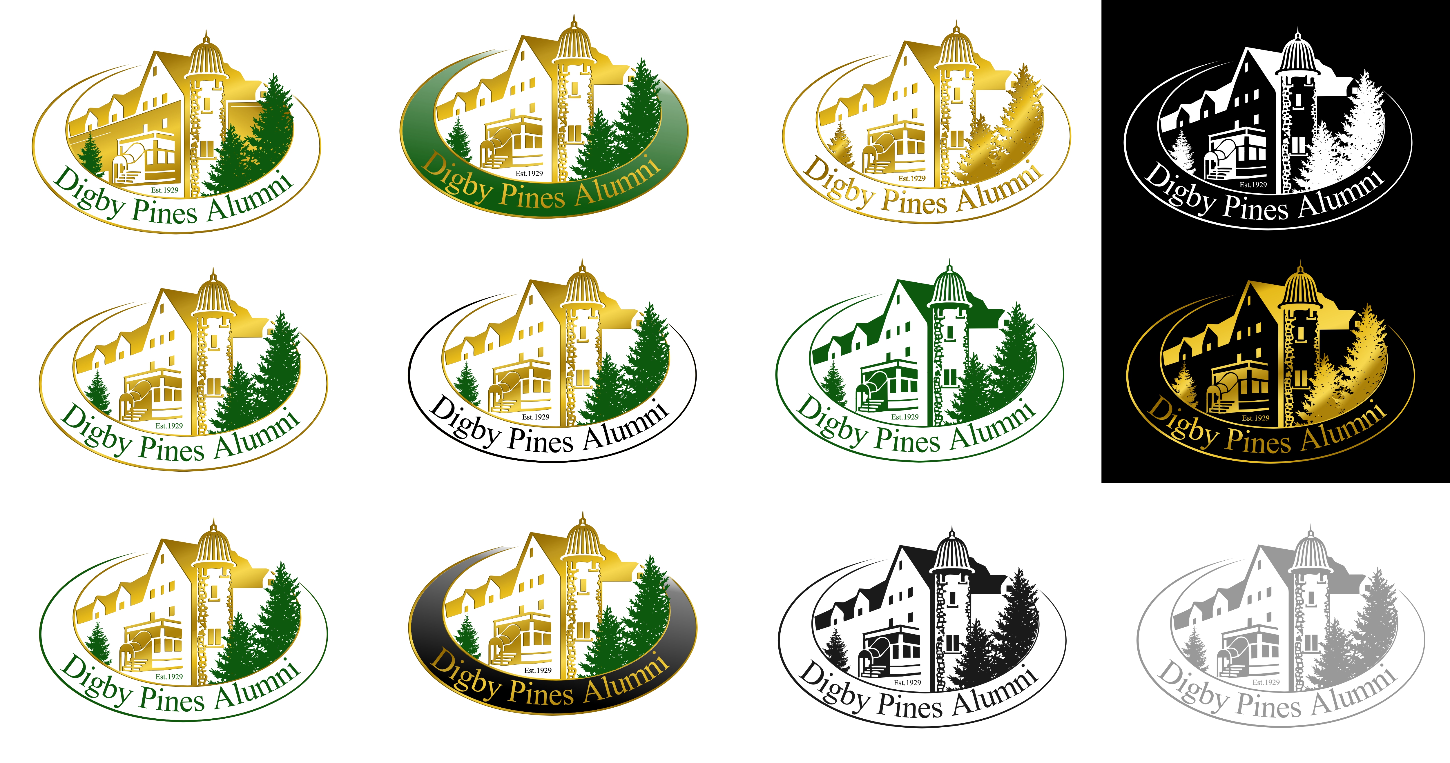
This customer received 54 logo designs from 22 designers. They chose this logo design from A10 as the winning design.
Join for free Find Design Jobs-
 C$150
C$150
-
 54 designs
-
 22 designers
Logo Design Brief
We need a logo design for a new initiative we are developing for our 93 year old historic Digby Pines Golf Resort & Spa in Digby, Nova Scotia Canada www.digbypines.ca. This program is directed to all past employees of Digby Pines Golf Resort & Spa. We would be sending out special offers to these past employees enticing them to return and stay with us. While the hotel is an historic hotel, our team would like a more modern look to the logo....e.g.
A. Has the major features of Digby Pines Golf Resort & Spa logo (view on www.digbypines.ca or attached), i.e. the oval shape and the turret and some trees in a more penciled-format; not a duplicate of the logo.
B. Has a much finer border on the oval.
C. Something that uses some green with perhaps gold highlights (metallic gold maybe), not the rust colour.
D. Digby Pines Alumni to be incorporated as part of the oval border curling around the left side of the logo?
E. FONT - Aparajita
Target Market(s)
Past Employees of Digby Pines Golf Resort & Spa
Industry/Entity Type
Hospitality
Logo Text
Digby Pines Alumni
Font styles to use
Other font styles liked:
- Aparajita
Colors
Designer to choose colors to be used in the design.
Look and feel
Each slider illustrates characteristics of the customer's brand and the style your logo design should communicate.
Elegant
Bold
Playful
Serious
Traditional
Modern
Personable
Professional
Feminine
Masculine
Colorful
Conservative
Economical
Upmarket
Requirements
Must have
- Must have a portion of the logo for Digby Pines Golf Resort & Spa in it - www.digbypines.ca. review project description.
Nice to have
- A. Has the major features of Digby Pines Golf Resort & Spa logo (view on www.digbypines.ca or attached), i.e. the oval shape and the turret and some trees in a more penciled-format; not a duplicate of the logo. B. Has a much finer border on the oval. C. Something that uses some green with perhaps gold highlights (metallic gold maybe), not the rust colour. D. Digby Pines Alumni to be incorporated as part of the oval border curling around the left side of the logo? E. FONT - Aparajita
Should not have
- Rust colour in the logo