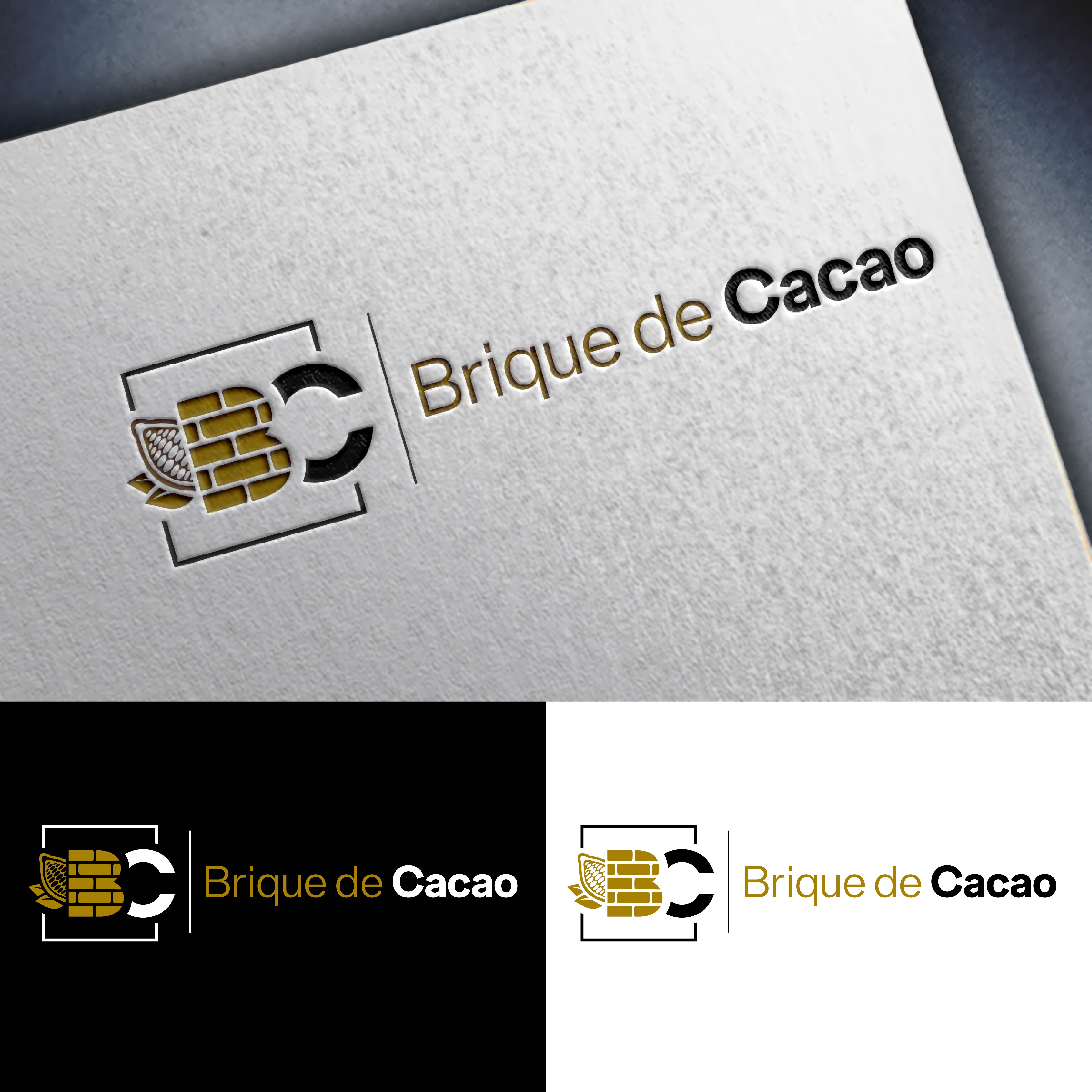
Chocolate factory logo “Cacao Brick”
Want to win a job like this?
This customer received 140 logo designs from 72 designers. They chose this logo design from John Mark Arts as the winning design.
Join for free Find Design Jobs- Guaranteed
-
 €190
€190
-
 140 designs
-
 72 designers
Logo Design Brief
“Brique de Cacao” is an innovative artisan chocolate brand that embodies the excellence of the “bean to bar” process, rooted in the rich heritage of Northern France. Our philosophy, encapsulated in our baseline "La Fabrique à Chocolat" or "Better Chocolate", is based on the celebration of the symbols of this region - bricks, mines, slag heaps - which testify to our commitment to tradition and innovation.
Our project is distinguished by an impact-oriented approach, geared towards more conscious consumption and respectful processing, emphasizing total transparency in our supply chain. By working closely with producers, we ensure the superior quality of our only two ingredients, underlining the authentic taste and unique terroir of our cocoa.
At "Brique de Cacao", eco-responsibility is not just a buzzword, but a practice integrated into every step of our process, reflecting our passion for chocolate, our respect for the health of our customers and our planet, and our desire to provide an uncompromising luxury product. Our aim is to evoke strong emotions in our consumers, offering them not only an exceptional chocolate but also an experience rich in meaning and shared values.
Specifications for the Creation of the "Cocoa Brick" Logo
1. Objective Logo
To create a distinctive logo for "Brique de Cacao", an artisanal "bean to bar" chocolate brand, reflecting the brand's commitment to quality, eco-responsibility, and the heritage of Northern France.
The logo must embody the values of transparency, passion, health and luxury.
2. Design criteria
Visual style: The logo should combine modern and traditional elements, evoking both the industrial heritage of Northern France (bricks, mines, slag heaps) and the artisanal chocolate-making process.
Color palette: Use earthy tones complemented by touches of color that evoke luxury (gold, silver) and naturalness (greens).
Graphic elements: Incorporate symbols linked to cocoa and the "bean to bar" process, as well as motifs representative of Northern France.
Baseline: Integrate the baseline “La Fabrique à Chocolat” or “Better Chocolate” harmoniously into the design.
3. Applications and adaptations
The logo must be versatile, adapted to various media: packaging, website, promotional material, and social networks.
Provide versions of the logo adapted for print (CMYK) and web (RGB), as well as black and white variations.
4. Technical constraints
The logo must remain legible and clear when reduced for applications on small media (eg stamps, letterheads, chocolate).
Provide a simplified version or a distinctive symbol that can be used on its own.
5. Deliverables
Source files in editable formats (AI, PSD).
High-resolution PNG and JPEG files.
Logo usage guide, including color specifications, spacing, and incorrect usage to be avoided.
Target Market(s)
B2C and B2B
Industry/Entity Type
Chocolate factory
Logo Text
BC
Look and feel
Each slider illustrates characteristics of the customer's brand and the style your logo design should communicate.