Caspar David Friedrich Art Exhibition
Want to win a job like this?
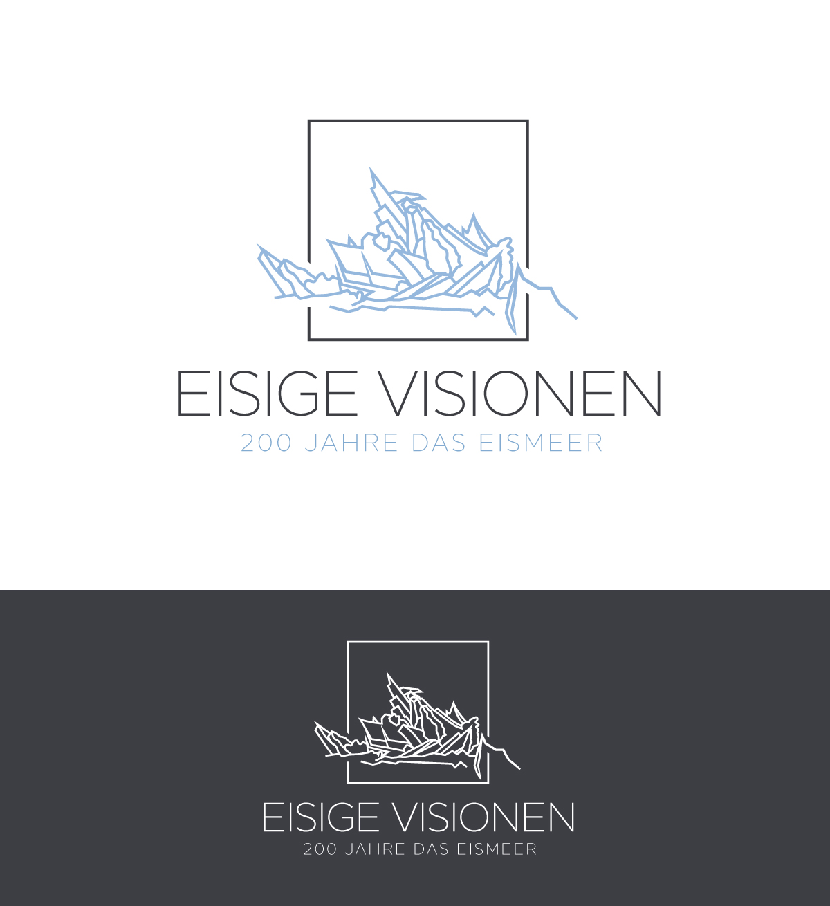
This customer received 109 logo designs from 64 designers. They chose this logo design from SolDesign as the winning design.
Join for free Find Design Jobs- Guaranteed
-
 €110
€110
-
 109 designs
-
 64 designers
Logo Design Brief
The Title of the Exhibition in German is "EISIGE VISIONEN: 200 Jahre das Eismeer."
The Exhibition consists of around 48 artists showing their modern interpretation of the painting Das Eismeer by Caspar David Friedrich
The exhibition will start in Hamburg, Germany where the original work from 1823 is hanging in a museum and will be shown in different cities around Europe in the coming months and years. There is an existing Logo from the parent brand which you can see in the attached files.
the goal is to find a minimalistic but easy to recognize logo for the exhibition. the main font used by the parent brand is Facit but it is not a must for the new logo.
Logo Text
EISIGE VISIONEN: 200 Jahre das Eismeer
Font styles to use
Other font styles liked:
- Facit
Colors
Designer to choose colors to be used in the design.
Look and feel
Each slider illustrates characteristics of the customer's brand and the style your logo design should communicate.
Elegant
Bold
Playful
Serious
Traditional
Modern
Personable
Professional
Feminine
Masculine
Colorful
Conservative
Economical
Upmarket
Requirements
Nice to have
- inspired by the main structural lines of the original artwork