One Man Army - gun owners club and shooting training company needs a logo
Winner
Want to win a job like this?
This customer received 153 logo designs from 56 designers. They chose this logo design from ArtTank as the winning design.
Join for free Find Design Jobs- Guaranteed
-
 A$250
A$250
-
 153 designs
-
 56 designers
Logo Design Brief
classified
Updates
Low design quality
Target Market(s)
Men and women 13-100 years old, civilians
Industry/Entity Type
Firearms, Sport, Education
Logo Text
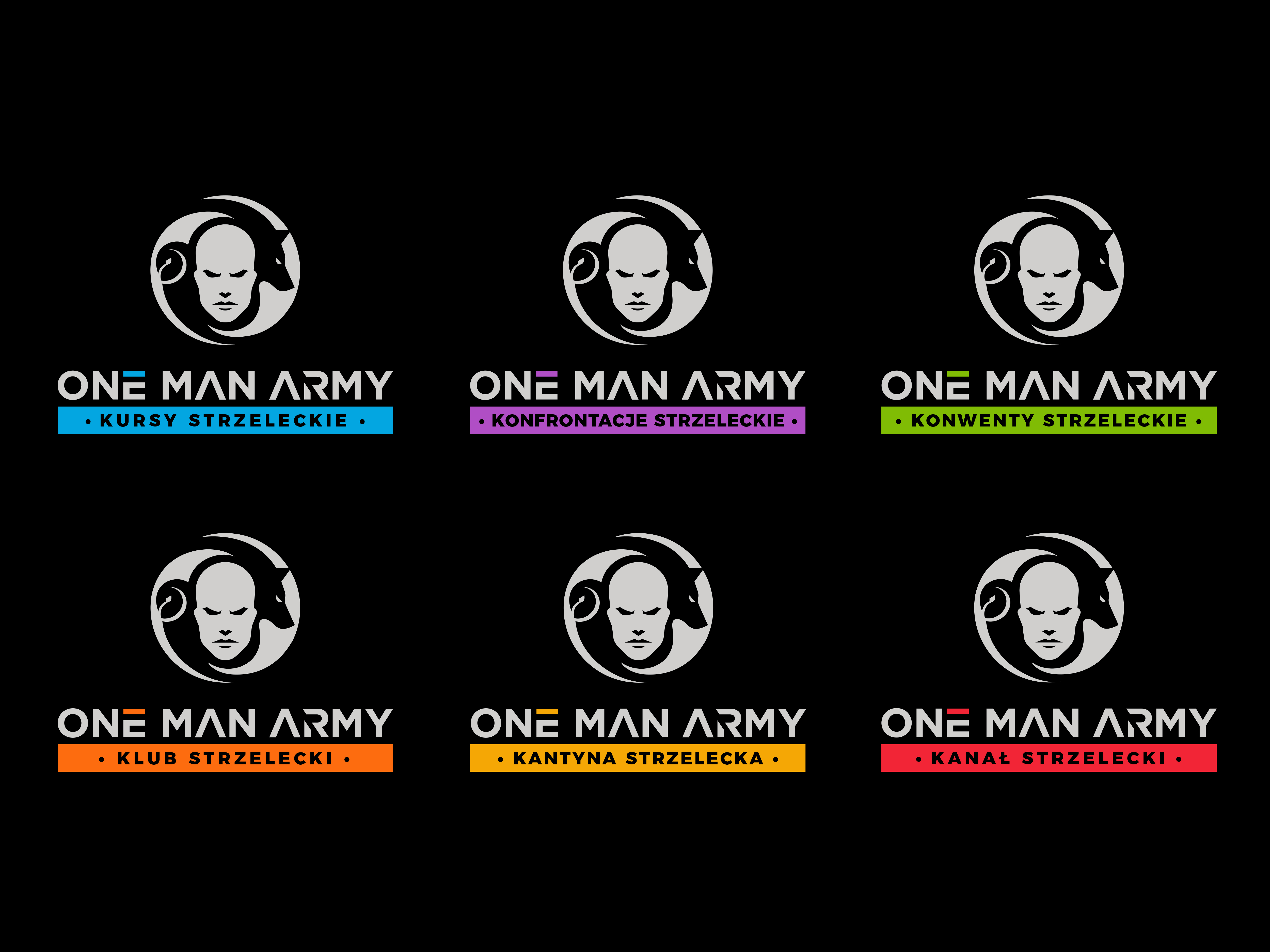
One Man Army
Logo styles of interest
Pictorial/Combination Logo
A real-world object (optional text)
Abstract Logo
Conceptual / symbolic (optional text)
Font styles to use
Sans Serif
Look and feel
Each slider illustrates characteristics of the customer's brand and the style your logo design should communicate.
Elegant
Bold
Playful
Serious
Traditional
Modern
Personable
Professional
Feminine
Masculine
Colorful
Conservative
Economical
Upmarket
Requirements
Must have
- The whole logo should refers to those 3 areas somehow, yet clearly and should convey the company's message (see the company description above) / The logotype "One Man Army" (I mean the text) should be included in the logo along with the signet (the graphical part), but the signet alone should be usable as a stand-alone icon / It should be something that both 18 years boy and 45 years dad would like to have on their t-shirts, tea cup etc. / There should be a place for a slogan per brand under the company name text (One Man Army). There are 5 slogans to be used interchangeably and/or if necessary: Kursy Strzeleckie, Konfrontacje Strzeleckie, Konwenty Strzeleckie, Klub Strzelecki, Kantyna Strzelecka, Kanał strzelecki / Typography should contain polish letters (uppercase and lowercase): ą, ć, ę, ł, ń, ó, ś, ź, ż / All should be neat, minimalistic and elegant / Signet must be possible to be inscribed in a circle or square and has to be clearly visible if resized to a small avatar, YT/FB/Insta profile icon etc. / Should be good looking in mono-color mode and be distinguished among the other firearm related companies in Poland (most of them have ugly logos) / Should be visible on both black and white backgrounds (especially if some people are using normal and some are using dark mode on their mobiles, PCs, etc.) / The company name text color should be defined permanently in the opposite of the slogans that should have their own colors (example: lets say that the graphical part and the text One Man Army is white, but the slogan “Kursy Strzeleckie” is blue, then if using in that context I would like to use the graphical part in blue as well). I want to distinguish the brands by colors.
Nice to have
- / negative space logos / creative combinations of shapes / letters / flat shapes that gives a 3D illusion / silhouettes / contours / unfinished but unambiguous shapes / references to Slavic symbols
Should not have
- / Not related to security or military / No skulls, blood or any other death or pain related references / No scopes and other aiming devices / not luxury, glamour, etc. / not overcomplicated (I mean too many details), so that it can be easily used not only in T-Shirts or billboards but on pens or small candies as well / not in military related colors (dark green, camouflage, etc.) / the colors should not be childish, effeminate, etc.
Files
PNG
like the contour
Wednesday, September 27, 2023
PNG
like the mixed letters
Wednesday, September 27, 2023
PNG
like the mix of shapes
Wednesday, September 27, 2023
JPG
like the esthetic and relation to 3 operations
Wednesday, September 27, 2023
JPG
like the contrast color
Wednesday, September 27, 2023
JPG
like the minimalistic and accuracy
Wednesday, September 27, 2023
JPG
i very like the negative space concept
Wednesday, September 27, 2023
JPG
i like the overal concept
Wednesday, September 27, 2023
Payments
1st place
A$150
2nd place
A$100