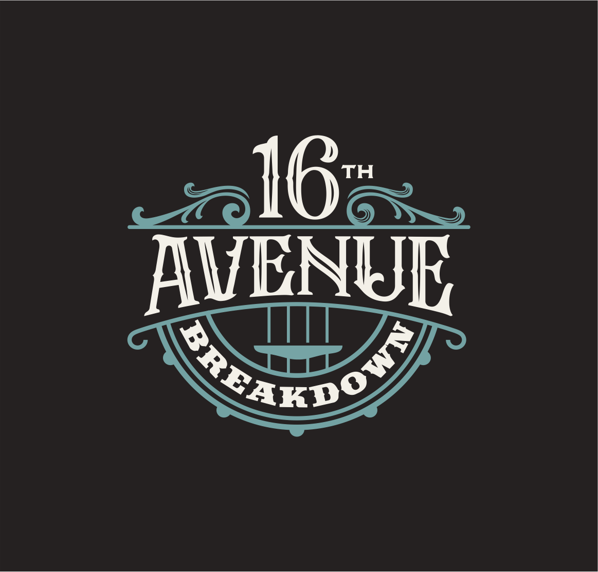
16th Avenue Breakdown
Want to win a job like this?
This customer received 67 logo designs from 19 designers. They chose this logo design from design.picnic as the winning design.
Join for free Find Design Jobs-
 US$150
-
 67 designs
-
 19 designers
Logo Design Brief
We need a band logo to use on products and social media. The band is an Americana band based in Nashville. We're more t-shirts and comfortable jeans, NOT boots and cowboy hats. We have a look closer to The Band or Jason Isbel than traditional country groups. I'll upload some files of the design and colors looks we like from other sources as a starting point. We need something without a lot of small design elements that would get lost in print media or B&W versions. We're a Nashville veterans with a sense of humor and big songwriting chops. The music uses pedal steel, mandoling and banjo even when we do arrangements of heavy metal songs. Can use "Ave." instead of "Avenue" in design if it helps with balance. Would be great to have something that worked in square or slightly-taller-than-wide rectangle shape. We like old trucks and dive bars. Examples keep the focus on the works while adding a little atmosphere through the shape and the font. Here are some fonts we like:
https://www.fonts.com/font/typodermic/scrubby
Also
Last, but not least, we love the colors in the attached osprey pic. Doesn't have to be this look, but the colors are both rich and not quite like all the other Americana bands at the moment, though similar enough to be in the Americana lane. Hope this helps. No eagles, flags, patriotic anything. The first example attached is more about putting some kind of visual interest around the text, NOT about the bird image. Old fashioned 5-point stars work, too. Thanks!
Target Market(s)
Music industry decison-makers, Americana music fans
Industry/Entity Type
Americana music
Logo Text
16th Avenue Breakdown
Logo styles of interest
Emblem Logo
Logo enclosed in a shape
Pictorial/Combination Logo
A real-world object (optional text)
Font styles to use
Other font styles liked:
- See possible font list in description section
Colors
Colors selected by the customer to be used in the logo design:
Look and feel
Each slider illustrates characteristics of the customer's brand and the style your logo design should communicate.
Elegant
Bold
Playful
Serious
Traditional
Modern
Personable
Professional
Feminine
Masculine
Colorful
Conservative
Economical
Upmarket
Requirements
Must have
- Interesting text layout, some visual interest beyond the font itself. Either emphasize "16th Avenue" together or "Breakdown" if you want to do a design with emphasis on one part of the name.
Nice to have
- Americana band based in Nashville. We're more t-shirts and comfortable jeans, NOT boots and cowboy hats. We have a look closer to The Band or Jason Isbel than traditional country groups. I'll upload some files of the design and colors looks we like from other sources as a starting point. We need something without a lot of small design elements that would get lost in print media or B&W versions. We're a Nashville veterans with a sense of humor and big songwriting chops. The music uses pedal steel, mandoling and banjo even when we do arrangements of heavy metal songs. Can use "Ave." instead of "Avenue" in design if it helps with balance. Would be great to have something that worked in square or slightly-taller-than-wide rectangle shape. We like old trucks and dive bars. Examples keep the focus on the works while adding a little atmosphere through the shape and the font.
Should not have
- No cowboy hats, boots, flags, eagles, other patriotic symbols