Design a new logo for Rockdale Musical Society
Want to win a job like this?
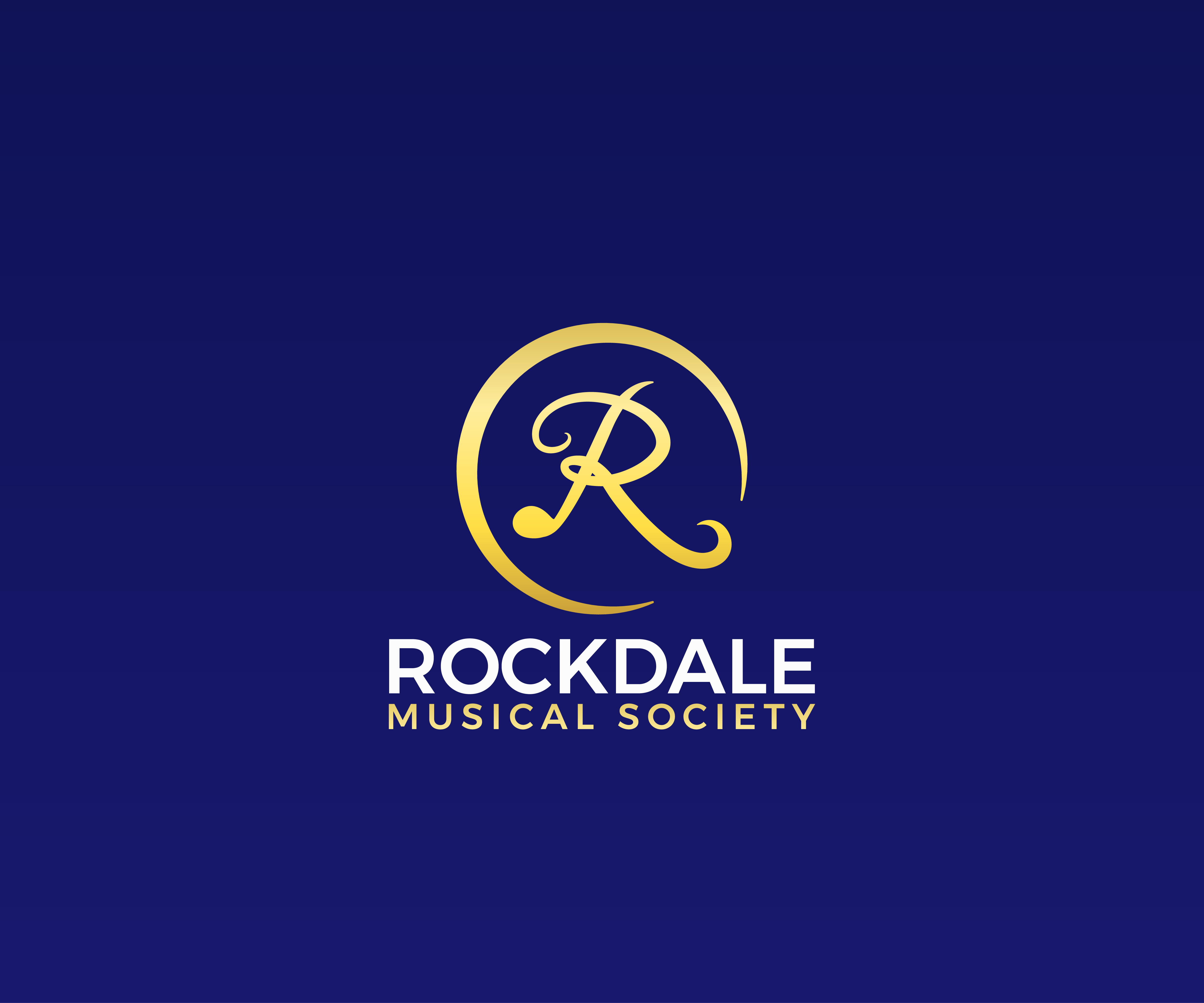
This customer received 9 logo designs from 5 designers. They chose this logo design from James J. as the winning design.
Join for free Find Design Jobs- Guaranteed
-
 A$220
A$220
-
 9 designs
-
 5 designers
Logo Design Brief
Logo Description: Rockdale Musical Society
The logo for Rockdale Musical Society is designed to strike a perfect balance between modern aesthetics and a strong representation of the society's rich heritage as the oldest musical society in Australia. It aims to captivate the audience with its contemporary look while conveying the organization's longstanding history and expertise in the world of musical theater.
Central Element:
At the core of the logo, a vibrant and dynamic symbol encapsulates the essence of the society. This symbol, inspired by musical notes and instruments, represents the energy, creativity, and passion that Rockdale Musical Society brings to its performances. Its sleek and contemporary design signifies the society's commitment to keeping pace with the evolving trends of the performing arts industry.
Color Palette:
The color palette chosen for the logo combines modern tones with a touch of nostalgia, reinforcing the idea of blending tradition with innovation. Deep and sophisticated shades of midnight blue evoke a sense of timelessness, while vibrant accents of gold or silver add a contemporary flair. These colors work together harmoniously to create an impactful visual presence.
Typography:
To further emphasize the combination of tradition and modernity, a carefully selected typography style is employed. A bold, modern font with clean lines and subtle curves is used for the organization's name, showcasing the forward-thinking nature of Rockdale Musical Society. For the tagline or additional text, a classic and elegant serif font can be employed, symbolizing the society's longstanding history and respected reputation.
Iconography:
To reinforce the society's heritage, an optional emblem or badge element can be incorporated into the logo design. This emblem could include elements such as a crown or a laurel wreath, symbolizing the society's longstanding reign and accomplishments in the musical theater domain. The emblem can be placed alongside the main symbol or subtly integrated into the typography.
Overall Composition:
The logo is designed to have a clean, balanced composition that ensures clarity and versatility across various mediums. It can be adapted for different applications, including digital platforms, merchandise, event posters, and programs. The design maintains a contemporary feel while still representing Rockdale Musical Society as a respected institution with deep roots in Australian musical theater.
In summary, the logo for Rockdale Musical Society harmoniously blends modern aesthetics with the story of being the oldest musical society in Australia. Through a dynamic symbol, a carefully selected color palette, an appropriate typography combination, and optional emblem elements, the logo encapsulates the society's rich history while projecting a contemporary and engaging image. Attached is our current logo, please stay away from the shield look as we think it looks to much like a school emblem. Keep in mind that we are the oldest musical theater company in Australia and want to make sure we come through in the new logo as well.
Updates
We still have not found the design we are looking for.
Target Market(s)
Our members and audiances
Logo Text
Rockdale Musical Society
Logo styles of interest
Emblem Logo
Logo enclosed in a shape
Abstract Logo
Conceptual / symbolic (optional text)
Wordmark Logo
Word or name based logo (text only)
Lettermark Logo
Acronym or letter based logo (text only)
Look and feel
Each slider illustrates characteristics of the customer's brand and the style your logo design should communicate.