Get Paid Accelerator
Want to win a job like this?
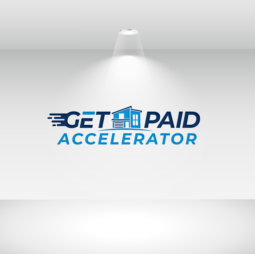
This customer received 419 logo designs from 154 designers. They chose this logo design from LogoAus as the winning design.
Join for free Find Design Jobs- Guaranteed
-
 US$490
-
 419 designs
-
 154 designers
Logo Design Brief
This is a logo design project for my real estate mentorship program the "Get Paid Accelerator". It is an adjunct to my existing real estate education business called "Let's Get Paid". The Get Paid Accelerator is a way for my students to learn faster and start their own business faster ie - Accelerate. As a starting point we have provided the Let's Get Paid logo as a point of reference, but we wont something that has a distinct identity while showing still showing a connection
1. Differentiation: The Get Paid Accelerator logo should have a similar aesthetic to the Let's Get Paid logo, but it should not be an exact replica. We want the logo to be distinct, while still maintaining a visual connection to the Let's Get Paid brand. We desire a distinct logo that effectively communicates speed and acceleration.
2.Real Estate Connection: The logo should incorporate minimal and modern representations of real estate. The Let's Get Paid logo features single-family housing, apartments, and office buildings, and we want the Get Paid Accelerator logo to showcase a similar connection to real estate, but with modifications, or color variations to establish a unique identity.
3. Fonts and Styling: Feel free to explore different fonts and stylization options to differentiate the Get Paid Accelerator logo from the Let's Get Paid logo. The chosen fonts should evoke a sense of speed and acceleration compared to the original logo.
4. Minimal and Modern: The logo should feature a minimalistic and contemporary design, aligning with current design trends.
5. Speed and Acceleration: The winning logo should prominently convey the ideas of speed and acceleration, reflecting the program's aim to propel participants towards their real estate investment and development goals.
Updates
Hi Great Creative designs, Most of the designs have multi floor buildings for apartment and office,,,but we need representation of single family homes so please be creative in showing that. The common single family depiction of an inverted V with four small squares to depict windows is to commonly used (may of the submitted designs have that),,,so please be more abstract and creative than depictions that are commonly used....thanks
Added Tuesday, 04 July 2023
We have invited more designers and increased the winning budget so would like more time to get more designs with the increased budget
Target Market(s)
People wanting to become real estate investors and pay for education related to it
Industry/Entity Type
real estate
Logo Text
Get Paid Accelerator
Logo styles of interest
Emblem Logo
Logo enclosed in a shape
Abstract Logo
Conceptual / symbolic (optional text)
Font styles to use
Other font styles liked:
- Something clean and modern
Colors
Colors selected by the customer to be used in the logo design:
Look and feel
Each slider illustrates characteristics of the customer's brand and the style your logo design should communicate.
Elegant
Bold
Playful
Serious
Traditional
Modern
Personable
Professional
Feminine
Masculine
Colorful
Conservative
Economical
Upmarket
Requirements
Must have
- Tie to real estate,,,depict speed and acceleration
Nice to have
- A different way to depicting the real estate buildings but that still shows a connection to the original.
Should not have
- See the attached file of what we DO NOT LIKE for representing a single family home. There are currently many submissions with this or something similar. It is very overused in many many real estate logos and does not represent the creativity and innovativeness we want to portray, The file titled we dont like.