United We Save! Innovative Team Buying Web App
Want to win a job like this?
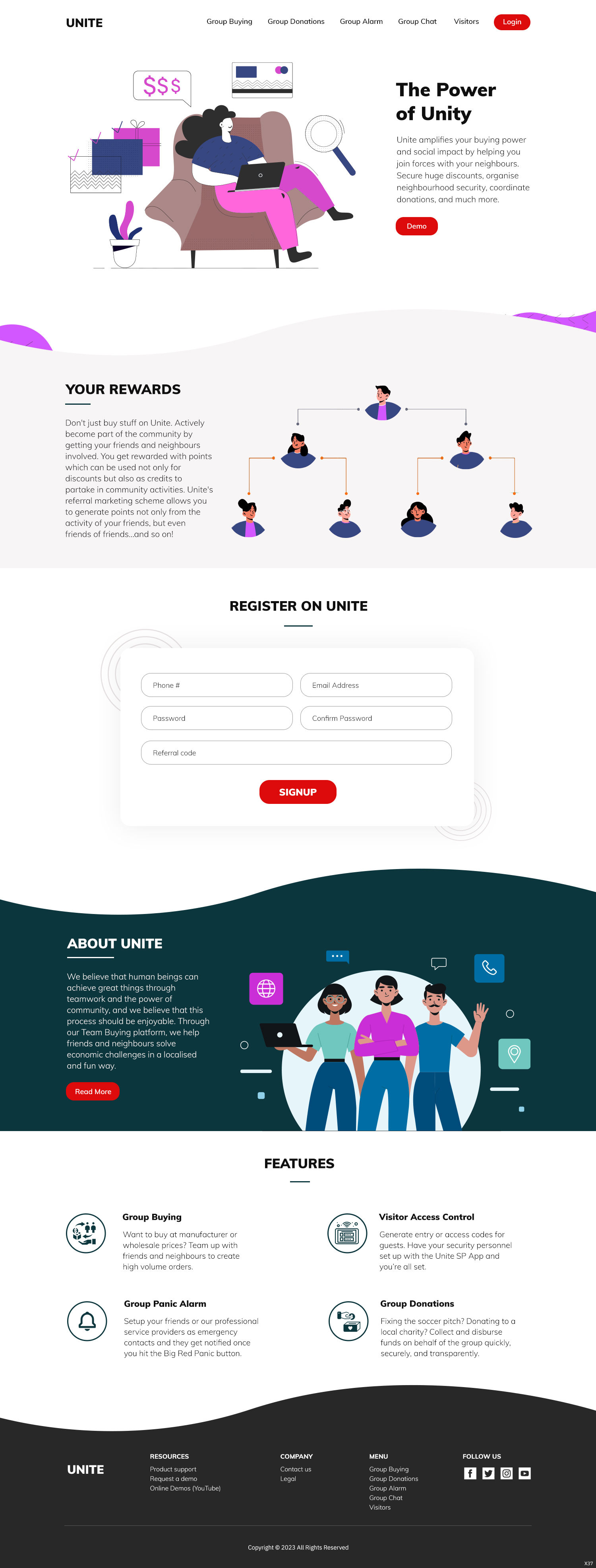
This customer received 54 web designs from 4 designers. They chose this web design from pb as the winning design.
Join for free Find Design Jobs-
 US$520
-
 54 designs
-
 4 designers
Web Design Brief
Unite is a team-buying/social commerce web app that is a cross between Groupon and sites/apps like Temu, Facily, and Pinduoduo. It is basically like a game in which users seek to get the lowest prices by working with friends and neighbours (as a team) to maximize order volumes. Sellers on the platform set volume targets which teams have to hit to secure wholesale price.
We need a landing page and a few (4 - 5) key pages that project a compelling game-like aesthetic that is innovative and playful, while being clean and classy.
Updates
Low designer entries
Target Market(s)
Nigerian homemakers. Typically 30+ years old. Predominantly female, middle class.
Industry/Entity Type
Ecommerce, Groceries.
Coding
Coded - Design and coding required
Number of Pages Required
5+ page
Look and feel
Each slider illustrates characteristics of the customer's brand and the style your logo design should communicate.
Elegant
Bold
Playful
Serious
Traditional
Modern
Personable
Professional
Feminine
Masculine
Colorful
Conservative
Economical
Upmarket
Requirements
Must have
- PAGES (1). Landing page. An attractive landing page that gives a brief overview of the concept and main features. We are going to roll out an MVP with just the landing page (which should include a sign-up form) so this page is critical and should be "self-contained" with it's signup inputs. The signup section must include a referral code so that we can track who referred whom. (2). Available deals. A listing of all active deals with enough relevant information. Note that deals have a deadline, a retail price, and a minimum volume target to unlock wholesale price. (3). Deal details page. This should show the standard price (the price the user would pay if he buys a small quantity), team price (the wholesale price based on the team hitting the required order volume), the points to be earned by buying the item, etc. (4). Checkout page. In addition to normal checkout stuff on this page the user can convert points into currency (at an exchange rate that may vary from time to time). Example: if price is $3,000 he may see that he has 1000 points in his wallet and the exchange rate is 1:1, so he can go ahead and convert to $1,000 and the price now becomes $2,000. (5). Profile page. Where the user can see things like his performance (how his points were calculated), his lineage ("children" and "grandchildren"), points required to get to the next rank, his order history, etc.
Nice to have
- GUIDELINES (1). Overall Aesthetic is game-like: playful, bright, and colourful. But clean and classic at the same time: we don't want a look that goes "out of fashion" within the next two or three years. (2). Referral is critical. Therefore the "Share" button (or whatever) should be easily accessible and visible on all relevant pages. (3). The user's community is critical. Therefore the activity of the users "network" (the "children" and "grandchildren") must be somehow dynamically visible at most/all times. We want to project a sense of realtime dynamism, just like a game. The user should be able to somehow "see" things happening in the network (e.g. when someone in his network buys something). (4). Like a game, the user's points, rank, and badges must always/usually be visible and we need an interesting visual effect when something happens that increases his points. Examples of actions that generate points include buying an item, when a "child" or "grandchild" buys an item, when someone you invited/referred creates an account, etc. We need a clear idea of the visual effect and how it would work.