DiamondLife new logo redesign
Want to win a job like this?
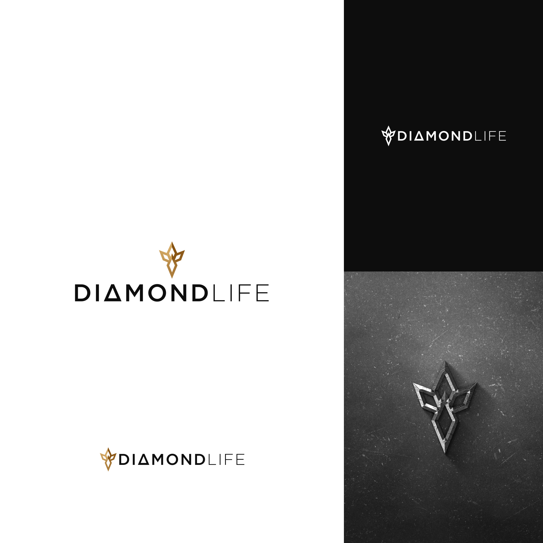
This customer received 106 logo designs from 42 designers. They chose this logo design from JohnM. as the winning design.
Join for free Find Design Jobs-
 US$150
-
 106 designs
-
 42 designers
Logo Design Brief
For the icon, we love the colors of our concept. The combination of different beige colors appears like brass or gold and adds a luxury feel to the brand which we really like
We like the stylized DIAMOND LOTUS FLOWER of the concept. The icon is comprised of 5 diamonds. Play with the aspect ratio of the diamond (length versus width) and see what looks best. Use the attached eps file for the font, character spacing, etc. and use a similar proportion of the attached icon to the logo as inspiration.
The icon creates kind of a star here (see red circle below). We’d love to see what you can do with this.
We’d like to incorporate the “gold” color tonality into this design. There’s many things you can do with that – and we can’t wait to see what you come up with. But remember that the icon still has to work in black and white as well.
Target Market(s)
architect/designer, factory, homeowner
Industry/Entity Type
Storage and organization
Logo Text
DIAMONDLIFE
Look and feel
Each slider illustrates characteristics of the customer's brand and the style your logo design should communicate.
Elegant
Bold
Playful
Serious
Traditional
Modern
Personable
Professional
Feminine
Masculine
Colorful
Conservative
Economical
Upmarket
Requirements
Must have
- Use attached DIAMONDLIFE logo