NETWORKERS
Want to win a job like this?
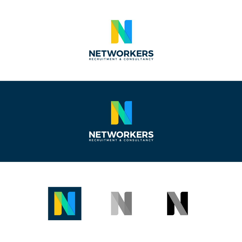
This customer received 186 logo designs from 80 designers. They chose this logo design from AAZ_Studio as the winning design.
Join for free Find Design Jobs-
 €190
€190
-
 186 designs
-
 80 designers
Logo Design Brief
Our company is a recruitment and consultancy agency (placement of consultants).
www.networkers.be (site under construction)...
We have decided to redo a makeover/rebranding of its activity... The current company operates under the name of www.d-network.be and will become www.networkers.be... Our activity is strongly linked to networking, with many contacts (clients & candidates)... We are specialized in 6x domains and each domain has its own site... The idea is to group all these domains into a single name/branding
- ICT (ICT-network.be)
- RealEstate (realestate-network.be)
- Digital/Marketing/Communication (digimarcom-network.be
- Sales (sales-network.be)
- HR & Admin (hradmin-network.be)
- Finance (www.finance-network.be)
Here are the criteria that correspond to us: Pep, Proactivity, Energy, Dynamism, Agility, ...
Target Market(s)
Director of Human Resources, Head of Departments
Industry/Entity Type
Services / Recrutement / Chasseurs de Têtes
Logo Text
NETWORKERS
Font styles to use
Look and feel
Each slider illustrates characteristics of the customer's brand and the style your logo design should communicate.
Elegant
Bold
Playful
Serious
Traditional
Modern
Personable
Professional
Feminine
Masculine
Colorful
Conservative
Economical
Upmarket
Requirements
Must have
- The logo must hit!
Nice to have
- A capital N as an acronym. A logo that people can remember. I like the N of Netflix,... A bit in the same style without obviously plagiarizing. Personally I like black it would give a style, class, pro and hard-hitting but I'm not against having other ideas. colors