

 Refresh
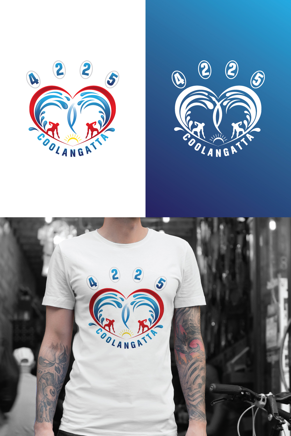
Coolangatta QLD 4225 Advertising Logo
Want to win a job like this?
This customer received 12 graphic designs from 4 designers. They chose this graphic design from ART VISUALS as the winning design.
Join for free Find Design Jobs
- Guaranteed
-
 A$100
A$100
-
 12 designs
-
 4 designers
Graphic Design Brief
I have a basic concept that needs the love of a professional to bring it to life.
The waves make a heart with a faint ‘Q’ in the centre, and the town name is lowered from the heart to resemble a face at first glance.
With the postcode at the top, can we make it so it also looks a paw, but not overly prominent - you should see heart, then face, and paw.
With colours, we’ll need red for the heart, and probably light blue and white for the ocean, maybe a little splash of yellow for the sun.
I understand less is more so will leave it up to the professionals 👍
The Canva job link is below - sorry Only just found out I can share it.
https://www.canva.com/design/DAFWrBslX9g/YM8v3Dw6iB-TOD760BGpCQ/view?utm_content=DAFWrBslX9g&utm_campaign=designshare&utm_medium=link&utm_source=publishsharelink&mode=preview
Target Market(s)
Businesses in a Coastal surfing town
Industry/Entity Type
Advertising
Font styles to use

Colors
Colors selected by the customer to be used in the logo design:
Look and feel
Each slider illustrates characteristics of the customer's brand and the style your logo design should communicate.
Elegant
Bold
Playful
Serious
Traditional
Modern
Personable
Professional
Feminine
Masculine
Colorful
Conservative
Economical
Upmarket
Requirements
Must have
- 2 waves to form a heart with a Q. the town name is to slightly lowered like a mouth. Postcode set out in a paw print style
