World Tour Subscription Box Design, with Greeting Card, Booklet and Web Banners.
Want to win a job like this?
This customer received 24 graphic designs from 3 designers. They chose this graphic design from Numan Ghani Studio as the winning design.
Join for free Find Design Jobs- Guaranteed
-
 A$190
A$190
-
 24 designs
-
 3 designers
Graphic Design Brief
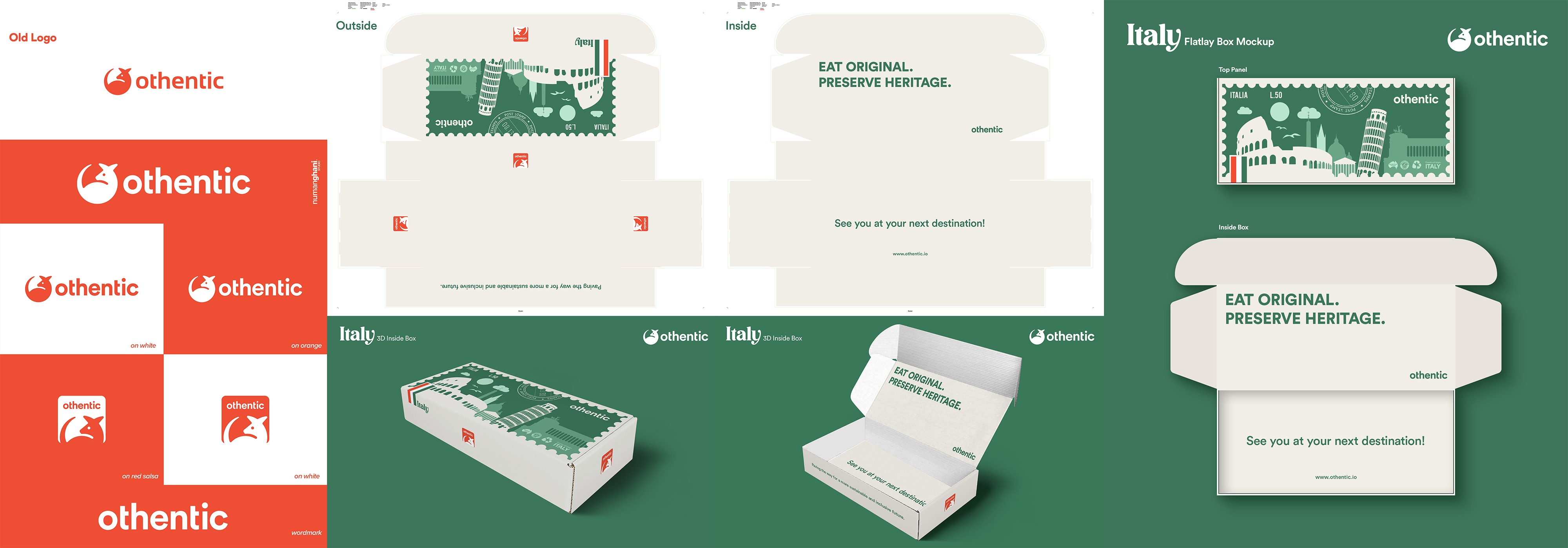
We need a PRINT READY box design with theme: ITALY
(Inner and outer sides)
The box contains Food & Beverage products coming directly from Italy.
Size: 80cmx35cmx16cm (attached for template). Yes, it's a big box, it has the wow factor, see the TikTok screenshot example - referring to the size only - it has the wow unboxing factor.
ONCE WE AGREE ON THE BOX DESIGN, we then need the below deliverables using the design adaptation from the Box:
- Greeting card
- 12-page booklet (See Sakur*co examples) - photos and copy will be provided.
- 3x Web/App Banners (See S*ku*aco examples) - the elements will need to be able to be used across different banner dimensions/sizes (a square, rectangle, etc. so for product hero shot, cover image, banner ads, story image, image listing, blog image, etc.).
The booklet structure is as follows:
(Total 1,000 words)
- Cover page
- (2 page spread) Intro 200 words max + Main Image
- A map indicating product origins
- (Across 5 pages) 2 products per page, 50-75 words each product + image
- (2 page spread) Community Development Innitiatives - 200 words max, a few images
- Back cover
After Italy, we will be doing India, China, Japan, Thailand, Mexico and Greece. So please keep in mind when designing the Italy Box as we need to allow a nice colour palette for the World Tour range.
Our company logo and other details will be provided.
Cheers
Industry/Entity Type
Tech, F&B, Travel
Look and feel
Each slider illustrates characteristics of the customer's brand and the style your logo design should communicate.
Elegant
Bold
Playful
Serious
Traditional
Modern
Personable
Professional
Feminine
Masculine
Colorful
Conservative
Economical
Upmarket
Requirements
Must have
- Style: Clean, minimalistic, sophisticated, a mix of contemporary & Traditional, and sustainable. Imagine receiving and unboxing an Apple product, we need the same wow effect. On the outside: we need to have the App Logo (attached with the colour code), along with 3x small USP icons (Australian Owned, HACCP certified, and Recyclable), and small text: "Country of Origin: ITALY". You can adjust the colour of the icons to suit. We also need to be deliberate and bold with our messaging for "EAT ORIGINAL. PRESERVE HERITAGE", so we need this text either on the outer or inner of the box. Due to size of the box, placing this slogan on the inside when customer is unboxing may be ideal. Also on the inside: The usual social sharing icons with hashtag info. Feel free to add an instruction icons on how to unbox - in order to deliver an unmatched immersive experience.
Nice to have
- Background illustration graphics on Italian heritage/landmark buildings, towers, etc is an option. ANOTHER EXAMPLE: Just to give an example of a cool box design, though we need to stick to the Box Style brief above, is from Graze - see attached.
Should not have
- Busy design, too flashy, graphics that are not representative of an Italian range.