The Reserve at Stillwater Apartment Community Rebrand
Want to win a job like this?
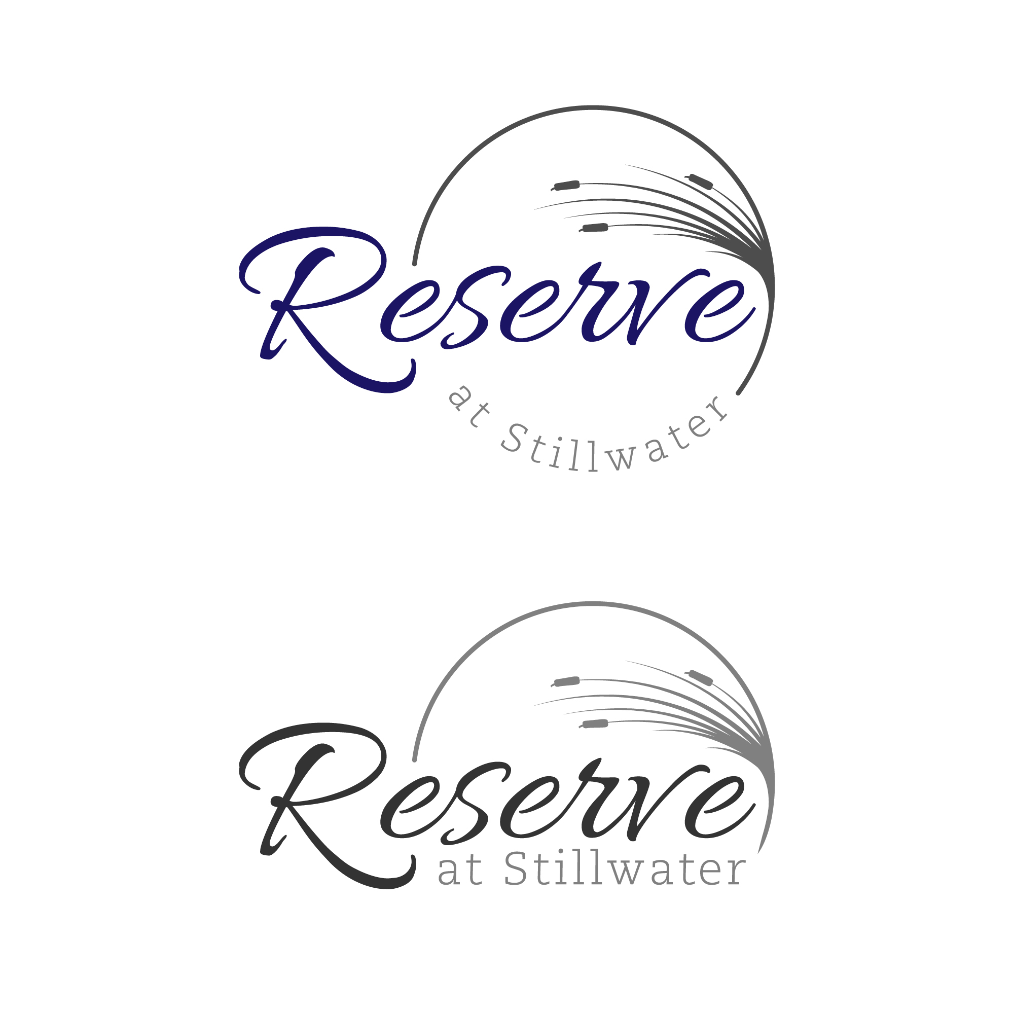
This customer received 222 logo designs from 130 designers. They chose this logo design from KENGZ as the winning design.
Join for free Find Design Jobs- Guaranteed
-
 US$300
-
 222 designs
-
 130 designers
Logo Design Brief
We have a 1990s, 256 unit apartment complex that is looking for a rebrand and modern look with some new owners. We are looking for a professional and modern design that is similar to ones attached but offer some variations. Located in Durham North Carolina, this apartment complex sits on a large pond which is where the name still water comes from. We are looking for blue, grey and white for colors. Attached are ones they like but wants a different variation of them.
Updates
Gathering more feedback
Slow in providing feedback
Target Market(s)
Renters between the age of 25-45, Young professionals as well as families
Industry/Entity Type
Real Estate Apartment Community
Logo Text
Reserve at Stillwater
Logo styles of interest
Emblem Logo
Logo enclosed in a shape
Abstract Logo
Conceptual / symbolic (optional text)
Wordmark Logo
Word or name based logo (text only)
Lettermark Logo
Acronym or letter based logo (text only)
Font styles to use
Colors
Colors selected by the customer to be used in the logo design:
Look and feel
Each slider illustrates characteristics of the customer's brand and the style your logo design should communicate.
Elegant
Bold
Playful
Serious
Traditional
Modern
Personable
Professional
Feminine
Masculine
Colorful
Conservative
Economical
Upmarket
Requirements
Must have
- Blue, Grey, white colors
Should not have
- no ducks, no animals, to busy