Design a visual element for a sustainable finance platform
Want to win a job like this?
This customer received 34 web designs from 11 designers. They chose this web design from Double d as the winning design.
Join for free Find Design Jobs- Guaranteed
-
 €340
€340
-
 34 designs
-
 11 designers
Web Design Brief
INTRO
‘Globalance World’ is a platform to analyse and compare investments and how sustainable, future-fit, and profitable they are. ‘Globalance World’ inspires, accompanies, and enables investors to successfully invest in future-oriented companies and investments that solve global challenges and shape a positive future. Explore the platform here: https://fe.globalanceworld.com/en
see the intro video here: https://vimeo.com/475001711
The platform included funds (https://en.wikipedia.org/wiki/Investment_fund), indices (https://en.wikipedia.org/wiki/Stock_market_index) as well as the users own custom portfolio. The platform is also capable of displaying companies with stocks and bonds.
The platform displays 3 key performance indicators for the users, see here (https://fe.globalanceworld.com/gdvfDBQGX5fnYDnTC/climate) on the left side:
- Climate score
- Footprint score
- Financial return
PROBLEM STATEMENT
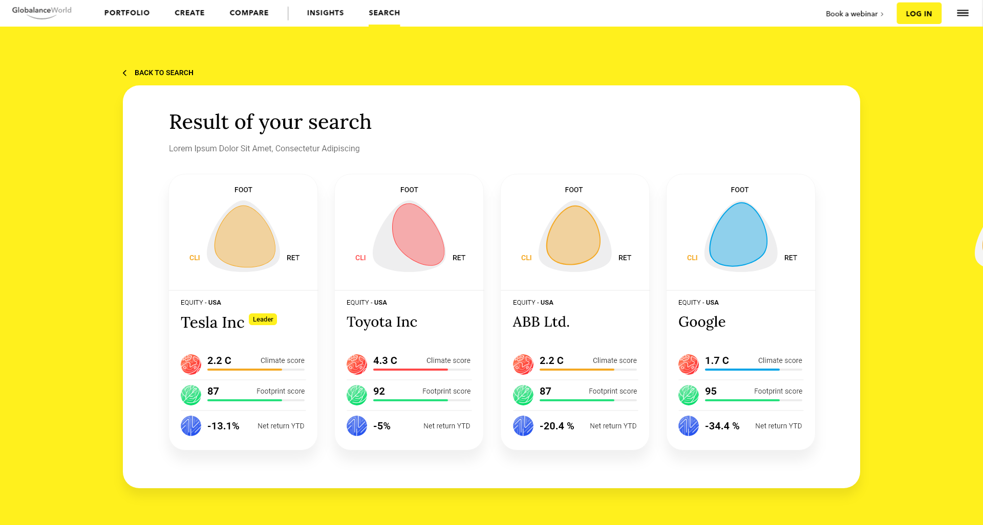
Currently we are showing the results of a search in this form: https://fe.globalanceworld.com/asset/WcpCDTDzKb5jdtKgS/climate
This is the result for a single asset. We are also planning search options for the user, which will result in several results (i.e. companies or funds). We need an attractive visual solution for an overview of several results.
Like in other platforms, we would like to display such “multi-search results” (which are stocks, funds etc.) in a visual attractive way, i.e. not in the current form or in the form of a table. Other platforms (e.g. Airbnb) are using visual attractive frames to display the search results.
We are also aiming to display stocks and fund in a similar way, i.e. with tiles / card-elements containing a differentiating visual element for each stock/fund.
As we are lacking “photos” from our objects like other platforms, we need to come up with a different unique visual element. Newly, several assets (e.g. a group like "biggest stocks USA") should be able to be called up together on Globalance World and visually differentiated per company/stock - but still having a similar concept and visual appearance.
- How might we present a company/stock, in a visual inspiring way in such a card-element?
- How might we include key KPI’s in the card in a simple but yet informative way?
REQUIREMENTS
- Design should be inspiring, simple, forward-looking and beautiful
The card-element should contain the following elements:
- Visual element
- The card-element should contain the following elements: 1) Visual element 2) Name of asset class (i.e. stock, bond, fund) 3) Name of company of fund (i.e. Tesla) 4) KPI’s
- A scaleable solution (especially for the visual element) which can be generated by a system
DELIVERY / RESULT
Create a high-fidelity design of a card-element, which could be placed into the platform, of the following companies:
- ABB (Infos & KPI’s: https://fe.globalanceworld.com/de/asset/tzXtakEHpHZwi6ipB/climate)
- Tesla (Infos & KPI’s: https://fe.globalanceworld.com/de/asset/WcpCDTDzKb5jdtKgS/climate)
Industry/Entity Type
Financial / Tech
Number of Pages Required
1 page
Colors
Designer to choose colors to be used in the design.
Look and feel
Each slider illustrates characteristics of the customer's brand and the style your logo design should communicate.
Elegant
Bold
Playful
Serious
Traditional
Modern
Personable
Professional
Feminine
Masculine
Colorful
Conservative
Economical
Upmarket
Requirements
Nice to have
- Design connects with the current solution for indices and portfolios of the globe
Should not have
- 1) There should be no legal problems with the use of the designs because of the use of trademarked elements 2) Please avoid using logotypes of the companies, or pictures of the company headquarters