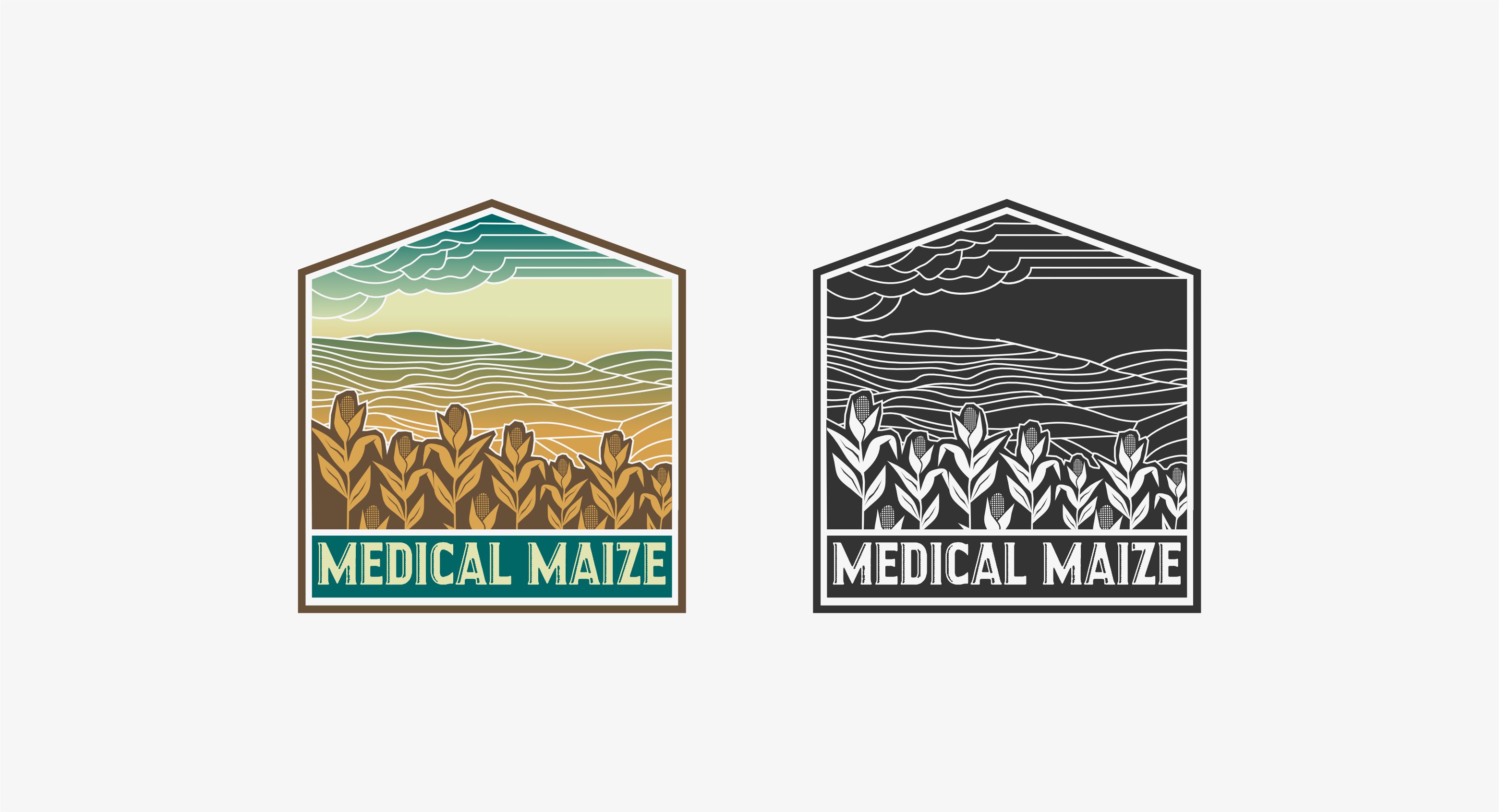
Medical Maize Corporate Identity/Branding
Want to win a job like this?
This customer received 59 logo designs from 26 designers. They chose this logo design from erikdesign as the winning design.
Join for free Find Design Jobs-
 US$150
-
 59 designs
-
 26 designers
Logo Design Brief
Medical Maize, LLC is a startup in Nebraska focused on developing a new biorefinery (biochemical mfg) campus with medtech contract sterilization & manufacturing services as well, collaborating with large private, local feedstock and energy companies.
Below is a summary of the initial vision for the project, which continues to get fine-tuned and evolve as alliances with strategic partners and customers get finalized.
NEBRASKA HAS AN OPPORTUNITY TO BE AN INTEGRAL PART OF A NEW NATIONAL PROGRAM THAT POSTIVELY IMPACTS AGRICULTURE, ALL FIVE BIOSCIENCE SUBSECTORS, AND HEALTHCARE.
UTILIZING NEBRASKA RESOURCES, WE COULD CREATE A SOLUTION TO OUR NATIONAL MEDICAL SUPPLY CHAIN SHORTAGES WHILE ALSO PROVIDING GREEN CHEMICAL SOLUTIONS FOR MEDTECH STERILIZATION AND BIOSCIENCE-RELATED MANUFACTURING. BY USING AGRICULTURE-DERIVED FEEDSTOCK (SUCH AS ETHANOL & CORN SUGAR) AS A BUILDING BLOCK TO DEVELOP A SUSTAINABLE PLATFORM, WE’LL ALSO BRIDGE THE PRODUCTION GAP FOR OUR NATIONAL CORN PRODUCERS AND BIOFUEL INDUSTRY LEADERS.
Target Market(s)
All MedTech Developers & Manufacturers, Healthcare Systems & Startups
Industry/Entity Type
Agriculture-Chemical-Biofuel-Medtech-Healthcare
Logo Text
Medical Maize
Logo styles of interest
Emblem Logo
Logo enclosed in a shape
Pictorial/Combination Logo
A real-world object (optional text)
Font styles to use
Colors
Colors selected by the customer to be used in the logo design:
Look and feel
Each slider illustrates characteristics of the customer's brand and the style your logo design should communicate.
Elegant
Bold
Playful
Serious
Traditional
Modern
Personable
Professional
Feminine
Masculine
Colorful
Conservative
Economical
Upmarket
Requirements
Nice to have
- Ag/Corn, medical symbol. The PDF with the carved wood art is a grouping that hung in an old Nebraska hotel. I love it and plan to have it in my office. I also love the retro logos...and was thinking they kind of look similar with the landscape feel.
Should not have
- See the photos below for color palette (very natural, earthy with greens, teal, gold, etc.) No primary colors. (The color selections in this form are limited, so I selected what I could.) I envision this to have natural/earthy shades. Also, I love "ombre" and the color teal & other jewel tones too.