New health software company connecting data to benefit patients and doctors
Want to win a job like this?
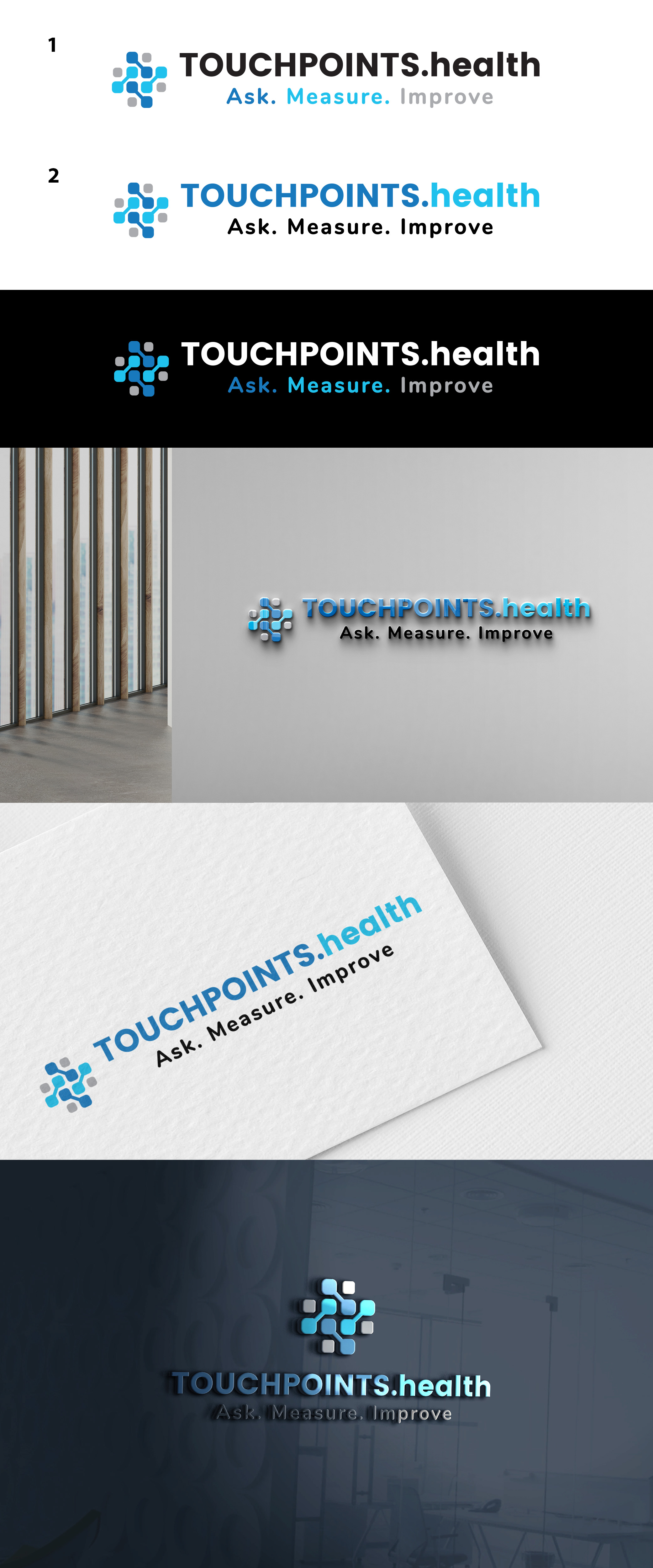
This customer received 137 logo designs from 70 designers. They chose this logo design from DANIELLA SK (Swan) as the winning design.
Join for free Find Design Jobs-
 £110
£110
-
 137 designs
-
 70 designers
Logo Design Brief
We need a clean logo for a first in class health software platform that improves patients journies using touchpoints doctors send them. The logo needs to reflect a 'touch' element as well as connected data points.
Keeping the TOUCHPOINTS.health with Ask. Measure. Improve below, focussing on the square logo to match it please.
Do's-We would like to keep the brand colours and fonts (see text file). We will use the logo as a favicon and as our main logo so needs to be unique enough to be recognisable from the logo alone as a favicon without the writing.
Dont's- Don't want any 'fingerprint' element or overly medicalised with health cross or snakes & staff etc.
The final design should communicate connected, secure data with a touch element.
Our current logo is enclosed so it's really re-designing the square logo preceding the words to a new, unique recognisable but clean element.
Logo Text
The logo element doesn't need any words as it will sit alongside TouchPoints.health writing