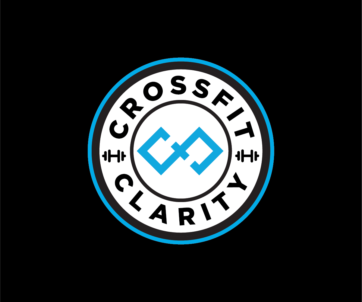
NEW CrossFit Gym - CrossFit Clarity Logo
Want to win a job like this?
This customer received 11 logo designs from 3 designers. They chose this logo design from Onse Officials as the winning design.
Join for free Find Design Jobs-
 US$110
-
 11 designs
-
 3 designers
Logo Design Brief
The name is "CrossFit Clarity." CFC is an acceptable abbreviation. Would love the words in a new font along with a simple graphic representation of either the initials or something else. Would like a version with both the logo mark and words. and another stand alone with just the logo graphic without letting. And a third with just the initials. Our existing brand colors include Cyan#39B2C6, Deep Cyan #082228 and mid-tone cyan #066277. Existing logo examples and social media backgrounds attached. I do like the wave pattern from the current logo, but that's it. Looking for similar clean, simple design but a stand-alone graphic to be used on apparel, etc.
CrossFit is constantly varied functional movements performed at a high intensity. My target audience is men and women middle to upper middle class ages 30-60. NOT beefed up gym rats.
Target Market(s)
30-60 year old men and women middle to upper-middle class. People focused on health and longevity.
Industry/Entity Type
CrossFit. Fitness. Microgyms
Logo Text
CrossFit Clarity
Logo styles of interest
Emblem Logo
Logo enclosed in a shape
Abstract Logo
Conceptual / symbolic (optional text)
Colors
Colors selected by the customer to be used in the logo design:
Look and feel
Each slider illustrates characteristics of the customer's brand and the style your logo design should communicate.
Elegant
Bold
Playful
Serious
Traditional
Modern
Personable
Professional
Feminine
Masculine
Colorful
Conservative
Economical
Upmarket
Requirements
Must have
- Colors provided in description. Original, unique graphics. Perhaps a graphic representation that is bold and could stand alone on a piece of merch without the words. Please match the colors provided
Nice to have
- The word Clarity should be emphasized vs. the word CrossFit. Maybe try something where part of the words are "out of focus" playing on the definition of the word Clarity - which means to see more clearly, to come into focus.
Should not have
- Duplicate submissions with different colors. Anything that looks like my current logo.