Mabel House - Fixtures and Furnishings (Design Firm and Shop)
Want to win a job like this?
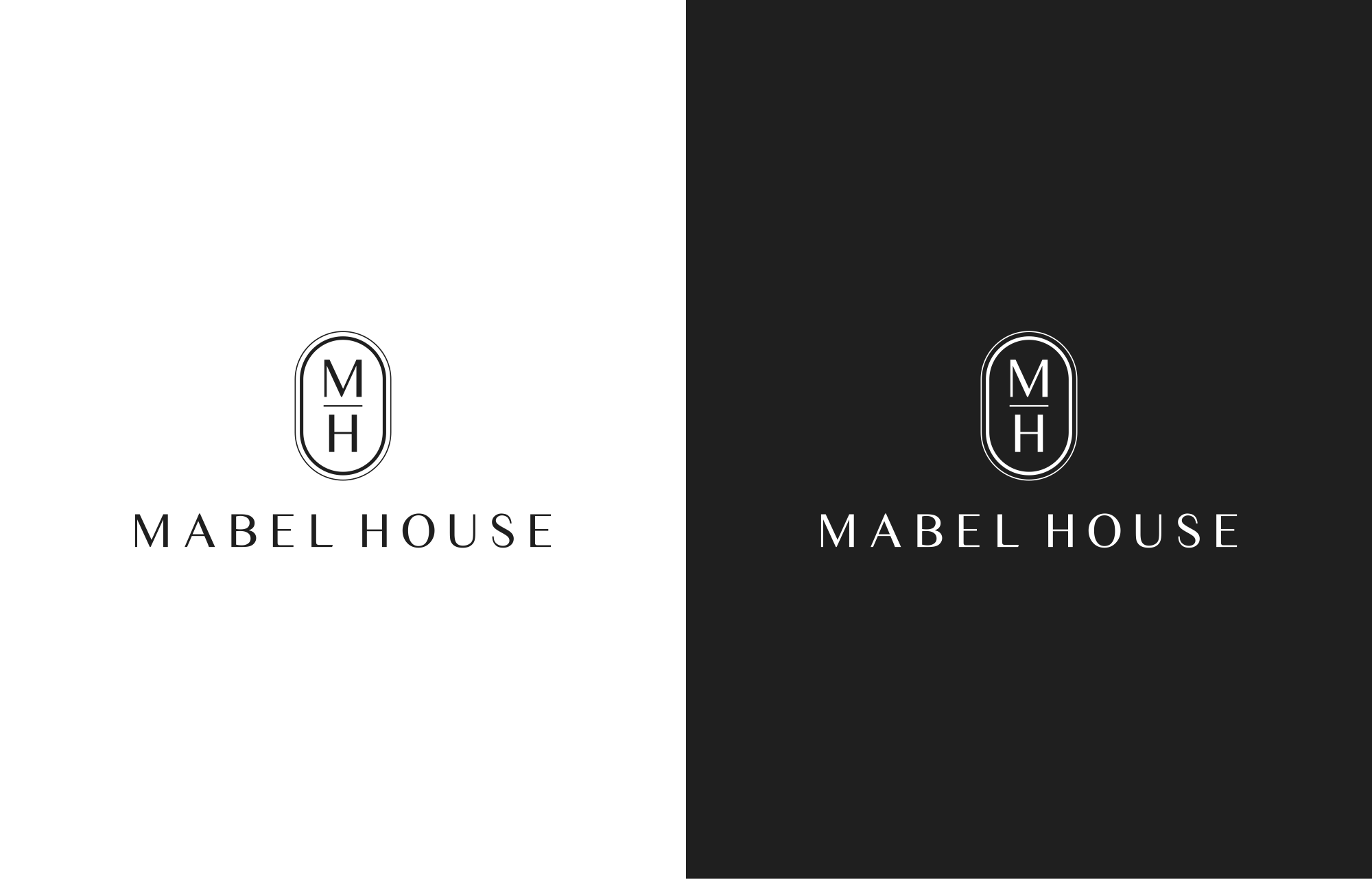
This customer received 284 logo designs from 110 designers. They chose this logo design from avoava as the winning design.
Join for free Find Design Jobs-
 US$110
-
 284 designs
-
 110 designers
Logo Design Brief
EDIT: I’d like to see logos that are a squared oval shape. I really like the diptyque candle logo (see uploaded image as a reference). I wouldn’t need text within the frame, but like that it has two line weights. I like that it looks like a simplified cartouche, or stamp. I like the look of MH stacked vertically, separated by a horizontal line within. I also uploaded an elongated Pickett style border
Hi!
I am starting a design firm with an e-commerce site selling fixtures and furnishings.
I want a very minimal black and white icon/ logo that is an MH, maybe encircled in some way, with mabel house written below in smaller font. I’m open to uppercase, lowercase, or a mix of letters.
I’d like to use a font that pairs well with a somewhat standard and easy to read font for letters/emails/ the website.
Overall, I want the logo and font to be soothing, timeless, refined, understated, neutral, and uniform, but not too basic. Wholesome, yet sophisticated.
I admire the style, logos, etc. of the following brands. Their sites are good inspirations for general look & feel
https://cuffstudio.com/
https://www.crofthouse.com/
https://leibal.com/
https://panorammma.com/
https://shop.lindyegalloway.com
Updates
Gathering more feedback
Target Market(s)
Chic homemakers
Industry/Entity Type
Interior Design; E-Commerce
Logo Text
MH; mabel house; MABEL HOUSE
Logo styles of interest
Lettermark Logo
Acronym or letter based logo (text only)
Colors
Designer to choose only greyscale colors for use in the design.
Look and feel
Each slider illustrates characteristics of the customer's brand and the style your logo design should communicate.
Elegant
Bold
Playful
Serious
Traditional
Modern
Personable
Professional
Feminine
Masculine
Colorful
Conservative
Economical
Upmarket
Requirements
Must have
- Simple, easy to read, Icon logo (MH) + Font combination (spelled out) below
Nice to have
- Timeless and transitional look and feel
Should not have
- Frill; a juvenile vibe; sterility; a corporate look and feel; an aggressive megatron "M"