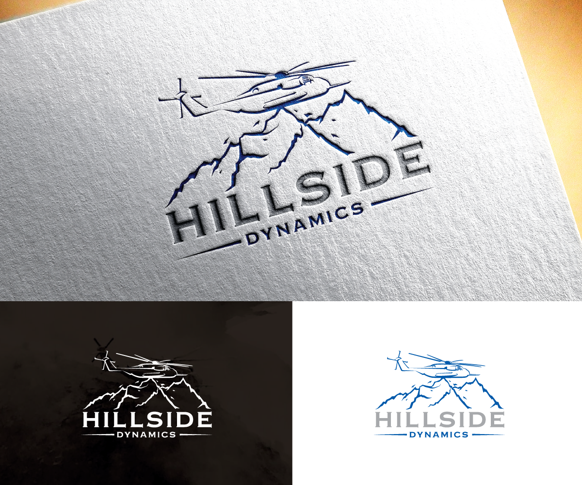
Helicopter Company Logo of a helicopter on a hillside
Want to win a job like this?
This customer received 46 logo designs from 22 designers. They chose this logo design from step forward 2 as the winning design.
Join for free Find Design Jobs- Guaranteed
-
 US$310
-
 46 designs
-
 22 designers
Logo Design Brief
We need a logo for an aviation consulting and helicopter parts sales company that primarily services civilian helicopter operators. Being located in the hills in Alabama, and considering the dynamic weather patterns that affect helicopters when operating in mountainous terrain, I'd like to evoke the feeling captured in the attached image. The CH53E has a very distinct shape and I'd like to stick with that over other smaller, more generic helicopter shapes. However, I know that more simplistic logos are more easily recognizable and tend to be more relevant for longer periods. I also intend to have the logo embroidered at some point so details will be lost and should not be required to get the point across. The design may incorporate the initials "HD" if it works. The final design should communicate our companies intimate knowledge of and experience in supporting helicopter operators. I want to be able to connect with executives as well as mechanics with my logo.
Target Market(s)
Helicopter owners/operators/mechanics
Industry/Entity Type
Aviation/ Helicopter Parts Supplier
Logo Text
Hillside Dynamics
Logo styles of interest
Pictorial/Combination Logo
A real-world object (optional text)
Abstract Logo
Conceptual / symbolic (optional text)
Font styles to use
Colors
Colors selected by the customer to be used in the logo design:
Look and feel
Each slider illustrates characteristics of the customer's brand and the style your logo design should communicate.
Elegant
Bold
Playful
Serious
Traditional
Modern
Personable
Professional
Feminine
Masculine
Colorful
Conservative
Economical
Upmarket
Requirements
Must have
- the feeling evoked by the attached image. A helicopter and a hill but the helicopter is only touching on a portion because the hill is falling away.
Nice to have
- Clean, simple design that still gets the point across.
Should not have
- I don't want a logo that's too busy.