3D Logo Design Two Toned Gold and Silver Metallic (Project Description in Full)
Want to win a job like this?
This customer received 103 logo designs from 15 designers. They chose this logo design from abella design as the winning design.
Join for free Find Design Jobs- Guaranteed
-
 A$219
A$219
-
 103 designs
-
 15 designers
Logo Design Brief
Hello Designers, I like first to introduce myself. My name is Daniel. I have worked on many projects over my years in the Industry; I am your connection to your client and will do my best to translate your client's Vision for you. I will be handling all aspects of the Amica logo re-design.
The purpose of the design request was to seek out long term graphic design talent for all needs of Amica now, and into the future and for all clients I represent now and into the future.
I have a direct interest in Amica Trust as a company, and I am one of the Directors. Still, I also represent many clients for which I usually source local graphic design talent, so to be honest, this is a test for me of the larger online graphic design community.
So let's get started.
Project: 3D Logo Design, Metallic, Two-Toned, Gold and Silver. I have underlined 3D because submissions so far have not been up to the standards of 3D in the client's Vision or mine, so we need to get this right. If any designer is unsure, get to Etsy or search terms such as realistic 3d Logos Gold and Silver.
The Logo needs to POP! Out at the customer like you could almost believe that if you touched the flat photo paper or computer screen, you could feel its texture or its risen nature.
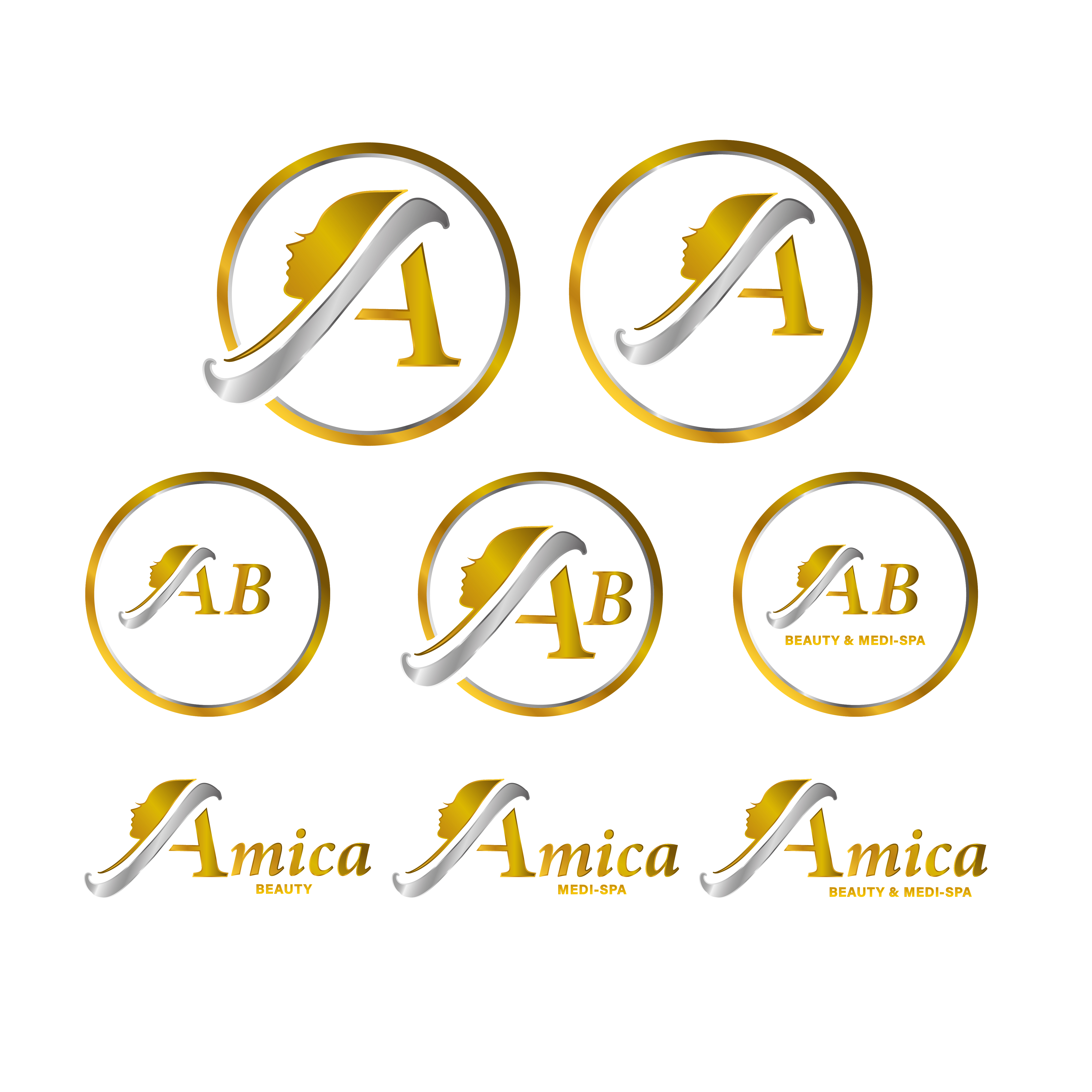
Logo Versions:
Step 1
The letter >A< is almost a logo on its own the A needs to be two-toned gold and Silver with no swoosh effects or curved calligraphy font. Sharp edges on the Logo design for >(A)<mica
Step 2
Logo Version 1 > Monogram: AM and AB
Now that the A has been created, you should be able to create the first versions for use. The Gold and Silver Circle around the Amica logo is for uniforms, and the signage plaque for the reception walls (AM) stands for Amica for Men, and (AB) stands for Amica Amica Beauty. We require both versions of this.
Step 3
Logo Version 2:
The Logo version will be (A)mica; this version of the Logo will be used as a logo heading for different purposes; it is a simpler design that flows from the versions already designed, so Amica the brand is emphasised.
V1: (A)mica
V2:(A)mica Medi-Spa
V3:(A)mica Beauty & Medi-Spa
V4:(A)mica Beauty
Step 4
Incorporated Versions Gold Circle around (AM) then running through the Initials (AM) Amica for Men different version of (AM) will be the same but have Amica Medi-Spa the final version Will be (AB) Amica Beauty the A created in step 1 will be the connecting factor across all logo versions.
Colours: GOLD/SILVER Metallic, not grey, not yellow it must be realistic metallic.
Project objectives: Design a set of logos for use in the following platforms webpage, social media platforms, apps, uniforms, physical signage, brochures, business cards and digital display screens.
Translation: Amica- Friend, Friendly
Friendly Beauty & Medi-Spa
Colours: GOLD/SILVER Metallic, not grey, not yellow it must be realistic metallic.
Target Audience: Brand Aware Customers, self-conscience, Amica already has its books full, so our target Audience depends on which version of the Logo; Examples: Amica For Men, Amica Medi-Spa, Amica Beauty.
Client Contact:
When the phone is answered, the staff answer AMICA as an example! How can I help you! Amica Idetifiys as Amica, Amica is not restricted or identified as Medi-Spa, Beauty Salon, or a Men's Salon, Woman's Salon and is Gender-Neutral, friendly- Amica it says it all, everyone is welcome!
Rebranding- Renovating Image
Amica is being reworked as a business/entity not to change what's good about Amica but to enhance its services, one of many goals is to break down the stigma Men have about visiting traditional beauty salons to make it comfortable for all people, no matter how they identify; we will be taking steps to cater for all. Give operating hours slots for certain clients' needs & which is why Amica needs different versions of the Logo depending on the target audience.
Creative Vision: I expect, as all clients will expect as a digital artist, that your work submitted will be your creative DNA. Add your spin and challenge yourself to get creative. The winning designer's Logo will be Amica's eternal Logo; it will not change again, as the planned investment into brand awareness will be lost.
Reward: I will reward the winning designer with ongoing work and another bonus payment for this work.
Current Submissions:
Nothing so far submitted is internal for Amica.
Some submissions have aspects that are too brief and funny enough; if we put part one designer's work and merged it with other designers' work, we would be closer but still not there.
Hopefully, the brief will help all designers understand and apologise for not having a clear brief originally.
Look forward to awarding the winning designer, and I will be reasonable to additional requirements for the winner and reward them fairly for perfection.
Kind Regards
Daniel
Web Development Project Manager
Target Market(s)
men and women
Industry/Entity Type
beauty industry
Logo Text
Amica for Men Amica Beauty and Medi-Spa, AM, AB
Logo styles of interest
Emblem Logo
Logo enclosed in a shape
Wordmark Logo
Word or name based logo (text only)
Lettermark Logo
Acronym or letter based logo (text only)
Font styles to use
Look and feel
Each slider illustrates characteristics of the customer's brand and the style your logo design should communicate.
Elegant
Bold
Playful
Serious
Traditional
Modern
Personable
Professional
Feminine
Masculine
Colorful
Conservative
Economical
Upmarket
Requirements
Nice to have
- i would like the A to stand out also the Amica to be raised of the paper or print also very elegant but luxury 3d pop out