Branding for Division of Critical Care
Want to win a job like this?
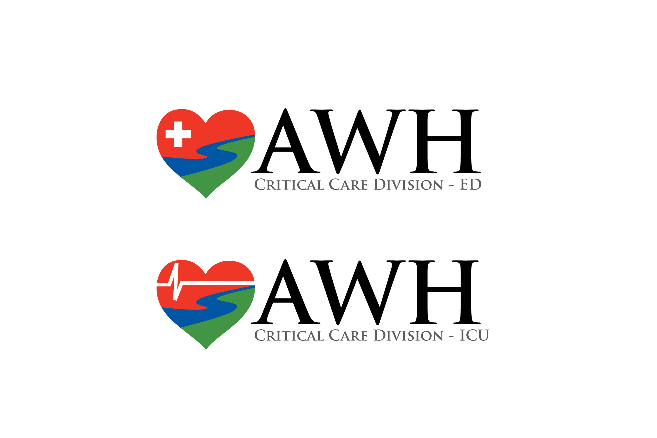
This customer received 95 logo designs from 57 designers. They chose this logo design from Roger B. as the winning design.
Join for free Find Design Jobs- Guaranteed
-
 A$300
A$300
-
 95 designs
-
 57 designers
Logo Design Brief
We are the Division of Critical Care. This incorporates both the emergency department and the intensive care unit of our hospital. The current hospital logo is not fit for purpose (see attached) and we would like to brand ourselves as a subdivision within the hospital (so there will be need to be some interplay with the official logo eg. same colours. The hospital logo is supposed to represent two towns linked by a river). The redesign should represent safety net and high level technical care that we provide to the most unwell patients in our departments. There will need to be two versions on the theme: 1. AWH Critical Care Division - ED = emphasis is on safety and care (eg. cupping hands) 2. AWH Critical Care Division - ICU emphasis on more technical symbols (eg. ECG, stethoscope).
Target Market(s)
recruitment of registrars
Logo Text
1. AWH Critical Care Division - ED 2. AWH Critical Care Division - ICU
Logo styles of interest
Pictorial/Combination Logo
A real-world object (optional text)
Abstract Logo
Conceptual / symbolic (optional text)
Font styles to use
Colors
Colors selected by the customer to be used in the logo design:
Look and feel
Each slider illustrates characteristics of the customer's brand and the style your logo design should communicate.
Elegant
Bold
Playful
Serious
Traditional
Modern
Personable
Professional
Feminine
Masculine
Colorful
Conservative
Economical
Upmarket
Requirements
Must have
- Colours blue red green