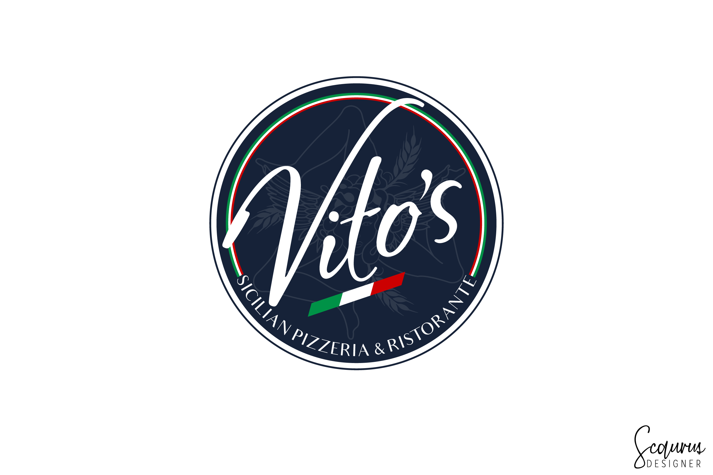
Vito's Sicilian Pizzeria & Ristorante logo since 1996!
Want to win a job like this?
This customer received 107 logo designs from 45 designers. They chose this logo design from InkThink by Scaurus as the winning design.
Join for free Find Design Jobs- Guaranteed
-
 US$350
-
 107 designs
-
 45 designers
Logo Design Brief
Project Facelift : Vito's has been dishing up Award winning pizza since 1996! It's now time to "put on a new dress" and strut our stuff again!!...ha!
Vito's needs a new modern logo specifically to incorporate in a new pizza box design. We love our logo, however back in the mid 90's we used orange and black and incorporated warm colors of red, orange, brown, beige, copper etc etc in the interior design and overall branding of Vito's. We stayed away from the Italian flag colors of green white and red, because everyone was using it, especially take out pizzeria's. Vito's, as you can see in the video, is a nice comfortable pizzeria & restaurant, that welcomes all clientele.
We would like to stay with a round logo but will entertain new ideas. Also, in our opinion, the Italian flag looks classy and high end when placed on navy blue color.
see video created in 2015:
https://www.dropbox.com/sh/l2quhk7pfhseh9t/AACWfH7vg1nbzQNVDKoa95MNa?dl=0
simple - clean - sharp
less is better....
Thank you!
Vito
Target Market(s)
The entire WORLD
Industry/Entity Type
Italian Restaurant & Pizzeria
Logo Text
Vito's Sicilian Pizzeria & Ristorante
Colors
Colors selected by the customer to be used in the logo design:
Look and feel
Each slider illustrates characteristics of the customer's brand and the style your logo design should communicate.
Elegant
Bold
Playful
Serious
Traditional
Modern
Personable
Professional
Feminine
Masculine
Colorful
Conservative
Economical
Upmarket
Requirements
Must have
- We must keep the Vito's signature in the center of the current logo. No new signature or font changes for "Vito's".
Nice to have
- see project description
Should not have
- our logo should not have any cartoon pizzaiolo's or any type of artwork....