The digital revolution company needs you!
Want to win a job like this?
This customer received 64 logo designs from 22 designers. They chose this logo design from Fezy Design Studio as the winning design.
Join for free Find Design Jobs-
 €190
€190
-
 64 designs
-
 22 designers
Logo Design Brief
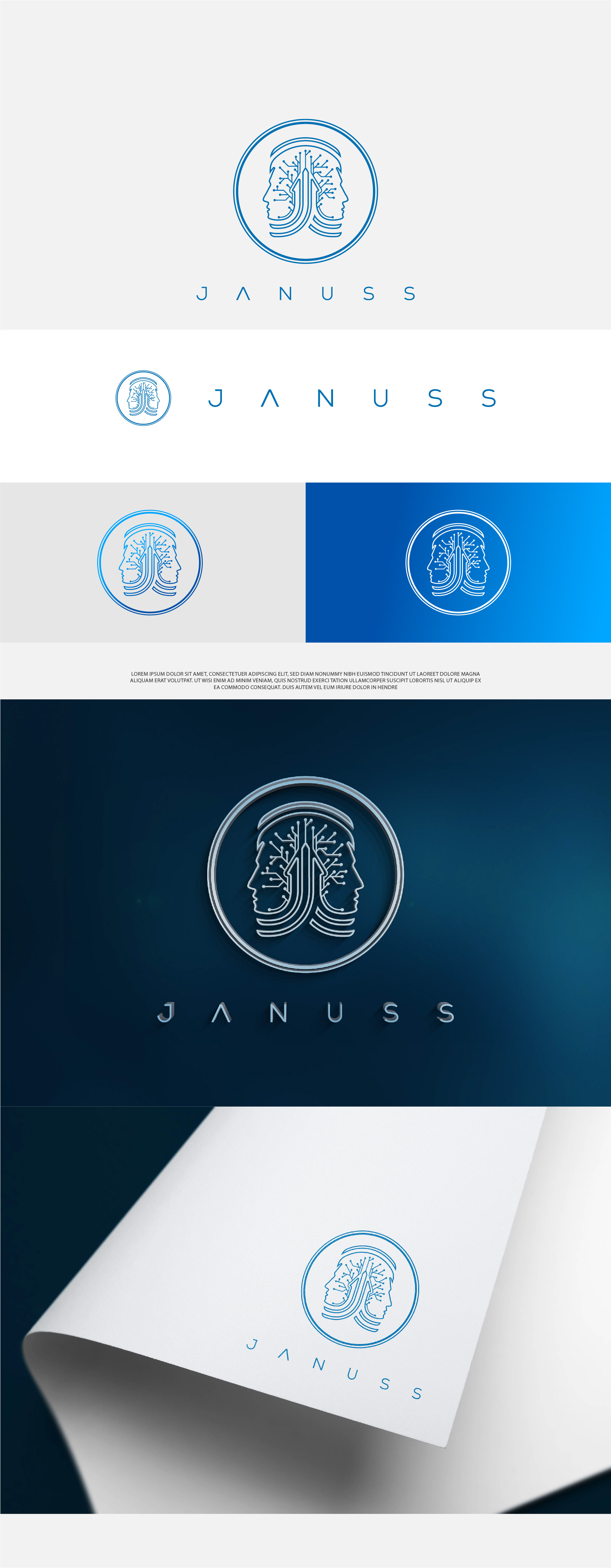
Janus (from Latin Ianus) is the god of beginnings, material and immaterial, as well as one of the oldest and most important deities of Roman religion.
Usually depicted with two faces, since he is able to look both to the future and to the past.
JANUSS bases its roots precisely in this: it takes up the concept of history and transition.
JANUSS is present. A company that merges the experience of the past with the innovation of the future.
We are a young, dynamic, digital and innovative company.
We are here to bring the skills of the younger generation into the working world of the past: we are here to modernize.
We are revolution, we are change.
The font of JANUSS, to be matched with the logo, should convey the sense of transition (the double face of Janus it's a must) from past (ex: the J as "capitello") to future (ex: the SS as if it were an arrow to represent the movement, the symbol to send forward).
Remember: it's for a Tech company focused on digitalization of SME
We need to give the perception of innovation.
For further information about colors and logo examples, open the brief attached below 👇🏼
Target Market(s)
Tech company
Industry/Entity Type
tech growth solutions
Logo Text
JANUSS
Logo styles of interest
Emblem Logo
Logo enclosed in a shape
Abstract Logo
Conceptual / symbolic (optional text)
Font styles to use
Other font styles liked:
- look at the brief
Colors
Colors selected by the customer to be used in the logo design:
Look and feel
Each slider illustrates characteristics of the customer's brand and the style your logo design should communicate.
Elegant
Bold
Playful
Serious
Traditional
Modern
Personable
Professional
Feminine
Masculine
Colorful
Conservative
Economical
Upmarket
Requirements
Must have
- The font of JANUSS, to be matched with the logo, should convey the sense of transition (the double face of Janus it's a must) from past (ex: the J as "capitello") to future (ex: the SS as if it were an arrow to represent the movement, the symbol to send forward).
Nice to have
- Remember: it's for a Tech company focused on digitalization of SME We need to give the perception of innovation
Should not have
- Avoid colors too strong, we prefer a palette between blue, orange, purple. No logos too historical, must be a hybrid.