Design a new logo for MSEA - an energy and commodity shipping company
Want to win a job like this?
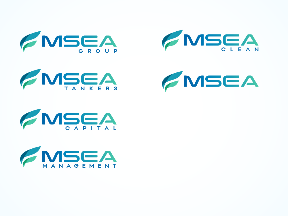
This customer received 90 logo designs from 47 designers. They chose this logo design from jaime.sp as the winning design.
Join for free Find Design Jobs-
 US$150
-
 90 designs
-
 47 designers
Logo Design Brief
We need a new logo for our marine transport company. Its an international business, shipping energy commodities across the oceans on innovative and environmentally clean ships (burning clean fuels). The target audience are large financial institutional investors, banks, commodity traders, energy companies . The reason for a new logo is (i) we entered the alternative fuel space as part of the transition to cleaner ships (lower carbon emissions) and would like the logo to reflect this transition, and (ii) the group has grown and developed across tanker shipping, investments in energy and ships, asset and ship management.
Checkout our current website: www.mseacpaital.com it has the info you need about the company. The "M" in our logo stands for the founders initial. The "SEA" stands for what our investment and transport / freight business is about - moving energy and commodities across the SEA and oceans.
Target Market(s)
commodity trade houses and energy companies (like Trafigura, Glencore, Cargill, Bunge, Exxon, Shell, BP)
Industry/Entity Type
Marine Transport / Enery shipping and trading / investments
Logo Text
MSEA (we have group companies like MSEA Tankers / MSEA Capital / MSEA Management / MSEA Group)
Logo styles of interest
Abstract Logo
Conceptual / symbolic (optional text)
Wordmark Logo
Word or name based logo (text only)
Lettermark Logo
Acronym or letter based logo (text only)
Colors
Colors selected by the customer to be used in the logo design:
Look and feel
Each slider illustrates characteristics of the customer's brand and the style your logo design should communicate.
Elegant
Bold
Playful
Serious
Traditional
Modern
Personable
Professional
Feminine
Masculine
Colorful
Conservative
Economical
Upmarket
Requirements
Nice to have
- colour tones reflecting the change from blue ocean waters to cleaner and greener (lower emissions), so was thinking blue-light blue-turquoise
Should not have
- no old style traditional shipping / marine logos. Also, we are NOT a forwarding company and not a logistics company. We are different in our industry in being creative, innovative and forward looking.