Chaos Basketball Visual Identity
Want to win a job like this?
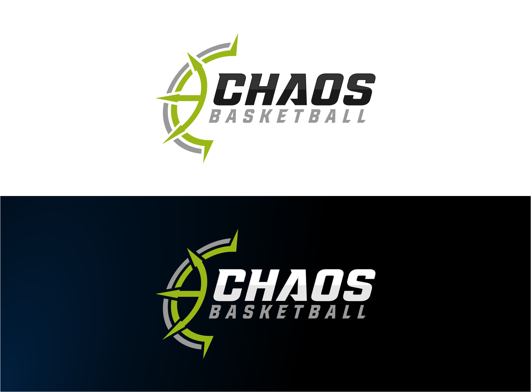
This customer received 47 logo designs from 23 designers. They chose this logo design from giza as the winning design.
Join for free Find Design Jobs- Guaranteed
-
 C$150
C$150
-
 47 designs
-
 23 designers
Logo Design Brief
The task is to create a logo that represents a new youth club basketball team in Canada. We like the idea of a wordmark that says Chaos, incorporated with a derivation of the symbol for Chaos (image called chaos1). Images called chaos2 and chaos 3 are examples of derivations of the symbol that might work for us.
I envision that the word Chaos could be written in capital letters, with the chaos symbol illustration placed above the word in an integrated fashion. Since the symbol can be made to look like a part of a circle, it might work to illustrate it to subtly look like a basketball and a chaos symbol at the same time. I'm interested in ideas that integrate the partial circle shape with the text (see files chaos6, chaps7, chaos8, chaos9 for examples). The circle could have texture/styling to it, if it works in the design (chaos6 for example).
We are not sure what font for the word CHAOS we want. I'd like to see the artists' ideas. I know we like the font NCAA Louisville Cardinals. That's a good starting point but I'm really looking for font ideas that are clean, modern and conjure motion/chaos. The word basketball should be integrated but is probably best suited in a smaller, secondary font compared to the word CHAOS (perhaps below or beside the word CHAOS).
The primary colors for the team are black, white and fluorescent yellow. In it's full format (CHAOS + basketball + symbol), it will be placed on black and white t-shirts and hoodies. It will also be placed on uniforms in framed areas shown in images chaos4 and chaos5. On the uniforms, I'm not sure what will look right yet, until I see the design. We may remove the word Basketball from the logo and just have CHAOS + symbol on the uniform. It is also possible that we will just include the word CHAOS from the logo if the symbol doesn't look right. That decision will be made later.
Other colors can be used in the logo but it must ultimately look good on the uniforms and black or white backgrounds. Two versions could be made - one for black background and one for white background.
NEW BASED ON THE FIRST FEW SUBMISSIONS: Lines should be thin, clean, sharp, modern. We generally do not prefer bold, thick, busy lines. I hope you understand what I mean by that.
Logo Text
CHAOS basketball
Logo styles of interest
Pictorial/Combination Logo
A real-world object (optional text)
Look and feel
Each slider illustrates characteristics of the customer's brand and the style your logo design should communicate.