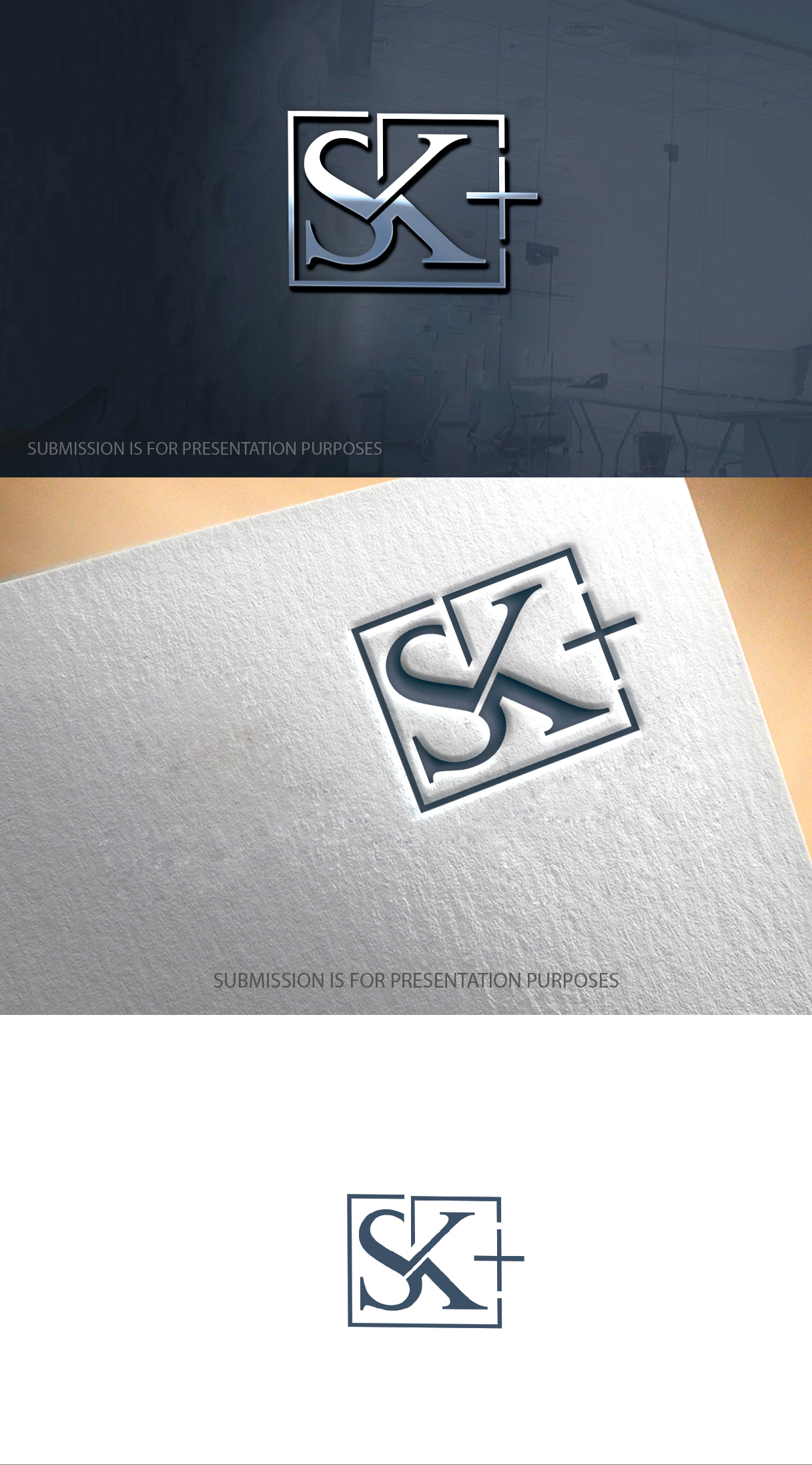
Logo design for a firm from to SK Law partners
Winner
Want to win a job like this?
This customer received 138 logo designs from 46 designers. They chose this logo design from graphicevolution as the winning design.
Join for free Find Design Jobs- Guaranteed
-
 US$210
-
 138 designs
-
 46 designers
Logo Design Brief
The law firm want to rebrand, and they would like a new logo. Here are some of the ideas, they want a splash screen on a web page home page We want something like that and the graphic they would like is something like a group of spinning lines that circle around kind of like a screen saver, for a few seconds and then form into the words SK Law Partners.
Target Market(s)
All prospective Clients
Industry/Entity Type
Legal Services
Logo Text
SK Law partners
Logo styles of interest
Wordmark Logo
Word or name based logo (text only)
Lettermark Logo
Acronym or letter based logo (text only)
Font styles to use
Sans Serif
Colors
Colors selected by the customer to be used in the logo design:
FFF300
FFF600
FEFA6F
FFFEC7
FFFEE8
EB3D1F
EC4F4E
F09395
F8D3D4
FCEDEE
Look and feel
Each slider illustrates characteristics of the customer's brand and the style your logo design should communicate.
Elegant
Bold
Playful
Serious
Traditional
Modern
Personable
Professional
Feminine
Masculine
Colorful
Conservative
Economical
Upmarket
Requirements
Must have
- We want something like that and the graphic they would like is something like a group of spinning lines that circle around kind of like a screen saver, for a few seconds and then form into the words SK Law Partners.
Nice to have
- Colors mentioned were black and white marble background, with golden lettering
Should not have
- A professional feel but not boring
Files
PNG
logo
Monday, August 2, 2021
Payments
1st place
US$110
2nd place
US$100