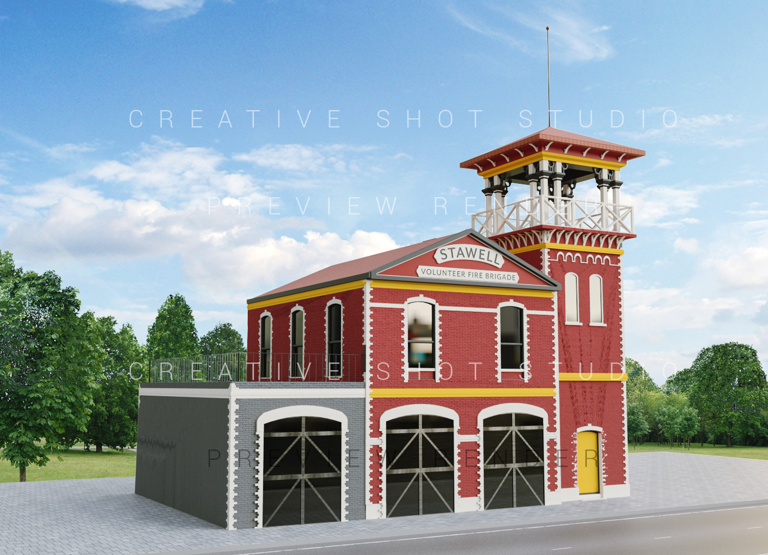
Simplified Old Fire Station Architecture recreation from old photos
Want to win a job like this?
This customer received 17 graphic designs from 5 designers. They chose this graphic design from Creative Shots Studio as the winning design.
Join for free Find Design Jobs- Guaranteed
-
 A$100
A$100
-
 17 designs
-
 5 designers
Graphic Design Brief
The Colour scheme for an old fire Brigade to replicate it’s initial build for presentation and discussion.
We have a draft made however it’s not suited to utilise for selecting colour combinations that depict the original patterns, around windows, front doors, bricks and/or bands with original detailing.
Two photos are provided of the original condition, and the goal is to have a more accurate en-face depiction of the different coloured brickwork, only in white or light greyscale, so it can be coloured later when the colour selections are being made within a heritage scheme agreement.
Thanks :)
Target Market(s)
This is to present to heritage consultants and public to discuss colour variations for exterior paint work.
Industry/Entity Type
Architecture
Font styles to use
Colors
Designer to choose only greyscale colors for use in the design.
Look and feel
Each slider illustrates characteristics of the customer's brand and the style your logo design should communicate.
Elegant
Bold
Playful
Serious
Traditional
Modern
Personable
Professional
Feminine
Masculine
Colorful
Conservative
Economical
Upmarket
Requirements
Must have
- Features from the original photos.
Nice to have
- Windows in the tower and second floor are appropriate, it’s only the 3 doors below that need to be reworked to match the old doors that were there initially.A nicely coloured version would be appreciated, the selected paint in suggesting are from Porters Paints. Base Brick Colourhttps://shop.porterspaints.com/paint/wall/dragons-eyeLight Brick Colour https://shop.porterspaints.com/paint/wall/wood-smokeWindows/trim/lettering https://shop.porterspaints.com/paint/wall/river-stoneDoor to the tower plus the two bands at the top of the building and towerhttps://shop.porterspaints.com/paint/trim/tumeric
Should not have
- Thick Solid lines/filled in areas - the idea is to have the ability to customise colours later with the project. No please omit supporting blue text and arrows.