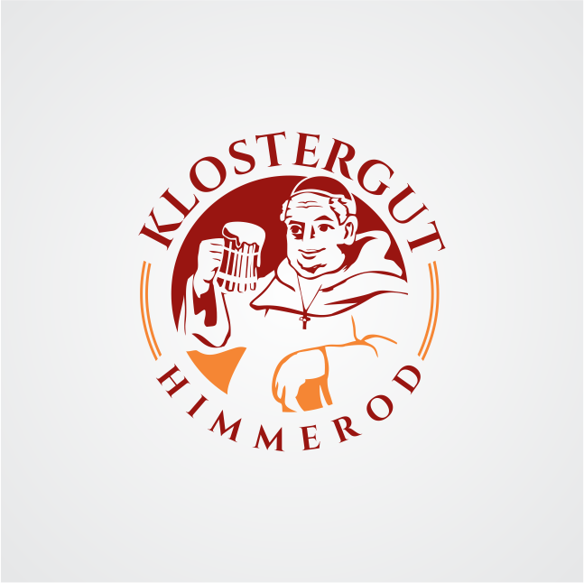
Figurative mark Klostergut (1/2 color graphic of a monk)
Want to win a job like this?
This customer received 19 logo designs from 8 designers. They chose this logo design from Khalik as the winning design.
Join for free Find Design Jobs- Guaranteed
-
 €80
€80
-
 19 designs
-
 8 designers
Logo Design Brief
A figurative mark - consisting of a monk's head - is to be developed, which will be used as an addition to the "Klostergut Himmerod" typeface. The word / figurative mark stands for the existing restaurant on the premises of the Cistercian Abbey of Himmerod, and is to be used gradually for products or other services (overnight stays, etc.). The claim of the monastery property will be "simply. Good." and thus carries the philosophy: simple, honest and regional products / cuisine. The monastery property is an excursion destination for locals and tourists (families, hikers, cyclists, vintage cars, bus tourists).
The basic color is a dark red (cmyk 31 | 92 | 90 | 28)
Target Market(s)
regional
Logo Text
Klostergut Himmerod
Logo styles of interest
Character Logo
Logo with illustration or character
Colors
Colors selected by the customer to be used in the logo design:
Look and feel
Each slider illustrates characteristics of the customer's brand and the style your logo design should communicate.
Elegant
Bold
Playful
Serious
Traditional
Modern
Personable
Professional
Feminine
Masculine
Colorful
Conservative
Economical
Upmarket
Requirements
Must have
- simple representation - similar to the attached example
easily reproducible on labels, glasses, signs
Nice to have
- Shape: round or oval
Relation to the food (as in the example)
Should not have
- no more than 2 colors