Bold Refresh to a Start-up Fertilizer Company
Want to win a job like this?
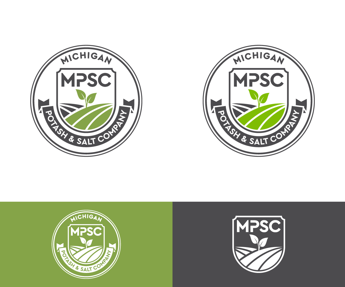
This customer received 218 logo designs from 77 designers. They chose this logo design from artpjg as the winning design.
Join for free Find Design Jobs- Guaranteed
- Bundled Project 2
-
 US$240
-
 218 designs
-
 77 designers
Logo Design Brief
We are an agricultural fertilizer start-up company that harvests potash (fertilizer for plants) and also salt (for road de-icing and for food uses). We don’t actually mine the mineral but instead drill wells and cycle water to dissolve the minerals under ground. Both products are white and look kinda like salt.
We are based in rural Michigan and would like to convey the farming/agricultural side of our business in the logo. Want to show stability, financial safety, long-term, solid business that we will be. This could include a plant or just some symbol.
The logo could also utilize the “&” to look like “Michigan Potash & Salt Company”. You can go to our website to look at our existing design (which includes a combine harvester and a wheat plant in the logo), and has too many colors, and too many shapes. You can also find a lot of other information on the website (mipotash.com).
I am also interested in a short-form logo that only uses the acronym MPSC, a grayscale image, webpage design, apparel design, and others.
Target Market(s)
General marketing and branding, local community, legislators,
Industry/Entity Type
Agriculture
Contact Information for Business Card
back of card should read:
Food for the world
Security for America
Character in Communities
Logo Text
Michigan Potash and Salt Company or Michigan Potash & Salt Company
Logo styles of interest
Emblem Logo
Logo enclosed in a shape
Pictorial/Combination Logo
A real-world object (optional text)
Look and feel
Each slider illustrates characteristics of the customer's brand and the style your logo design should communicate.
Elegant
Bold
Playful
Serious
Traditional
Modern
Personable
Professional
Feminine
Masculine
Colorful
Conservative
Economical
Upmarket
Requirements
Must have
- Company name should not focus on 'Michigan' but should be more focused on 'potash' and 'salt'. In other words, Michigan should not be any larger or pronounced than the 'potash' and 'salt' part of the logo.
Nice to have
- I like to have the "MPSC" in the logo/emblem as well because we will be referring to MPSC rather than saying the long name.
Should not have
- Probably should stay away from water drops
Payments
Total
US$240
Project Deadline
08 Jun 2021 12:26:32 UTCProject Upgrades
Bundled project(s)
- offering US$39 business card design to winner
- offering US$49 stationery design to winner