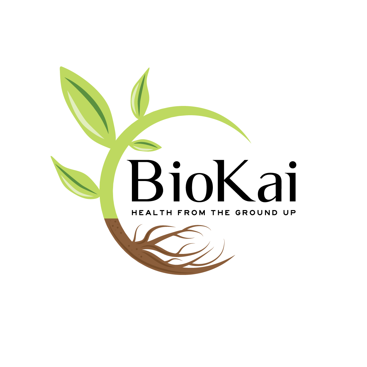
Soil Consultant and Composting Business needs a logo design

Want to win a job like this?
This customer received 101 logo designs from 51 designers. They chose this logo design from Kimh as the winning design.
Join for free Find Design Jobs- Guaranteed
Logo Design Brief
We need a logo design for a new company based in New Zealand. It is called "BioKai - Health from the Ground Up".
It is a sister company from KoruKai Herb Farm (www.korukai.co.nz, thanks LogoPorn for the awesome logo).
We are wanting to educate people on the benefits of healthy soil to grow nutritious food filled with nutrient, antioxidants, phytochemicals to keep and make us healthy (health from the soil). The soil organisms and diversity play here a crucial role to foster our own human microbiome as well.
At the start we are offering education and consultancy for farmers, growers and people wanting to grow their own food - how to make compost, how to look after the soil microorganisms etc.
We want to extend this to supply compost innocultants and other products that help people and make their job easier.
We would like to see designs that are visually similar to KoruKai Herb Farm's design to visualize the connection of the two companies.
We would like to see the colour green.
The final design should communicate healthy plants/seedlings growing in healthy soil.
Target Market(s)
Farmers, Growers, Gardeners
Industry/Entity Type
Gardening
Logo Text
BioKai - Health from the Ground Up
Logo styles of interest
Pictorial/Combination Logo
A real-world object (optional text)
Font styles to use
Other font styles liked:
- Luxia, Highway Gothic expanded
Look and feel
Each slider illustrates characteristics of the customer's brand and the style your logo design should communicate.
Elegant
Bold
Playful
Serious
Traditional
Modern
Personable
Professional
Feminine
Masculine
Colorful
Conservative
Economical
Upmarket
Requirements
Must have
- A pictoral logo with green and maybe a seedling growing etc.
A brown earthy colour would be good to have.
Text: BioKai - Health from the Ground Up
BioKai should be spelled like that "BioKai"
We want people to see that BioKai is a sister company from KoruKai so the look should be similar but still different enough to be visually different at a glance. We want the pictoral to be unique and not similar or the same as the KoruKai one. The writing can be similar to KoruKai's logo.
Nice to have
- We like designs that are clean and clear and not overly playful. We like designs that concentrate on the important parts and not add any unnecessary things.
You can play with fonts or use Luxia and Highway Gothic Expanded.
Should not have
- Unnecessary additions that are confusing or overly playful.
Do not add tillage lines from an agricultural field as this is not what we promote with BioKai.