Comparison Website Design for Glue Website
Want to win a job like this?
This customer received 35 web designs from 12 designers. They chose this web design from Ved Web Services as the winning design.
Join for free Find Design Jobs- Guaranteed
-
 A$370
A$370
-
 35 designs
-
 12 designers
Web Design Brief
Note: We don't have a logo, it's not needed. Just put placeholder.
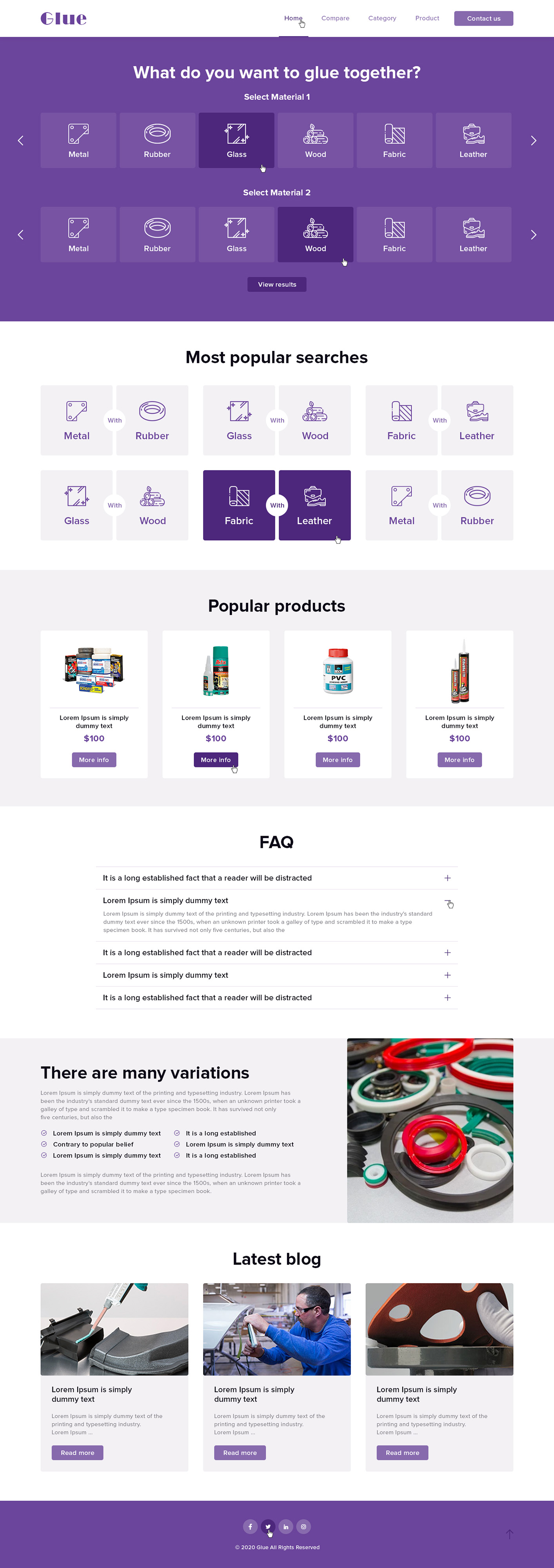
We would like a website comparing A to B, simple elegant design, simplistic styling. Website is for helping people find the best glue to glue 2 things together. For example, Metal to wood, Metal to rubber, glass to fabric and so on. Select 2 options and be shown the best glue/adhesive for the job.
Purpose of the website:
Allowing someone to pick 2 materials they want to glue together, and showing them the best product for it. We want someone to select 2 materials like "Metal and Rubber". It'll then show the best glues/adhesives from best #1 to #5-10 other ones. The design is simple and doesn't need much detail.
Design rules:
Please design using bootstrap 4 with a modified 1440px width.
We're looking for 4 main pages:
Home Page, Compare Page, Category Page, Product Page.
Target Market(s)
Everyone
Industry/Entity Type
Adhesive
Number of Pages Required
3 page
Font styles to use
Colors
Colors selected by the customer to be used in the logo design:
Look and feel
Each slider illustrates characteristics of the customer's brand and the style your logo design should communicate.
Elegant
Bold
Playful
Serious
Traditional
Modern
Personable
Professional
Feminine
Masculine
Colorful
Conservative
Economical
Upmarket
Requirements
Must have
- We like the following features of these designs:
https://dribbble.com/shots/6401517-InsureTec-Dashboard - Main menu with the drop down, this will change depending on the active page. If they are on a metal page they could be shown "glue metal to ___" options. We also like the simple table view in this design under "users" heading.
https://dribbble.com/shots/6300662-Energy-Concept-Quotation-Page - The entire colour palette is great! The simplicity of the design is great.
https://dribbble.com/shots/8593973-Loans-Comparison-UI - The boxes at the top look great, if there was 2 of these with a compare icon between them and above that saying "glue metal to rubber" and it shows an icon/image or metal and glue... The table of products is also good, it has dot points and details which we like.
https://dribbble.com/shots/4586351-Transfer-Money/attachments/4586351-Transfer-Money?mode=media - The right it shows which 2 products are selected (metal and rubber) for example, on the left it would say "best glue for metal and rubber". This is too detailed though, so it would need to be simplified nicely.
https://zapier.com/ - They do a good job of "comparing" 2 things and displaying integrations well. You can get lots of ideas from them linking A to B similar to what we want to show.
https://www.marketingautomationinsider.com/hubspot-vs-auto-pilot/ - This shows a good example of the hero section how it should look.
Features of each page to help you design:
Home Page-
Menu (shown in examples above)
Hero section (colour section) with a centre heading saying "what do you want to glue together" with 2 boxes below to select materials from.
List of most popular searches (metal to rubber, glass to wood, fabric to leather... repeat these to fill space).
List of popular products with basic details about each one (grid format, not list).
FAQs - You choose design for this
Content section (simple design, headings, paragraphs, dotpoints, images...)
Blog section - Simple 3 column grid with an image on top, heading, paragraph, button.
Compare Page-
Showing 2 materials in the colour hero section under or to the right of the heading and paragraph.
Best product (highlighted)
9 other products (list table)
3 column section saying glue (product a to ___) with other product that isn't product b + reverse of this.
Content section
Category page-
heading and breadcrumbs in hero section
Standard product list 1 column on the left with filters, 3 products shown on the right in grid format with basic details on each one.
Product page-
Image left, details on the right.
Keep the image smaller not 50% as we want it to not take up too much space vertically.
Under this put a table where this product ranks for gluing things together. for example #3 for gluing metal to rubber, #1 for glass to wood.
Content section.
Please note, keep this design flat, simple and pretty. We don't need it over-designed or detailed, we simply want a simple functionality website that clearly shows what we're looking for.