ENGVEST Logo Design update with eXp Commercial
Want to win a job like this?
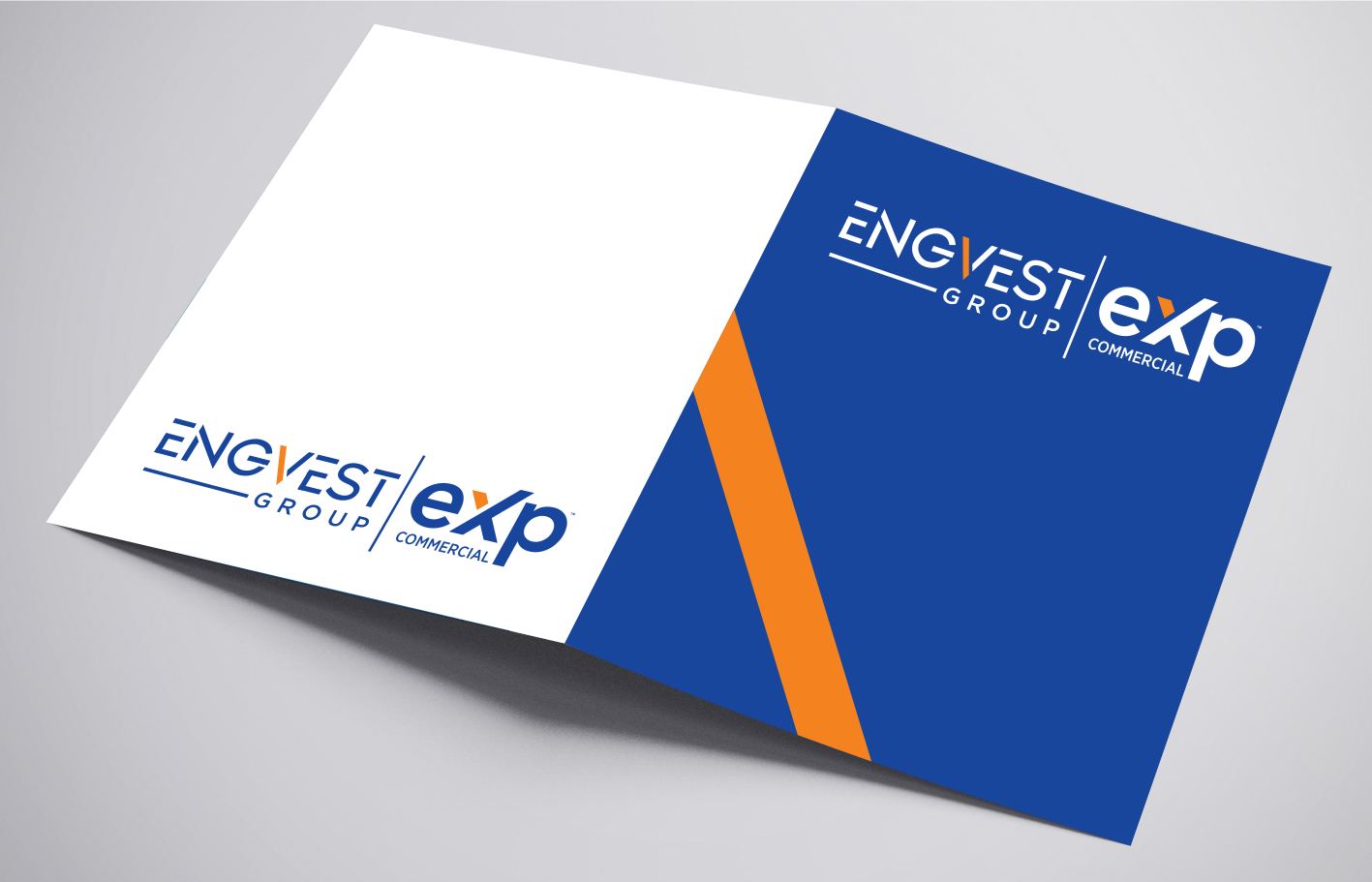
This customer received 62 logo designs from 22 designers. They chose this logo design from BNdesigner as the winning design.
Join for free Find Design Jobs- Guaranteed
-
 US$200
-
 62 designs
-
 22 designers
Logo Design Brief
We affiliated with a new company eXp Commercial which we can not change their logo but we still have a branded Group name ENGVEST . I will attached some old engvest logos we had . I will use to Logo on my website and Marketing signs . I will need to fit this 2 logos together on a Real Estate 4' x8' Sign . So the Combined logos shouldn't be too wide. I would like a Horizontal Logo and a Square logo so it fits ion Social Media Profiles Circles . ENGVEST Group | eXp Commercial . I would like to add my website very small to the logo if possible engvest.com . Take at look at the files that I have. Thanks. - here are some brand guildlines https://join.exprealty.com/brand/
I added an updated logo design I was trying to make. I like the design I created. Please fix and see what other ideas you have . Thanks
Updates
I uploaded a new AI file of a design I was working on. Please help recreate and see if there is anything else you can add to it .
Added Monday, December 14, 2020
Target Market(s)
Commercial Real Estate \ Investment Sales \ Leasing \ Tenant Rep\ Office | Retail \Industrial
Industry/Entity Type
Investment
Logo Text
ENGVEST Group | eXp Commercial
Logo styles of interest
Wordmark Logo
Word or name based logo (text only)
Lettermark Logo
Acronym or letter based logo (text only)
Font styles to use
Look and feel
Each slider illustrates characteristics of the customer's brand and the style your logo design should communicate.
Elegant
Bold
Playful
Serious
Traditional
Modern
Personable
Professional
Feminine
Masculine
Colorful
Conservative
Economical
Upmarket
Requirements
Must have
- I like the Blue - eXp Commercial has some orange color to it. I am trying to create a ENGVEST Group brand to work along eXp Commercial (eXp Commercial Logo can not be adjusted )
Nice to have
- ENGVEST - Would be cool to design the E with maybe 3 lines instead. Something that looks like investment or Commercial Retail/Office and etc
Or do a color variation to the V to stand out?
I am think the E (3 Lines) might be too aggressive depending on the design
Should not have
- No added ICONS unless it is in the ENGVEST letters