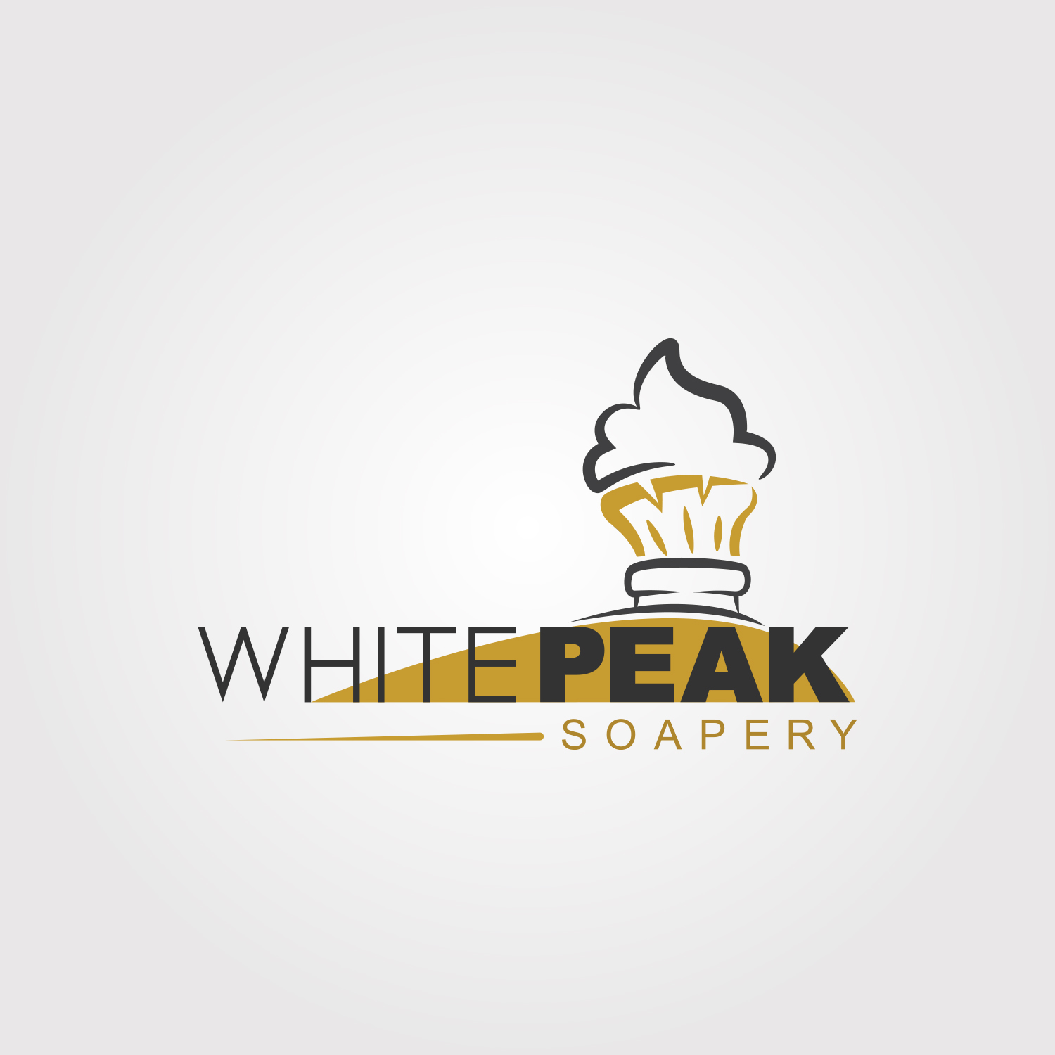
White Peak Soapery - Simple Lather on Shaving Brush
Winner
Want to win a job like this?
This customer received 42 logo designs from 18 designers. They chose this logo design from bleko2 as the winning design.
Join for free Find Design Jobs-
 C$120
C$120
-
 42 designs
-
 18 designers
Logo Design Brief
The company name White Peak Soapery stands for the peaks seen in white shaving lather (when using a brush and shaving soap). The vision for a logo is to have a shaving brush full of lather, looking almost like cool whip swirl and not showing the brush bristles at all, or very minimal. Something pure and simple.
Key words: nostalgic yet modern. Vintage in a new world
Target Market(s)
North America
Industry/Entity Type
Barbershop
Logo Text
White Peak Soapery
Logo styles of interest
Abstract Logo
Conceptual / symbolic (optional text)
Look and feel
Each slider illustrates characteristics of the customer's brand and the style your logo design should communicate.
Elegant
Bold
Playful
Serious
Traditional
Modern
Personable
Professional
Feminine
Masculine
Colorful
Conservative
Economical
Upmarket
Requirements
Must have
- One of the sample images attached shows simple and hard lines. I like that idea. Like a distant tree or mountain in a background setting. A little along the lines of vector art.
Nice to have
- I'm not sure if it's visually a good idea, but how about a foreground of grass hills and the background of the brush and lather being a sort of tree? Sort of a sign of pure and simple.
Customers may abbreviate to WPS (White Peak Soapery). Perhaps do something with those 3 letters. I wouldn't necessarily oppose using certain letters to be part of the artistry of the logo. I just don't want it to represent power.
Should not have
- I do not wants this to be 3D art. I also do not want detailed lines or it being a realistic version of something shot with a camera.. It should not feel busy.
Payments
1st place
C$120