Distinctinctive and nordic inspired container design for a new started health and active brand.
Want to win a job like this?
This customer received 16 packaging designs from 8 designers. They chose this packaging design from SimonWhitaker as the winning design.
Join for free Find Design Jobs-
 €170
€170
-
 16 designs
-
 8 designers
Packaging Design Brief
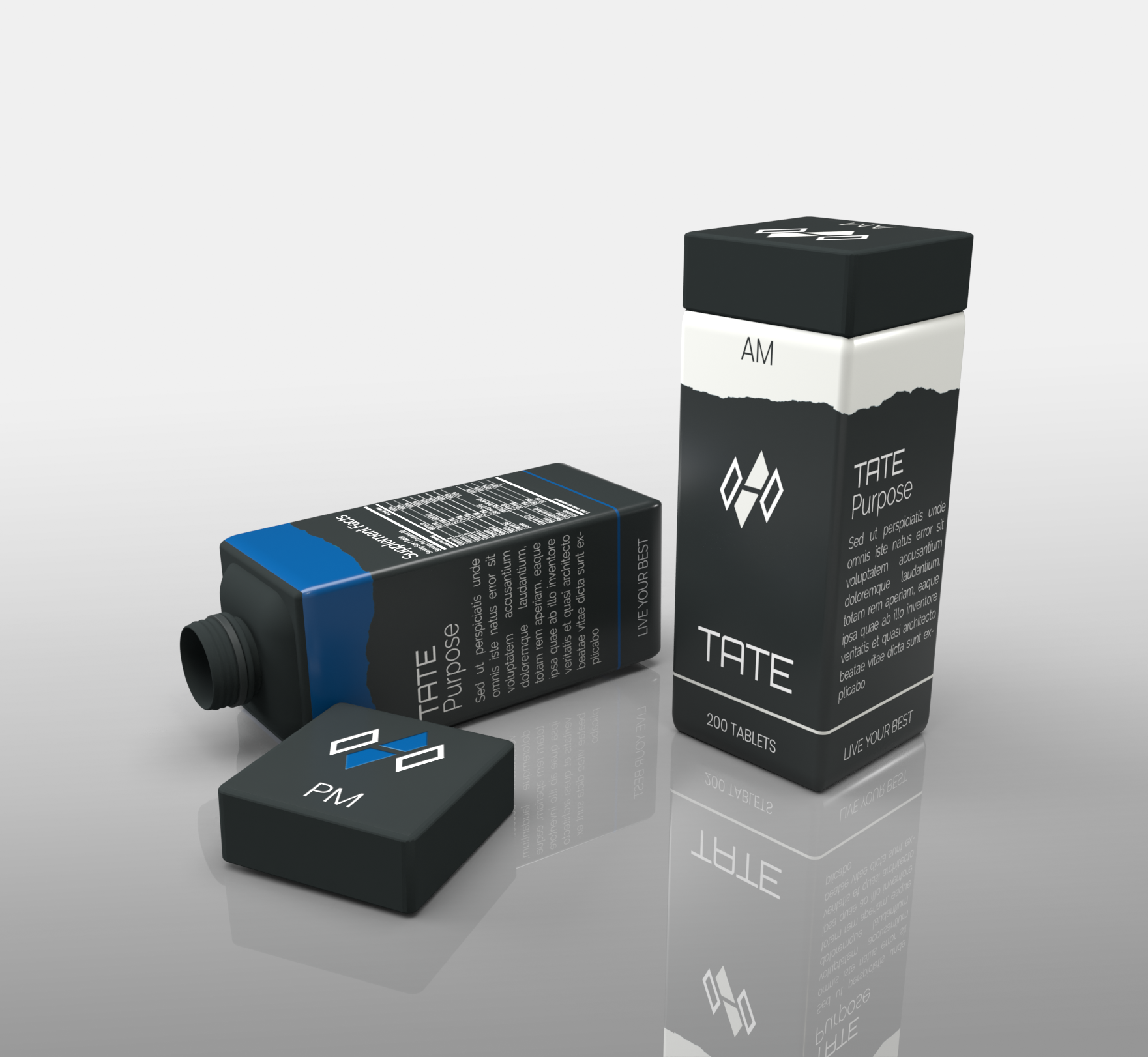
Our company name is TATE and stands for "Take action, To Elevate". Our goal is to provide a no BS approach to Supplementation and specific problem solving products.
As a Danish based brand our key words is: "Minimalism", "clear lines", "Nordic colours i.eg. and as seen in canvas", "Purity", "simplicity", "design", "Functionality", "health", "clarity" and "calm".
This design is aimed at a two container product (AM) for "night" and (PM) for "day".
Design is focused on a rectangular shape with a rectangular shape lid that screws on to a uniform and harmonious design.
Colour wise we are most into matte "earth colors that can also be seen in canvas.
These can be singular or a mix in the design but we kindly ask to stay away from "bright and shiny" colours.
Logos and scriptures will be added as a 2D effect, with exception for the lid logo which we would to see retracted into the lid itself.
In a rendering design we would like two containers next to each other seen from different angles where one lid is screwed off and one is screwed on.
In addition we would like a single container rendering showing only PM and only AM.
Happy designing
Claus & Dannie - TATE
Target Market(s)
European and North american markets.
Target: Male and Female age group 18-50.
Industry/Entity Type
Health Product
Font styles to use
Look and feel
Each slider illustrates characteristics of the customer's brand and the style your logo design should communicate.
Elegant
Bold
Playful
Serious
Traditional
Modern
Personable
Professional
Feminine
Masculine
Colorful
Conservative
Economical
Upmarket
Requirements
Must have
- Clear and distinctive profile
Matte colours
uniform and harmonious shape (rectangular base)
inspired by earth minerals colours and contours.
Nice to have
- 3D visual effect in rendering to better get a feel of the product
Should not have
- Shiny colours or material indicators.