Westerfolds Cycles logo design
Want to win a job like this?
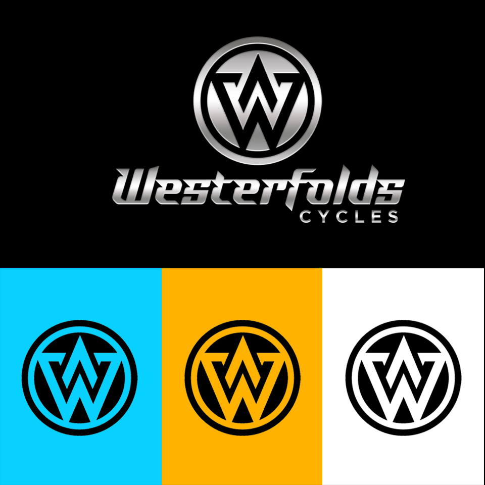
This customer received 92 logo designs from 47 designers. They chose this logo design from rezz as the winning design.
Join for free Find Design Jobs-
 A$150
A$150
-
 92 designs
-
 47 designers
Logo Design Brief
Looking for a new logo for a mountain bike focused store using the letter W as the symbol (think Wordpress' logo).
The logo will be used in a few different ways, but would need to be optimised for Social (instagram), tee-shirts, cycle clothing, favicon. This means it either needs to be circular or square.
The logo symbol will be used both with the logo text (underneath) and without.
No fluid logos from the 1980's please.
Needs to be mono-chrome, and can be used as either black or white (i.e. no colours in the logo itself)
Target Market(s)
Mountain Bike riders. Predominantly male
Logo Text
Westerfolds Cycles
Logo styles of interest
Emblem Logo
Logo enclosed in a shape
Abstract Logo
Conceptual / symbolic (optional text)
Lettermark Logo
Acronym or letter based logo (text only)
Font styles to use
Colors
Designer to choose only greyscale colors for use in the design.
Look and feel
Each slider illustrates characteristics of the customer's brand and the style your logo design should communicate.