Delivery Performance Dashboard for Web Portal
Want to win a job like this?
This customer received 24 app designs from 7 designers. They chose this app design from Jesse Yusufu as the winning design.
Join for free Find Design Jobs- Guaranteed
-
 US$120
-
 24 designs
-
 7 designers
App Design Brief
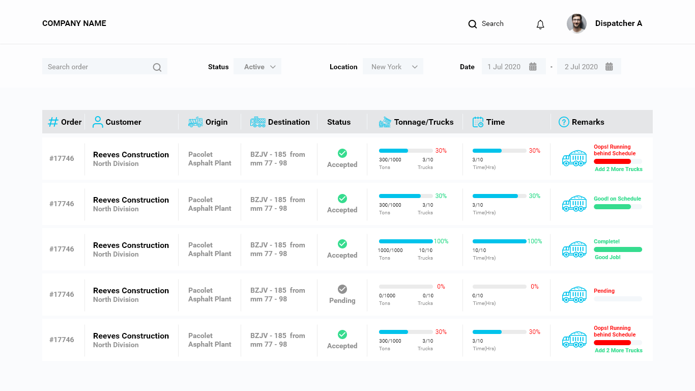
We need you to design a dashboard for our web portal. We deliver sand and stone to construction jobsites. The attached screenshot is from our current web portal dashboard . It shows how much material has been delivered from an order.
Dump trucks will deliver multiple loads during the day and the dispatcher uses the dashboard to monitor if they need to add more trucks or less trucks to fulfill the order. An example would be, I need to ship 1,000 tons of sand to a jobsite and I plan to use 10 trucks during the day and that it will take 10 hours of hauling to complete the job. After 5 hours of hauling (50% the day is over), I should have delivered 500 tons of sand (50% of the order). But maybe there is a lot of traffic, and I only have delivered 300 tons. The dashboard will show that I am behind schedule and I might need to add 2 more trucks to the job.
Industry/Entity Type
Construction
Font styles to use
Look and feel
Each slider illustrates characteristics of the customer's brand and the style your logo design should communicate.
Elegant
Bold
Playful
Serious
Traditional
Modern
Personable
Professional
Feminine
Masculine
Colorful
Conservative
Economical
Upmarket
Requirements
Must have
- We need a progress bar showing how much material has been delivered, how much material was requested to be delivered total and how much material should have been delivered at the current time. The goal is to show the user if the deliveries are ahead or behind the expected pace and why.
Nice to have
- The icons for plant, driving and jobsite show if the actual times have exceeded or beaten the planned times. Maybe you have other ideas to show the user if the trucks are sitting longer on the jobsite, at the plant to get loaded or driving to and from the jobsite.