EIFFEL IT
Want to win a job like this?
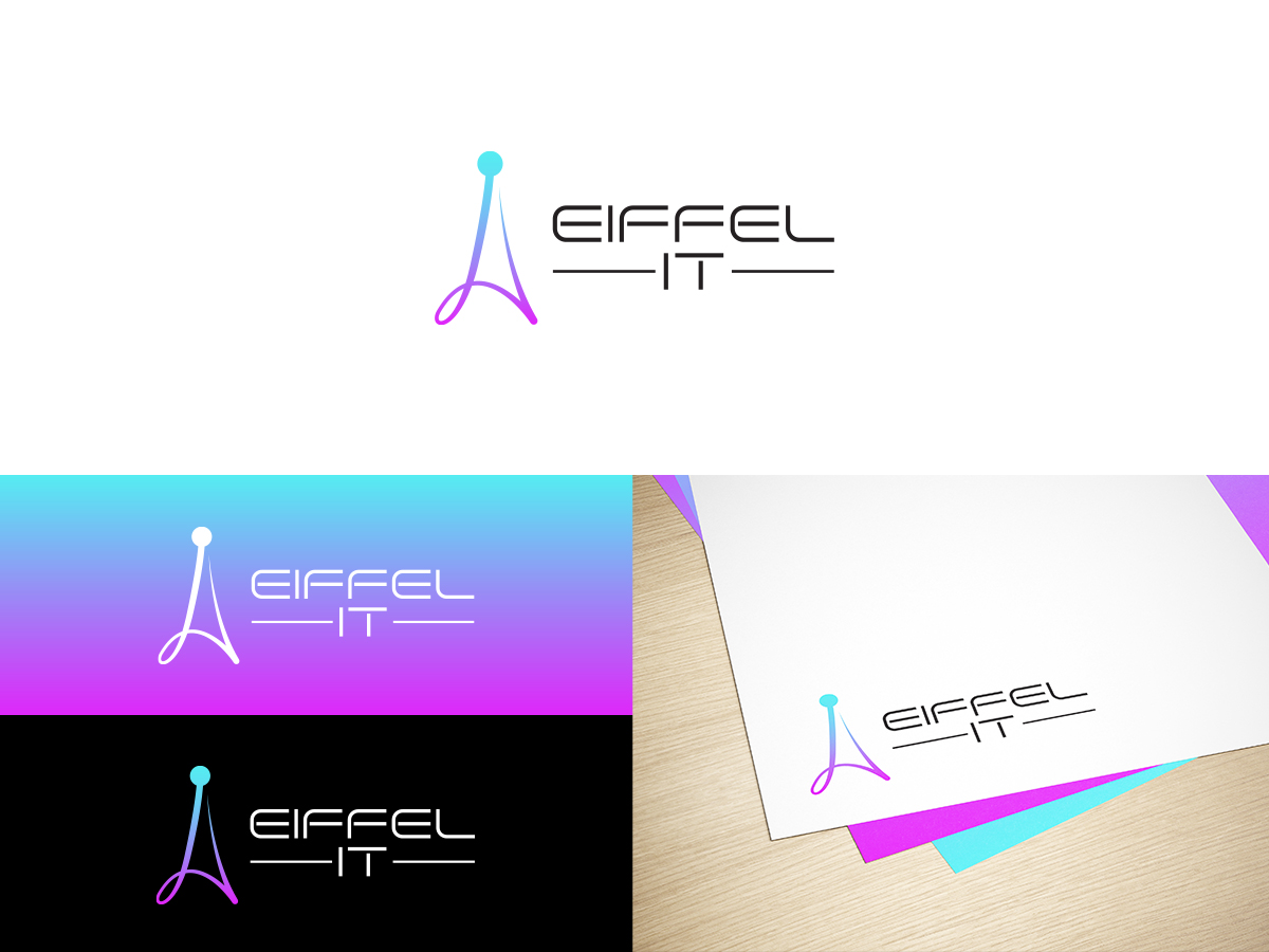
This customer received 369 logo designs from 100 designers. They chose this logo design from Slant Line Media as the winning design.
Join for free Find Design Jobs- Guaranteed
-
 €190
€190
-
 369 designs
-
 100 designers
Logo Design Brief
EIFFEL IT is a Franco Thai company in information system and particularly on the Digital Transformation, Consulting, Engineering, Architecture, Offshore solution (Infrastructure, Middleware, Integration) and application development.
EIFFEL IT is a refence of a French name and with a famous modern and daring architecture in his days.
The purpose is to have a logo representing the Eiffel Tower with an IT & Architecture spirit.
We would like to have a logo really simple, lean and modern based on a vision for the future.
Regarding the color, we would like to reuse a blue and orange color OR Blue, White & Red as the Thai and French flag.
The name of the company can appear in the global logo but we need to reuse just the design without the company name: the purpose is to extract some elements of the logo to reuse them separately (example: for a website or shirt…)
Colors for Blue & Orange
===========
Back: # 344d59
===========
Blue Lightning: # 36c0ff
Blue clear: # 39caff
Blue medium: # 37bfff
Blue medium2: # 56c8fd
===========
Orange Lightning: # fdad46
Orange clear: # ffb764
Orange medium: # cf8d3b
Updates
Besoin de plus de jours pour examiner
Besoin de quelques jours pour choisir un design
Target Market(s)
middle or big companies (different activity area) based in Europe & Asia
Logo Text
EIFFEL IT
Logo styles of interest
Emblem Logo
Logo enclosed in a shape
Pictorial/Combination Logo
A real-world object (optional text)
Abstract Logo
Conceptual / symbolic (optional text)
Font styles to use
Look and feel
Each slider illustrates characteristics of the customer's brand and the style your logo design should communicate.
Elegant
Bold
Playful
Serious
Traditional
Modern
Personable
Professional
Feminine
Masculine
Colorful
Conservative
Economical
Upmarket
Requirements
Must have
- The name of the company can appear in the global logo but we need to reuse just the design without the company name: the purpose is to extract some elements of the logo to reuse them separately (example: for a website or shirt…)
Nice to have
- a modern audacious eiffel tower
Should not have
- Avoid everything already seen before
too much traditional
not enough graphic
too many elements