COVID-19 Accredited CME Impact Infographic
Winner
Want to win a job like this?
This customer received 52 infographic designs from 25 designers. They chose this infographic design from DA. as the winning design.
Join for free Find Design Jobs- Guaranteed
-
 US$110
-
 52 designs
-
 25 designers
Infographic Design Brief
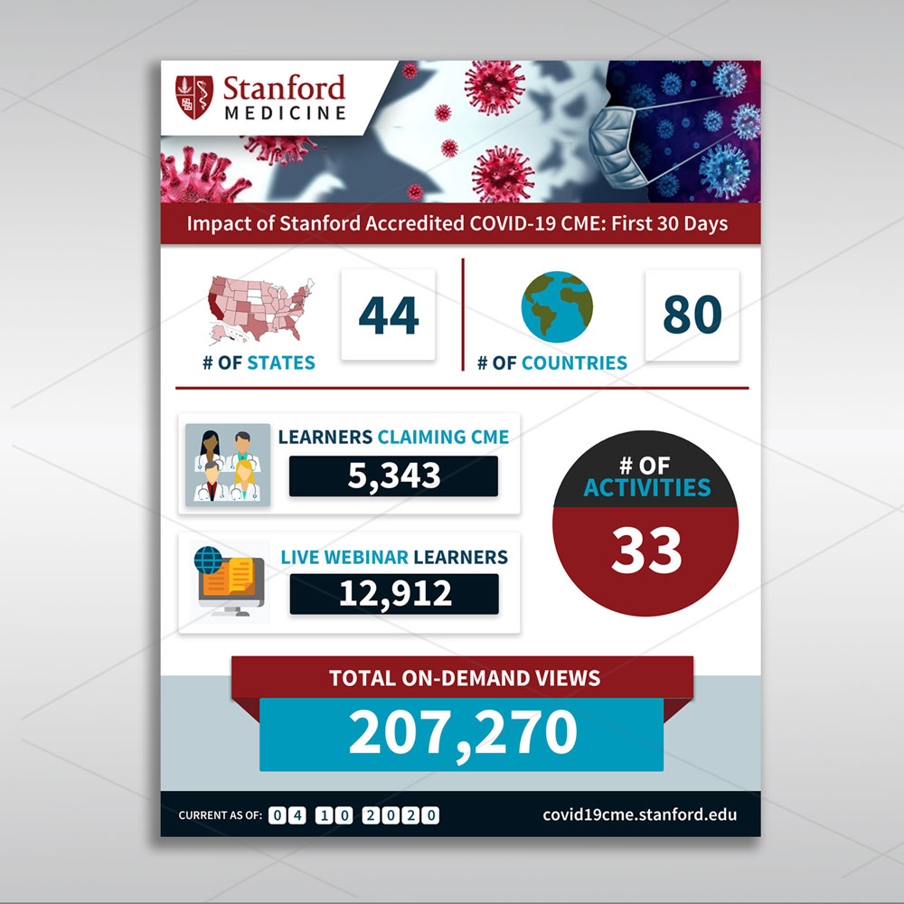
We want an infographic showing how much COVID-19 Continuing Medical Education we have accredited and its impact. Our website is at https://med.stanford.edu/cme/COVID19/education.html The attached document is intended to simply show the elements. You have complete freedom on design. We will be updating the numbers weekly so it is important that we have the files so that we can update it. This can be done in powerpoint, publisher, word, in-design, illustrator. Don't use crazy fonts that we wont have.
Target Market(s)
Internal to Stanford. We just want to show the impact of our work
Industry/Entity Type
Education
Look and feel
Each slider illustrates characteristics of the customer's brand and the style your logo design should communicate.
Elegant
Bold
Playful
Serious
Traditional
Modern
Personable
Professional
Feminine
Masculine
Colorful
Conservative
Economical
Upmarket
Requirements
Must have
- We must be able to update the numbers ourselves.
See attached document for the pieces that we want.
The sizes of the numbers in the attached are based on importance to us.
Nice to have
- Not mandatory but try to use these colors. https://med.stanford.edu/identity/color-palette.html
I was thinking that perhaps the big number could be done in traditional train. Like this: https://www.shutterstock.com/image-illustration/flip-board-under-constuction-page-isolated-1542221300
Files
Download all files - 0.3 MBPPTX
stanford cme impact statement
Saturday, April 4, 2020
JPG
simple_banner_1559372807.img.1200.high Monday, 06 April 2020 00:27:20
Monday, April 6, 2020
XLSX
state shading Saturday, 11 April 2020 02:31:29
Saturday, April 11, 2020
Payments
1st place
US$110